


Can simplified user interfaces (SUI) revolutionize your visual instructions?
You may not have heard of simplified user interfaces (otherwise known as SUI) before, but there’s a good chance you’ll have seen them. Companies like Dropbox, Microsoft, Adobe, and Google use SUI graphics to help their audience navigate their software.
But what are SUI graphics, and how can they improve your users’ experience? Instructional content and SUI expert, Anton Bollen dives deep into the benefits of giving your screenshots the SUI treatment.
Anton started his career as an intern at TechSmith, and now he’s TechSmith’s European Customer and Market Strategist. He’s also a talented tutorial video creator thanks to his concise, clear nature and his eye for details.
In this post, Anton shares why you should consider SUI graphics over traditional screenshots, when’s the perfect opportunity to use them, and how to create effective SUI graphics.
You can watch the video on this topic at the top of this post, to listen to the podcast episode, hit play below, or read on for more…
What are simplified user interface (SUI) graphics?
Anton’s definition of simplified user interface graphics or simplified user interface (SUI) is that they’re a design treatment for screenshots. The design reduces contextually unimportant information to help the user focus on what’s necessary.
SUI graphics often replace less relevant information with simple shapes to direct the user’s eye to the key information. This means that a SUI screenshot is not an accurate software depiction but instead represents the software to guide users through specific instructions.
“For us, as content creators, it’s a fantastic technique to guide the attention of the learner or the viewer on what really matters.”
The clue is in the name – simplified user interfaces are all about instructing people better by simplifying.
When to use SUI
SUI graphics are a key feature of instructional design and show clear pathways to completing a task.
In the example below, there are two screenshots. The left-side image is an original screenshot, but the right-side image uses SUI graphics to remove irrelevant features. Both illustrate that the user must click ‘File’, then ‘Connect Mobile Device’, but which image communicates the instructions more clearly?
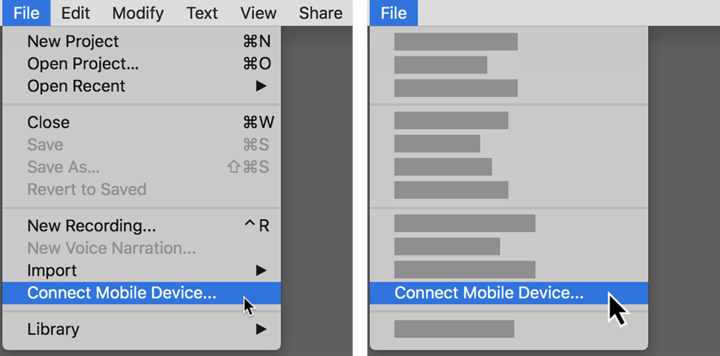
The right-side image reduced and removed the less relevant information, such as the different menu entries, hotkeys, and the main menu bar entries. This reduces the visual noise that a screenshot presents to a user and focuses only on the important parts.
There are many situations where it’s appropriate to use SUI graphics, for example, training, marketing, and user onboarding. Anton highlights general user onboarding as the perfect place to use SUI graphics because they clearly introduce new features.
“Very often, new features are documented or explained with simplified animation or graphics. They make perfect sense in that situation because the user is not familiar with all the details of that application or that feature.”
Why choose simplified user interfaces over screenshots
Anton believes that one of the most significant challenges learners face with screenshots is the amount of information.
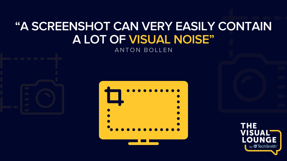
Anton defines visual noise as less relevant information or distracting graphics. If the software is complex, it can be difficult to demonstrate exactly where the user needs to focus.
“New users were getting too caught on unnecessary details, which was taking away from their ability to just focus on the key message.”
As you become more familiar with software, you learn to filter out the parts you don’t use. However, a new interface’s design can overwhelm new users, as they aren’t sure what will or won’t be necessary to help complete their tasks.
Some visual instructions add design tools such as arrows, boxes, or highlighted text to draw the user’s attention to where it needs to be. But SUI graphics remove the less important information, leaving behind only the essential parts.
According to Anton, one of the downsides to using SUI graphics is pushback from unreceptive users. He suggests that you should do some testing with your audience to learn whether they prefer SUI graphics or traditional screenshots before you begin creating them.
How simplified user interfaces can break down language barriers
Using screenshots is a fantastic way to help someone understand a piece of software. However, if that software is updated or translated into a different language, then the instructional content will need updating.
“Unfortunately, some companies counter this by reducing the number of visuals they use to document their services, which I really dislike. I think we are all visual people, and visuals really help with the learning and understanding of processes and information, so taking that away is not the solution.”
Anton is passionate about using SUI graphics for localizing your instructional content. He sees a lot of potential for optimizing translation workflows and expanding your reach into other markets using SUI graphics.
Anton stresses that by designing SUI graphics without any text and supplying text instructions in a caption, you can use these same graphics for any language you support. These are far easier to update and more versatile to use than a traditional screenshot.
How to create a simplified user interface graphic
Creating a SUI graphic takes more time than taking a simple screenshot, but there are ways to speed up and simplify the process.
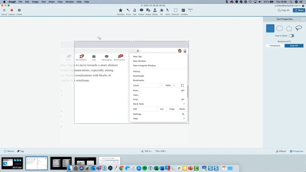
There is software available to empower you with the tools to create great SUI graphics. We’re going to demonstrate how to create a SUI graphic using Snagit.
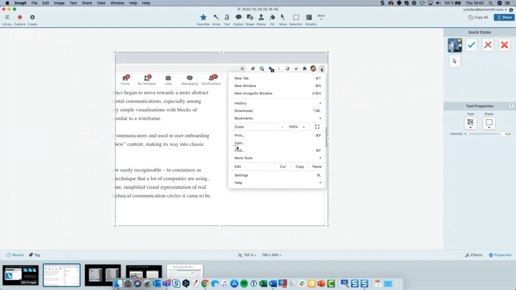
First, you need to reduce the complexity of the screenshot. You can do this by removing elements that aren’t important. Anton suggests removing unnecessary hotkeys, plugin icons, and extra text.
To do this using Snagit, use the ‘Selection’ tool with ‘Background Fill’ set to ‘Auto-Fill’, draw a box around what you want to remove, and hit delete.
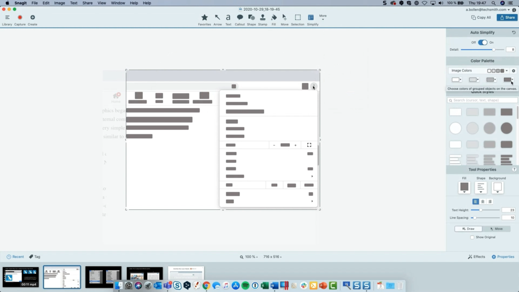
Next, Anton advises simplifying your screenshot. This is where you can blur out unnecessary menu items by choosing the ‘Simplify’ tool and turning on the ‘Auto Simplify’ feature.
You can change the colors and edit the simplification using the ‘Move’ tool to design your SUI graphic in a way that you’re happy with.
Simplifying your graphic is the most important part of this process. You need to carefully select what to keep and what to remove to create enough context for your users.
Without the right amount of context, users may get confused and struggle to effectively utilize your instructional content.

Context is key when creating any visual instructions, so it’s vital to leave in visual anchor points so the learner knows what they’re looking at. These could be stand-out buttons, color blocks, or visually dominant menu items. Keep these anchor points the same to help your users visually navigate your SUI graphic.
You should test your graphics by seeing if people can follow your instructions or if your SUI elements are interfering. Anton notes that one of the problems with SUI graphics is that they can work against simplifying the problem with too many distracting graphics.
How to take simplified user interfaces further
Anton states that it is possible to create SUI videos, but it requires much more work. The technology isn’t as advanced as it is for screenshots, so to create effective SUI videos, you need to create animations almost from scratch.
He believes that SUI videos can be incredibly useful in guiding a user but advises ensuring that the return on investment is there before you take the time to develop them. Anton’s final words of advice are to weigh up the benefits of putting in the extra effort to create SUI graphics and what they could achieve for you.
“It’s going to look nicer, it’s going to make a better first impression, [SUI graphics] are going to be more successful, I don’t have to make as many updates, and I can maybe use them in more languages. You do have to think about it a little bit, but nevertheless, I think a lot of cases, it’s definitely worth it to go that extra small mile.”
From onboarding more effectively to limitlessly localizing, SUI’s benefits could be great for your audience. So, consider leveling-up your next screenshots with the SUI treatment. To learn more about creating better visual instructions, check out the range of courses and resources available at the TechSmith Academy.
