Alternative text, commonly known as alt text, describes an image or its function. The importance of alt text lies in both its use for accessibility and search engine optimization, or SEO. For accessibility purposes, alt text is description text that is read by screen readers that assist low vision or visually impaired users with an understanding of the image.
For SEO purposes, alt text is indexed by search engines and used to improve their knowledge of a web page as well as improving website performance. Given that each day a billion or more image searches occur, alt text has to be a key driver in your SEO strategy as it tells search engines important information about your article via that image.
TechSmith Snagit is the best tool to easily capture, annotate and share images. Using Snagit helps users with their process to create clear and effective alt text for images.
What is alternative text (alt text)?
If alt text is not present, a screen reader will not be able to describe an image to a visually impaired user. This negatively impacts their experience with a website, oftentimes rendering it unusable. Beyond user experience, missing alt text hampers SEO.
Search engines use alt text to understand the content of an image, improving SEO and ranking. Alt text helps search engines better understand a web page through a collection of alt text for images, as well as improving the changes of your images appearing in image search results.
Image capture and editing tools, such as Snagit, can assist users in capturing images that need alt text and annotating them for clarity and usability. Improving your alt text starts with improving your image!
The best snipping tool for Windows and Mac
Don’t let clumsy built-in tools hold you back. Take and edit screenshots with Snagit!
Get Snagit
Best practices for writing effective alt text
Writing effective alt text doesn’t have to be difficult. Follow these simple guidelines to ensure you have the best alt text for your images.
Be descriptive yet concise
Describe the image clearly in a few words without overloading the reader. It can be a delicate balance, but first seek to describe the image as completely as you can. Then, review your description to make it as succinct as possible.
Spell check your alt text
The words you use in your alt text must be spelled correctly in order for screen readers to properly read them. Misspelled words would negatively impact the experience for a user, leading to confusion and disruption. In addition, your SEO would be negatively impacted as a search engine would not understand a misspelled term, thereby harming the optimization.
Avoid repetitive words
Avoid using redundant, repetitive words. See what I did there? Also, there is no need to start the alt text with “image of” or “picture of.” Doing so is redundant, as the screen reader understands that it is an image.
Provide context for the image
Write alt text that provides context relevant to the page or article where the image appears. Using images that do not support the context of the page should be avoided. Complex images or purely decorative images aren’t ideal for people using screen readers, as it could add unnecessary overhead to their ability to comprehend the information on that page.
Decorative images don’t need alt text
While describing most images with alt text makes sense, you do not need it for every image on a page. If you are using an image that is decorative, where it doesn’t add any information to the context of the page, you do not need to supply alt text.
<img src="banner.png" alt=" ">Other examples where alt text is not necessary are images that are part of page design, that are part of a text link, those with an adjacent text alternative, and those used for ambiance. Leaving the alt text empty is the preferred method so that screen readers disregard it. More guidance on alt text for decorative images can be found at the W3C images tutorial.
Alt text examples
There’s good alt text descriptions, and there’s the bad. Poorly written alt text makes it difficult for the visually impaired to gain a complete understanding of the image’s content and context. Let’s take a look at a few examples that were poorly written.
<img src="retreiverpuppyplaying.jpg" alt="Dog in park"><img src="salesgrowthchart.jpg" alt="Growth sales chart">While these versions contain text related to the subject, they lack the specificity necessary to convey the image’s full context. They are too concise.

Let’s improve upon these alt text versions by making them more clear and descriptive.
<img src="retreiverpuppy.jpg" alt="Golden retriever puppy licking lips while chewing on rawhide bone in a large yard">Including the type and age description of the dog, what he is doing, notable colors, objects, and the specific location helps a visually impaired person more easily gain an understanding of the specific context of the image.

<img src="salesgrowthchart.jpg" alt="A hand with a pen drawing the word “Sales” and a rising arrow on the chart depicting sales growth">Improving the description by identifying the type of chart, specifically that the chart is emphasizing the growth, the word that appears, and that a hand is drawing the content, fully builds an understanding for those with visual impairment.
The improved examples above are also necessary for SEO because they include more descriptive context for the page when it is being searched. Improving alt text matters!
How Snagit helps with alt text creation
Snagit can help with improving your use of alt text. Use Snagit to capture images and annotate them, making it easier to think about what needs to be conveyed in the alt text.
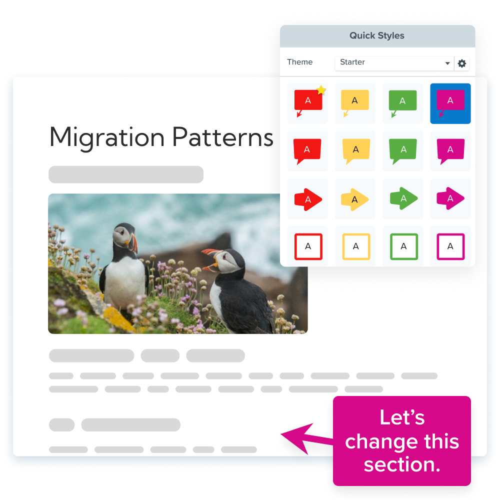
Snagit’s simple annotation tools can be used to draw attention to key aspects of an image that should be reflected in the alt text.
- Use the arrow tool to point out a specific feature of the image
- Use the shape tool to frame an area
- Use the highlighter tool to draw attention to text in the image
- Use the magnify tool to zoom in and show detail of an area
- Use the stamp tool to add more substance to your image
Improving the detail of your images with Snagit makes building your alt text easier, and you are able to align your content with your web page context.
Why use Snagit for image and alt text optimization?
Quick image capture
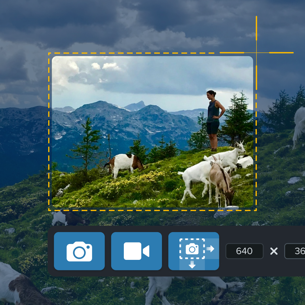
Snagit allows users to easily capture high-quality screenshots or images that need alt text.
Annotating for clarity
With Snagit, users can annotate images to highlight important elements that should be described in the alt text, improving both accessibility and clarity.
Creating visual tutorials
Use Snagit to create visual guides and tutorials, which can be supplemented with effective alt text, improving both user experience and accessibility.
Snagit Assets
Snagit Assets is a library of 100 million images, templates, themes, photos, and more. Use Snagit Assets to find the perfect image to match the content for your blog post, web page, or documentation. Our searchable assets come with an image description to help you get started with your alt text.
Ready to improve your alt text with Snagit?
Are you ready to improve your alt text and make a positive impact on both your SEO and visually impaired users by making your content accessible? Download Snagit today and start capturing and annotating images. Snagit makes it easier to create accessible content with well-written alt text!


Share