
It can be tempting to just skip the screenshots and avoid making videos when it comes to user documents and other content.
But when you create visual content, you make content that matters.
In this video, Daniel Foster shares how easy it can be to add visuals to your documentation or training content, even if you don’t think you have the skills or time.
Video transcription
Hi. I’m Daniel Foster. I work at TechSmith, and I want to share today with you some ideas, that I’ve been sharing, with a lot of groups around the country and even internationally.
First off, who is TechSmith? So, we’re the makers of Snagit and Camtasia. And these are tools for creating images, GIFs, and videos.
And if you’re in Technical Communication as a field you’re probably already familiar with these products.
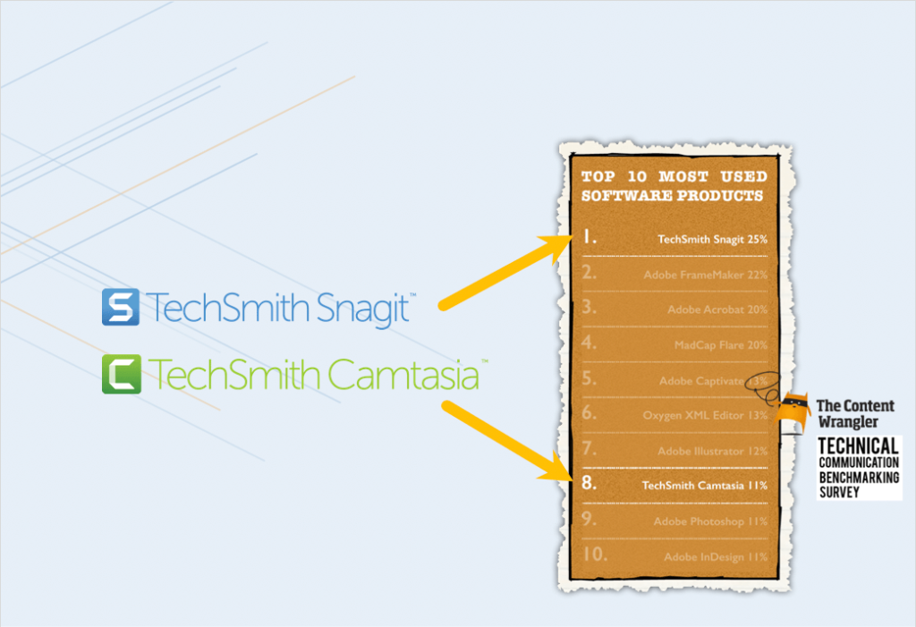
Content Wrangler, which does a, a benchmarking survey every couple of years, recently, showed that Snagit’s number one and Camtasia’s number eight among all the software tools that Technical Communicators have in their toolbox.
And, one of the things I get to do, as a Strategy Lead, is to help set the direction for Snagit. And so to do that I’m walking to a lot of practitioners, a lot of folks that are actually in the trenches making content. And one of the themes that I hear a lot is that even though the tools and, the ability to make visuals has gotten more and more accessible to more people, they still struggle on their teams with this tension between text-only content or visuals.
And so it ends up sometimes looking like this wall of text. And why is that? Well, that’s because there’s a perception that it’s much easier to just create, and localize, and update, and maintain text-only documents.
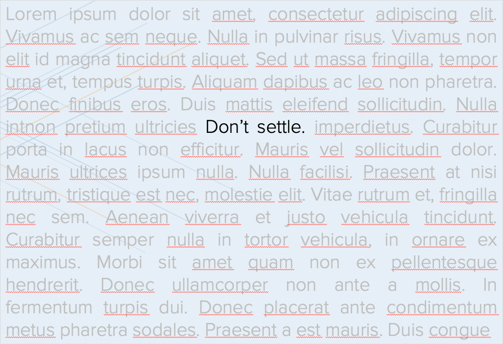
And I want to say to you today don’t settle. We don’t have to settle for that because I think there’s a way out of this tension and that’s I want to talk about today. So, really there are two main takeaways, that I want to leave you with after we walk through this content.
And the first is that visuals do matter, and I’m gonna share some original research that we did that helps establish that fact.
And, second, I want to give you some ideas and inspiration for how you can get creative to, to escape this tension between, “Yeah, I wanna have visuals in my content, but it’s expensive and difficult to do. Is there a solution?” And I want to talk about one potential solution and kind of a creative approach that we’re seeing out there that Technical Communicators are adopting.
Record professional videos with Camtasia
Camtasia’s features make video recording and editing super easy
Download Free Trial
Do visuals even matter?
So, first off, you know, this is totally a fair question to ask, is do visuals even matter? Does it matter if my content is just text or if it contains these visual elements?
Well, we felt like there wasn’t really a great answer out there. There wasn’t a lot of good research on this that felt credible. And so what we did is we hired an independent firm to tackle this in a research project so that we could answer that question.
And, we really gave them the reins of objectivity. We just said, “Hey, you know, we’re going pay for this, we have some input about how it’s structured, but really the outcomes are up to you. You know, we’re not going dictate what you find.”
And so we took a risk that the results could be different than what they were. But let me talk about what the project was and a little bit about the three big findings.
So, before I get to the findings though, I’ll just give you a quick outline of the methodology.
So, we kind of had three stages to the, to the research. One was about preference, what did people prefer. So, opinion poll, a pretty broad opinion poll that was global in scope.
And the next stage was actually going into a lab and, and an observation experiment, having people perform different tasks, and then seeing their time on task and how efficient and effective they were.
And then the third was some economic modeling to see what would that look like, in terms of economic indicators and significance.
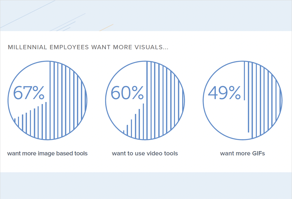
So, with the first section what we really found is that people do have a marked preference for visuals in their communication and in the technical things that they use to learn new technologies or new processes at work. But most workplaces actually fail at delivering this.
A lot of the content is just sort of a wall of text. And, so, particularly among Millennials this was a very marked preference that folks really preferred to have images, videos, even animated GIFs in their content rather than text only.
And Millennials are, you know, a growing percentage of your coworkers, your colleagues, and your customers, which is really important.
So, they’re not just a small group at this stage anymore. Millennials are really the dominant group in the workforce and becoming more so.
And so let me think about, why this preference matters. Oh, and actually this, this slide shows that preference actually extends beyond Millennials.
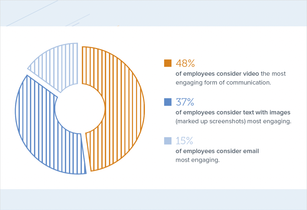
So, there it is in the broader workplace population as well, people have a marked preference for video and, and images.
But why does this matter?
Well, to your customers, if you think about it, your audience or your customer has choices. And so they can Google and find other content that’s not your content to answer their questions. And if what comes up in those Google results is videos from some third-party or just somebody who thinks they know your product, maybe it’s quality, maybe it’s accurate, maybe it’s not.
So you kind of lose control and you’re not really in that conversation at that point.
Also, there’s a perception issue, right?
So, if people have a marked preference for visual content and they’re not finding that content from your brand it kind of reflects poorly on your brand, right? Your brand ends up looking a little bit stale or obsolete and unengaging in ways that you don’t want to have that reflection or shade on your brand.
Do visuals actually help people perform tasks better?
So, the second main finding from our research was, that, that visuals actually help people perform tasks better. And so, we did an observational study and so we had people perform various technical tasks. We’ll link to the full study, so you can kind of dig in and see all the research yourself.
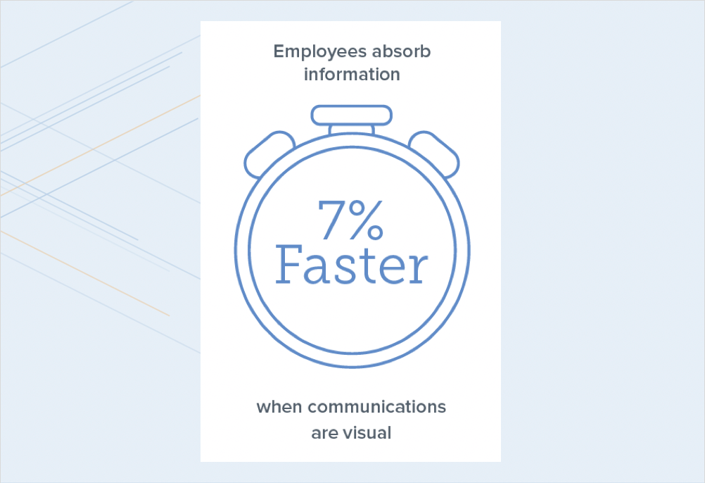
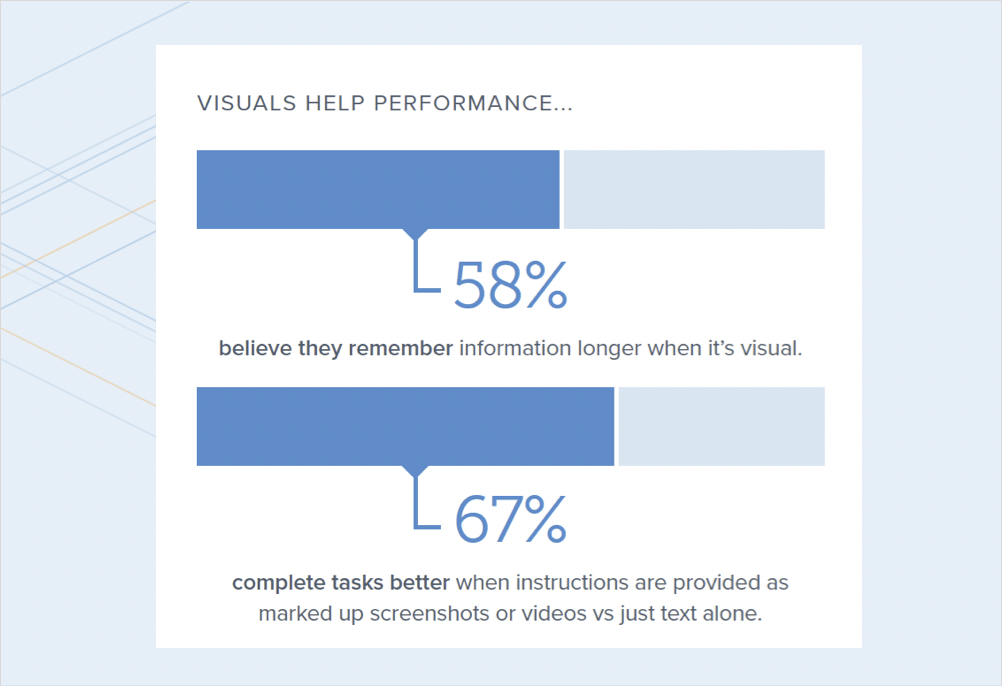
But, what we found is that there was an important, significant, increase in the ability to complete these tasks when people, had visuals in their content. So, about 7% was kinda the lift there. And, people also felt like they could remember the task’s, instructions better if they had more visual, content to them.
So, after they walk away that means that they’re not having to ask again or search again or, contact your support center again to remember how to do this.
Retention is important.
And, finally, task completion. Just being able to literally, complete the task accurately. There was a good lift that we found there, too.
So, just to recap, it’s important to include visuals for these two reasons that we’ve talked about:
- One, preference
- And, two, execution of tasks.
People are actually more effective at, at technical tasks when they have some visual support in there.
Can using visuals gain productivity?
And then, third, we kind of wanted to do an economic modeling exercise. So, the third part of the research was actually taking some of these productivity outcomes and saying, “What happens if you model those out economically using things like GDP and productivity numbers?”
So, what would that mean to companies, in terms of gained productivity? When we looked at the numbers you say, okay, well people pick up maybe six minutes a day if they have visuals in their content and they’re able to execute their tasks more efficiently.
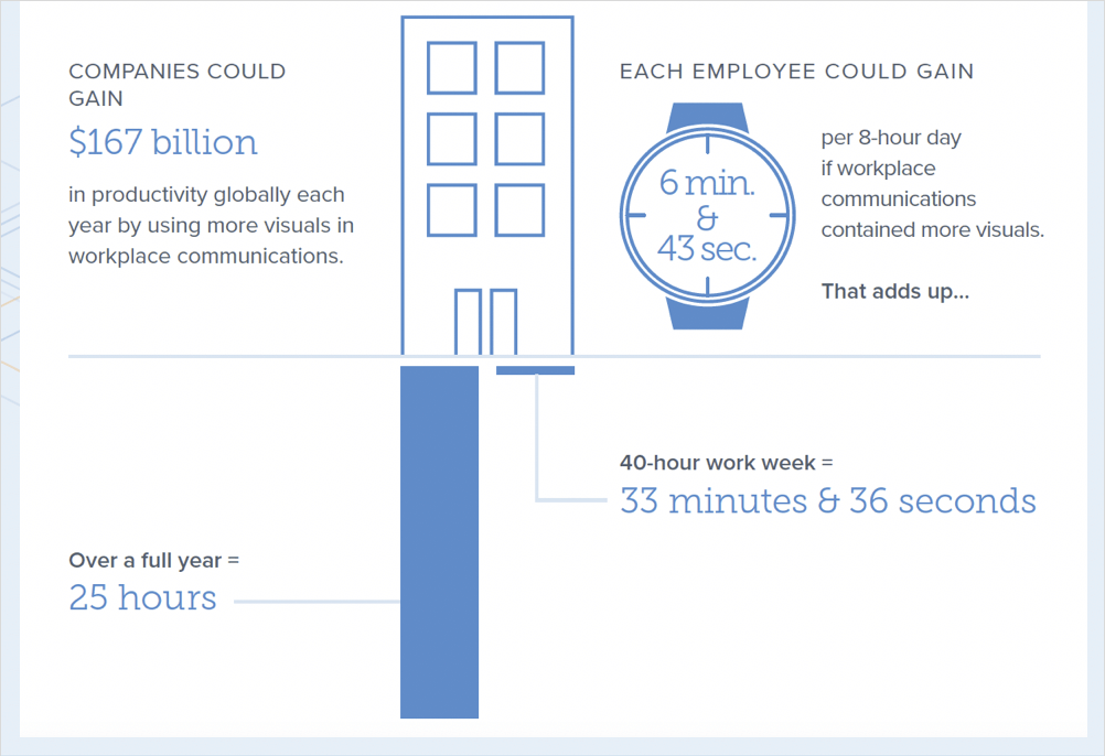
And then you multiply that out to a week, it’s about 33 minutes per week, or over the course of a full year, it’s something like 25 hours.
All of that just to say that these kinds of things do matter. Right? They matter to your business and they matter to your customers and how effective they can do the kind of jobs that they’re trying to do.
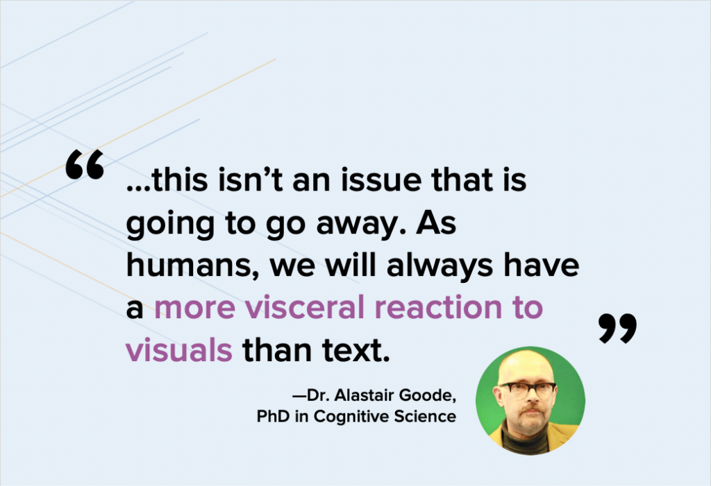
And this was a great summary quote from the actual researcher who did this project for us, and really it’s pointing out that this is not going away.
This is a trend. There’s going be more expectation by people and more demand for visual content because all the rest of the information and content that they’re consuming elsewhere is visual. So, that’s just the way things are going. And it’s not likely to reverse.
How to hack your technical communication with visuals
So, all that to say visuals matter, right? And we’ve talked about that from a preference, from an actual, task efficiency standpoint, and then from the economic factors.
But in reality, a lot of us have a lot of challenges as Technical Communicators.
And these are things like how do I update my visuals in my content every time my UI changes? So, for many people, the product or service that they work on might ship updates frequently, you know, a few times a year, maybe even a few times a week. So, that can create a lot of, challenge with churn.
Maybe you localize your content into multiple languages and that can be a challenge when you think about the visual component. Maybe you have to support many different versions or platforms. And so that puts stress on content teams.
Maybe your UI of your product is just, it feels clunky, not modern. It’s just not beautiful and it comes across as kind of an eye chart when you put it in your documentation.
And then there are these niche problems that we’ll hear about like, “I have a cloud product I support and unfortunately I can’t easily get at a dummy instance with dummy data that’s already populated to make it look real, to make it look like it’s the real live instance.”
So, as Technical Communicators you may encounter some of these problems and, one of the things that I love doing is, is looking across different domains and different, disciplines and saying, “How are other people solving these problems?”
A few years ago I started seeing a lot of content that looks kind of like this, so it’s basically wireframe-looking-content and usually, it came from marketers. And, it would be sort of a suggestion or an abstracted version of a screenshot that would be in some of this marketing material.
So, it started to make me think about why are they doing this? What’s the benefit of that? Besides being eye-catching, is there some other benefit there?
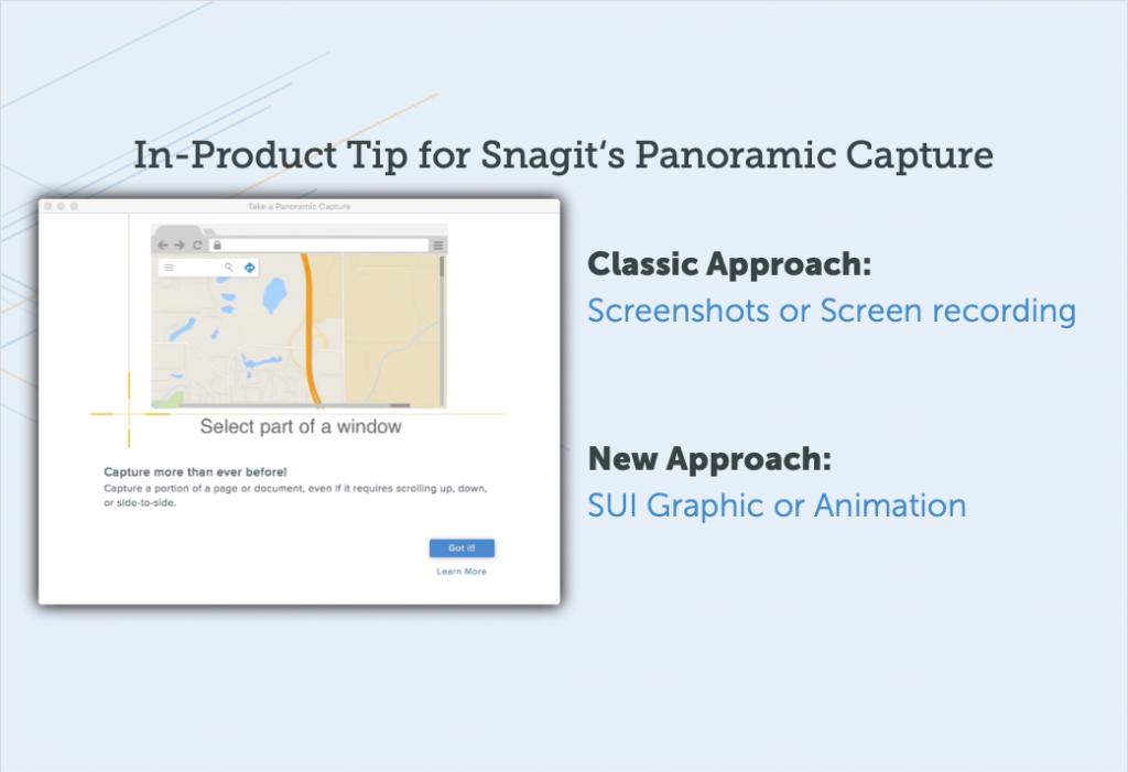
And then you started to see this kind of content, this simplified graphic, also works its way into things like in-product onboarding, the little animations or the static images that show up in a product that is explaining some of the functionality or the how-to or in What’s New content, or in, release notes.
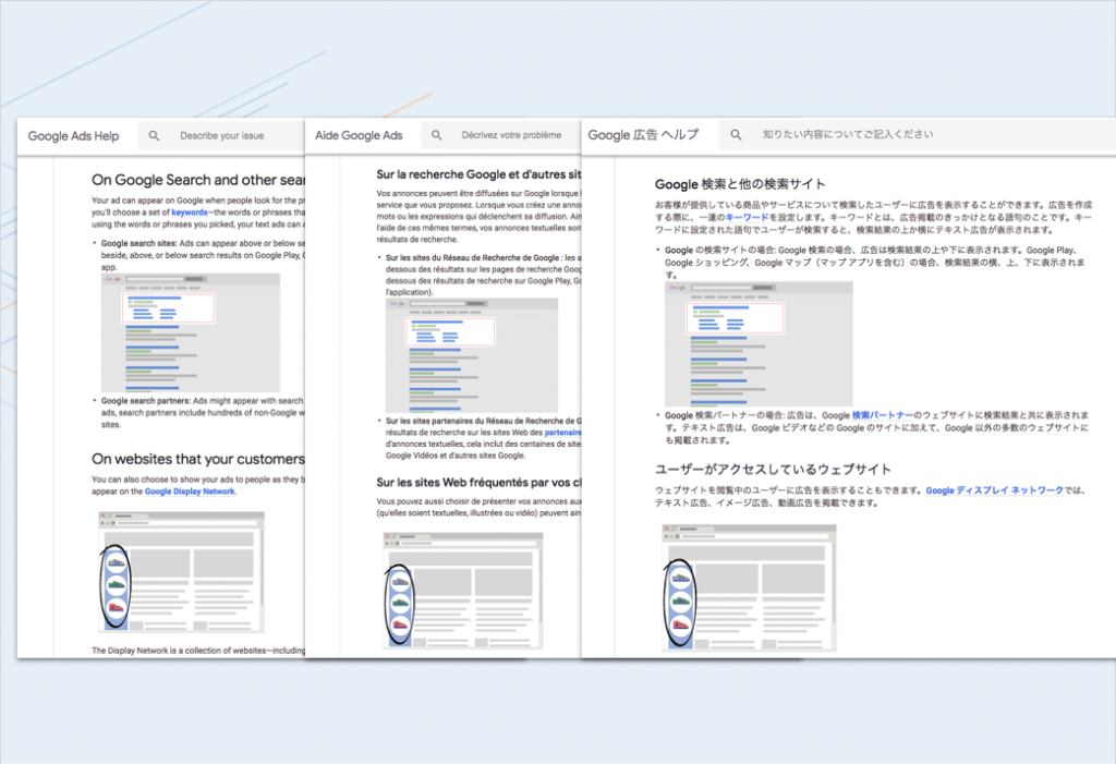
Then we’d see it work its way into documentation. So, this example is from Google, and you can see here that they have the exact same images in their English, French, and Japanese articles.
And, of course, they support like 20 other languages, so it’s in those as well. So, it’s kind of like what’s going on here? Why are folks doing this and what is this trend? We cast about for what, an established name would be for this, because it’s easier to talk about something if, you know, if it has a name and, there wasn’t really an established name. So, we coined the term, simplified user interface or SUI for short. It’s also really fun to say SUI.
But it’s really this idea that you’ve abstracted out any irrelevant or distracting details from an image and what you’ve left is the key, important pieces.
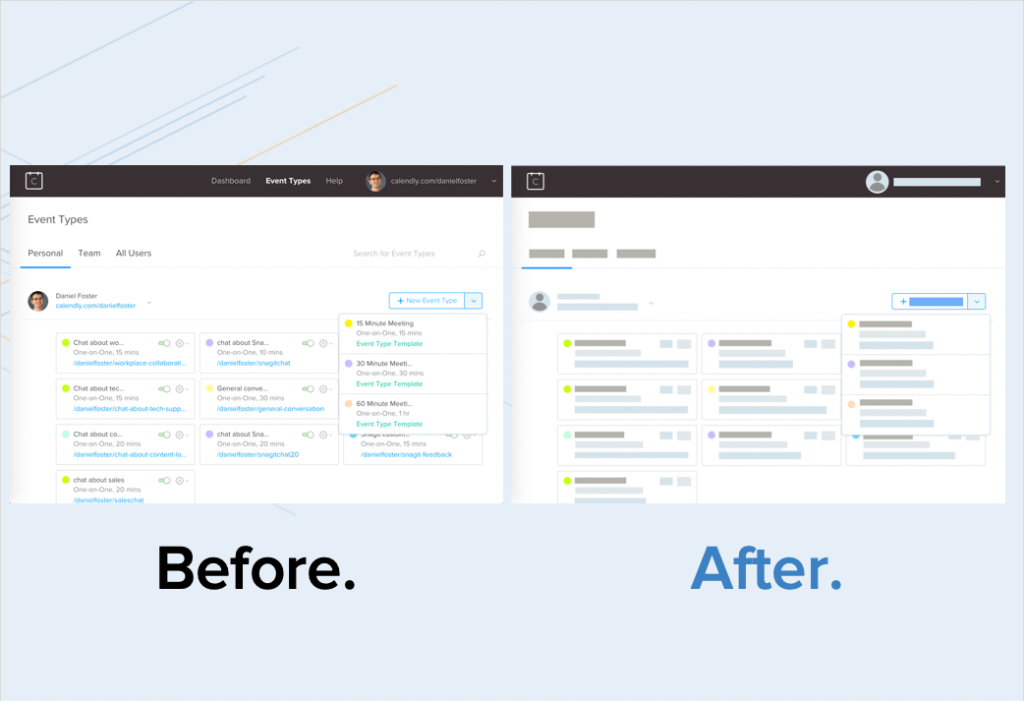
And so this is what that can look like, here’s a quick before and after. So, what you see on the left is just a screenshot of a service that I use called Calendly. It’s really great for scheduling customer calls. But anyway, the interface, you can see that a typical screenshot you’d have all the detail.
And then on the other side what you see is this SUI-fied or, or simplified treatment where you’ve really abstracted out a lot of that detail. And, and you might think, “Well, can people actually recognize what the product or interface is?” It turns out you can.
So, if you look at this one it’s pretty obvious what this is when you, when you stop and think about it a second.

This is Finder or Explorer, on Mac and Windows.
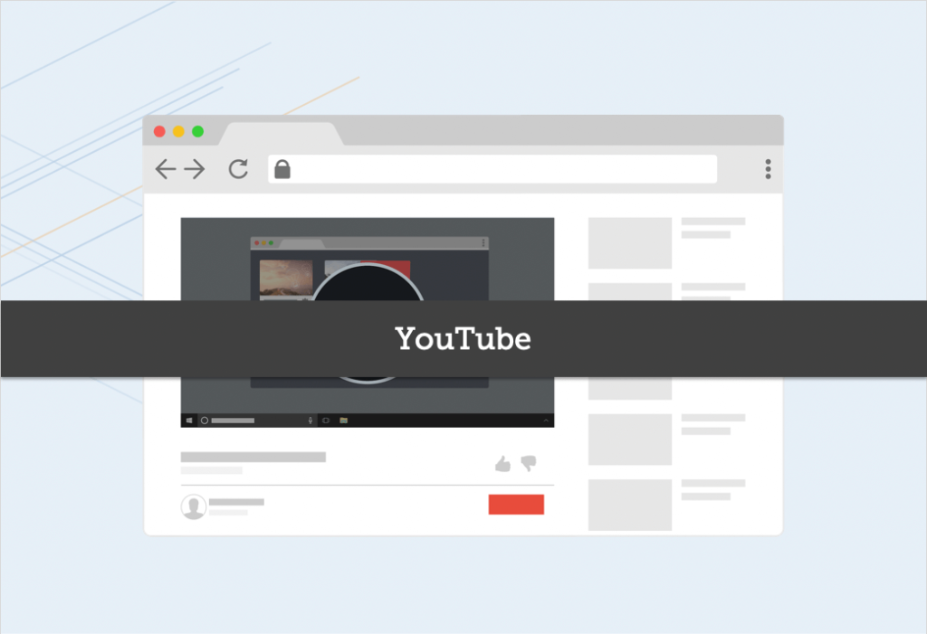
And, here’s another example, which is YouTube, right?
You can kinda look at it and see right away like, “Oh yeah, that’s YouTube”, even though there’s no text and everything is very abstracted.
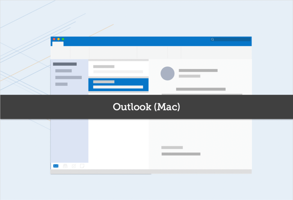
And one more example, this is one we spend a lot of our time in day-to-day and, of course, it’s Outlook.
Right?
So, you kind of can get the sense from the layout and from the basic colors of what, what that original interface was.
Can simplified graphics work in technical communication?
So, great, that’s good, but then as a Technical Communicator you’re probably asking yourself, “Okay, but I still need people to follow steps. Like, the point of the graphics is not just to look pretty, but it’s to show you where in the interface to click. So, where is the value for a Technical Communicator?”
So, let’s take another example.
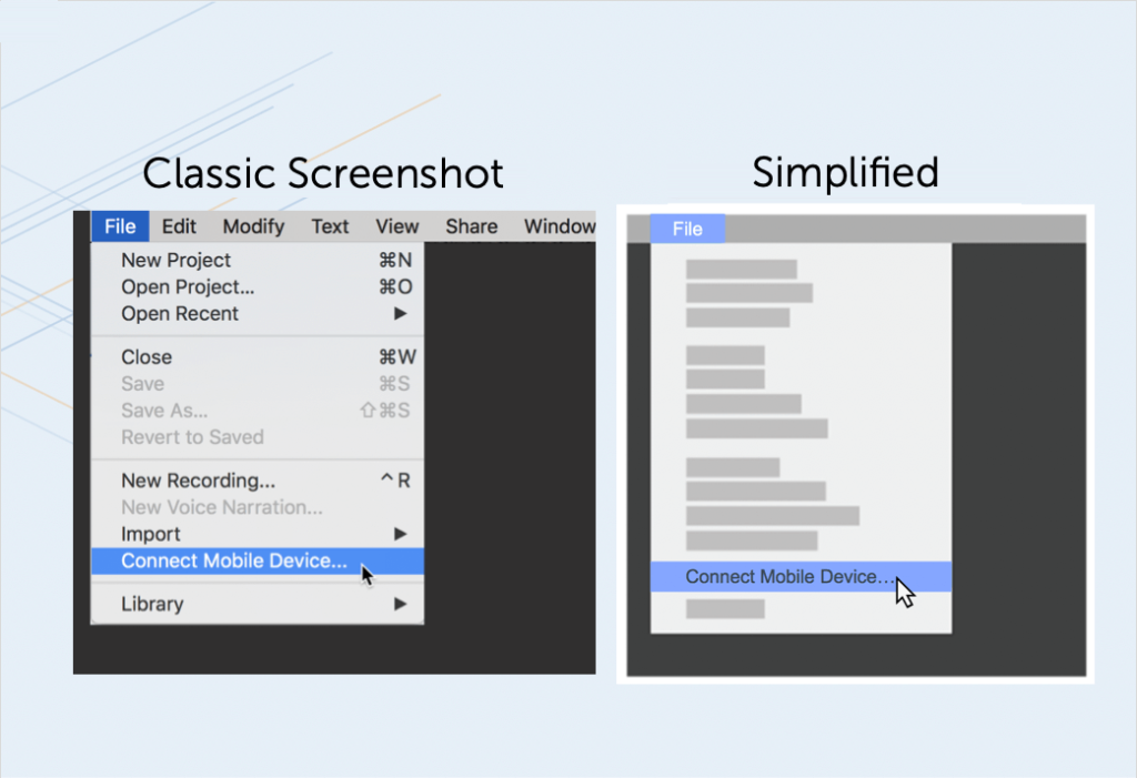
This one is a very just typical menu, and what you’ll see here is that when you step back and really look at it with fresh eyes there’s a bunch of stuff in here that’s not important for showing the two steps, which is ‘click file, click connect mobile device.’
That’s really the point of this graphic and yet there’s a ton of extraneous information.
So let’s abstract that out and you can see how much easier it is to really just follow along and say, “Oh, file, connect mobile device. That’s the two main things I need to know. Got it right there. Very visual. Very front and center.”
Of course, you’re going to want to pair that with some text.
And the text on the side is gonna say, you know, “Here are the steps”, and a little bit of context, but when you pair those together, this simplified graphic and that text, it’s a very powerful way to convey the information.
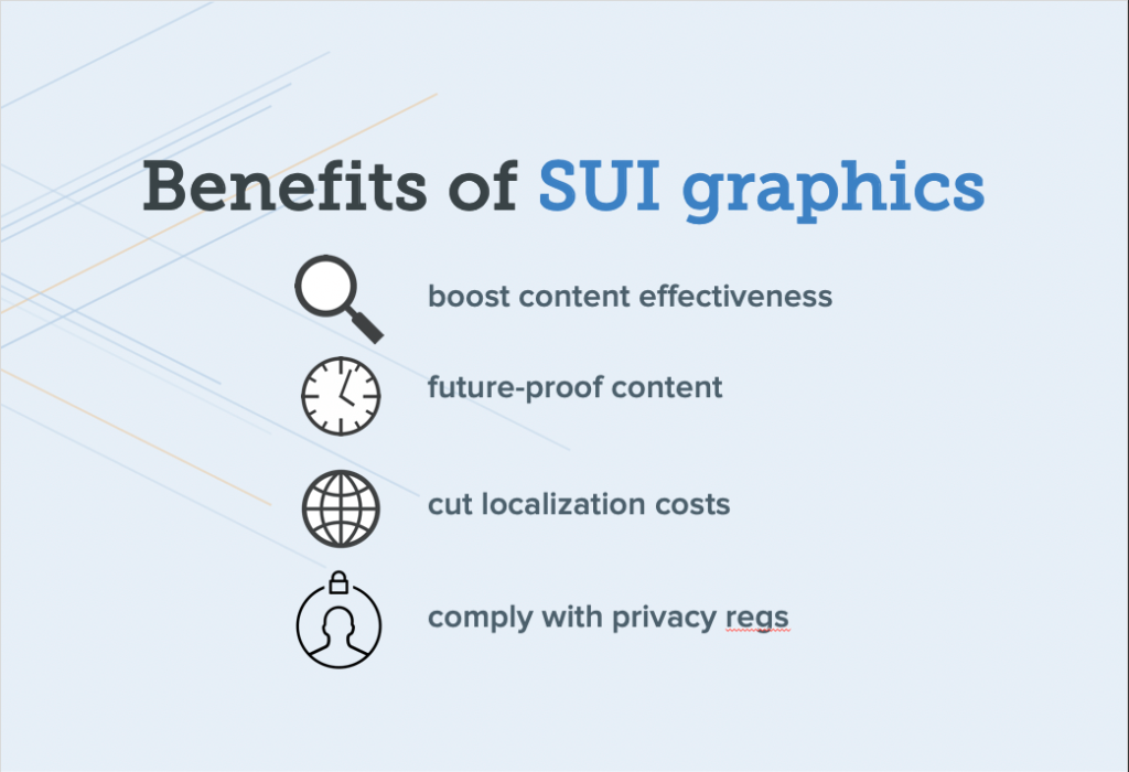
So, what we just saw is that this simplified graphic approach actually helps focus the viewer’s attention on what’s most important, which boosts your content effectiveness, but it has some nice side benefits for technical teams as well.
Future-proof your content
So, one is that it’s gonna help future-proof your content. Right? So, every time your interface changes, small changes to the interface, incremental things that happen on an ongoing basis, you don’t have to go back and revise all of your screenshots again. Because a lot of that detail has been abstracted out. So, there’s a big cost savings there.
Scale localization
Localization, if you localize, you may be able to get away with having a little bit of English. I’ve been seeing this, more and more brands they do this, there’s some English in their screenshots in their localized content because they’ve abstracted out a lot of the text and what’s left is just the key elements.
And you know your audience. If your audience is okay with that, that can be a great way to save some dollars on localizing your images.
Hide personally identifiable information of customers
And then, we kind of hinted at this, if you are in a regulated industry or dealing with, PII, personally identifiable information of customers, it’s a great way to sort of hide that and make sure that your screenshot doesn’t look sort of hacked up. You know? It’s not like black boxes or blur that looks so mysterious, but it looks good and it can save you from getting customer information out there in the wild when you shouldn’t.
How are top brands using simplified graphics?
So, let me just run through a couple of quick examples. These are some different, brands that you recognize or maybe you don’t recognize, but, brands you probably recognize and how they’re using this technique in some of their own content.
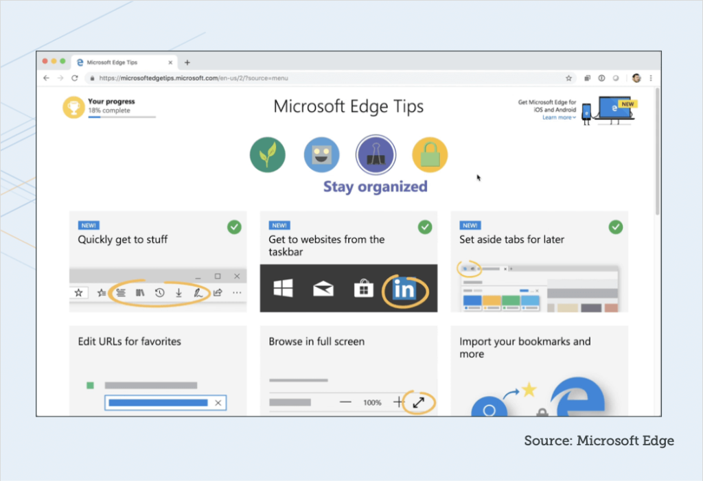
So, this one is from, Microsoft.
They recently launched this whole set of great tips for Microsoft Edge browser. And what you notice is that the animation on the top is completely simplified.
There’s no text in it at all. And all the text is editable text that’s around it, so it’s much easier to localize that, but the animation itself has no text, so that it doesn’t have to be localized.
Now, they went all in. It might not work for you. You could even look at this and say maybe they went a little too far, that it’s a little hard to follow, but you can see the savings right away and not having to localize those for every language.
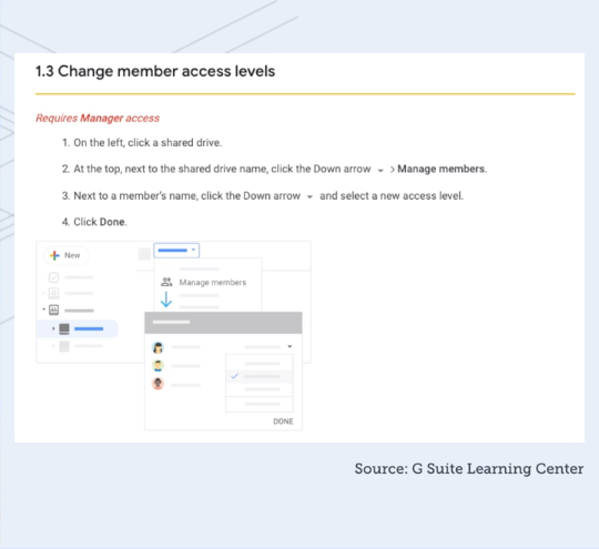
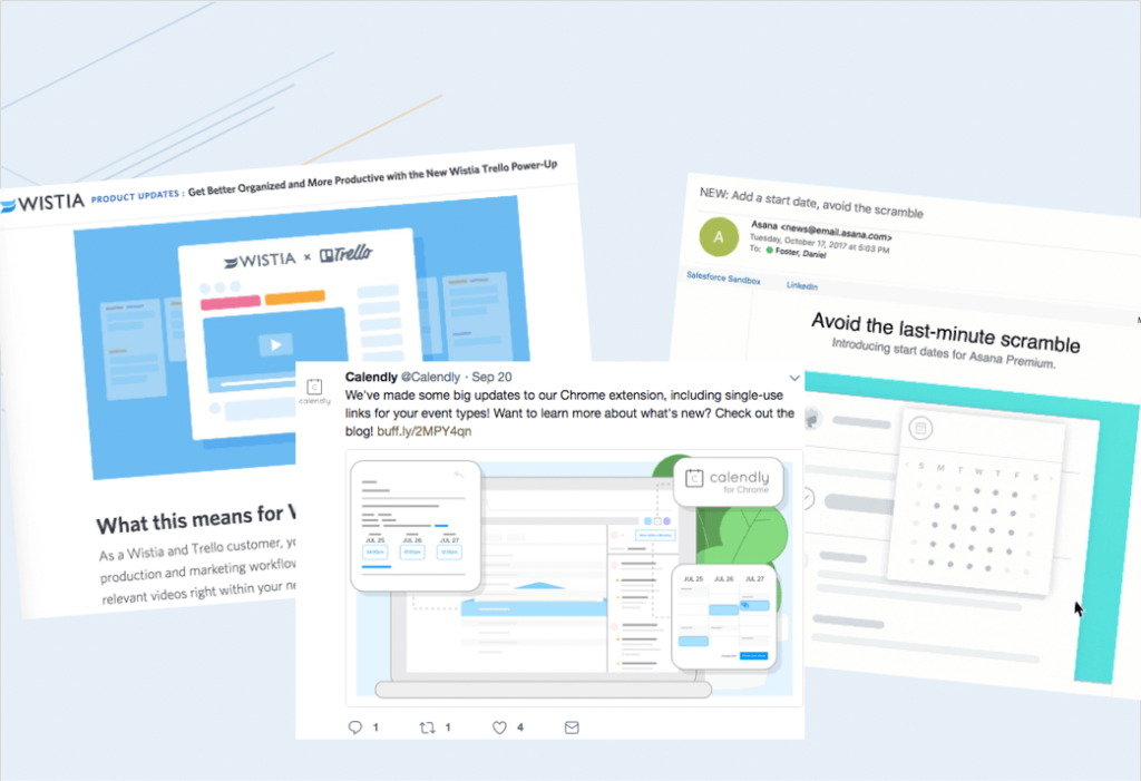
And this example is from Google.
They recently, put a lot of content out around the G Suite, Google Suite, and if you look at particularly in the Getting Started series, getting started with Slides, getting started with Drive, you’ll find that there are these really nice simplified graphics that show up in amongst the content.
Dropbox, this example is a Spanish web page, but it’s on the English site as well, and I expect it’s on every language.
These little animations that just show you an overview of a concept, right? And it’s all simplified. Again, they can use that one graphic or animation across all of their content and languages.
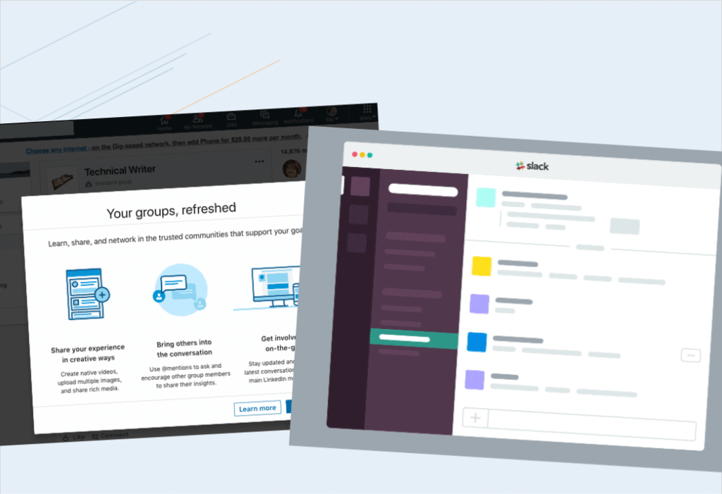
Procore, this is a group that some of their folks are in our, SUI community. We have a Slack community, with people that are trying to implement this approach to graphics. And, one of their members, one of their team members shared this example from their own documentation.
And you can just see it’s, you know, it’s text and then you have this, graphic that everything, has simplified down and it looks really nice.
Another one from Blackbaud, also a member of our, SUI community in, in Slack, and this is just getting at this challenge of a blank slate.
When you come into their product it would be all blank, so how do we get people going and get them kind of over the learning curve.
So, they created these little animations, again, using this simplified approach.
Our own content, so as TechSmith, we, we do this as well.
So, we have Snagit on Windows and on Mac platforms. So, with being multi-platform, of course, those menus aren’t always gonna be identical.
And so what you see here is how the menus, look different on, on Windows and Mac, and that’s okay, but in your documentation you just want to show one representation of that and not have to worry about the differences and also, not have to update those menu items every time those two menus might change, items or wording or, or items come in and out of those menus.
So, again, future-proofing and helping with, supporting multiple platforms.
We’ll take a quick look at this one. This is actually in the Camtasia product.
So, when someone opens Camtasia for the first time, again, instead of an empty state we actually have a project on the timeline that, that kind of walks them through a high-level overview of the interface and some of the key functionality.
So, I’ll let this play, and it does have some audio, and notice how much we’ve abstracted here.
“Right now, you’re in the Camtasia Editor. The editor is made up of the timeline, where you can arrange and edit your clips, the canvas, which is your video preview, and the tools panel where your media’s stored, along with shapes, animations, effects, and more. At the top of the tools panel, there’s a button to launch the Camtasia recorder, a tool that captures all of the action on your computer screen.”
So, you know, we just have a voice that’s kind of narrating through and saying, “Here’s what you’re seeing.” And, again, it’s really abstract. It’s very high level to say, “Here are the parts of the application and here’s like one key workflow to get started with, recording.
And I want to point out in that workflow, and you’ll see it visually, illustrated here, is we’ve really been aggressive with how much, detail we’ve pulled out of the interface for this video. And we’re just showing you the real key details, where is that record button and where is the start recording button.
And a lot of the other stuff we’ve done the favor to the user of removing that for the moment so that we can focus their attention on what’s most important.
Can I make simplified graphics?
All right, so you might be thinking, “Cool, how do I actually do this?”
I’m not going go into right now all the detail on how to do this. We have some great tutorial content on our site, and show you how to create these graphics, but let me just start by giving you a few kinds of high-level guidelines or design principles.
What colors should I use in my graphics?
So, the first one here, and I’ll use this example again, is thinking about color. So, color is really important to this simplified graphic or SUI approach because color is what helps people see that it is, indeed, the same interface that they’re used to.
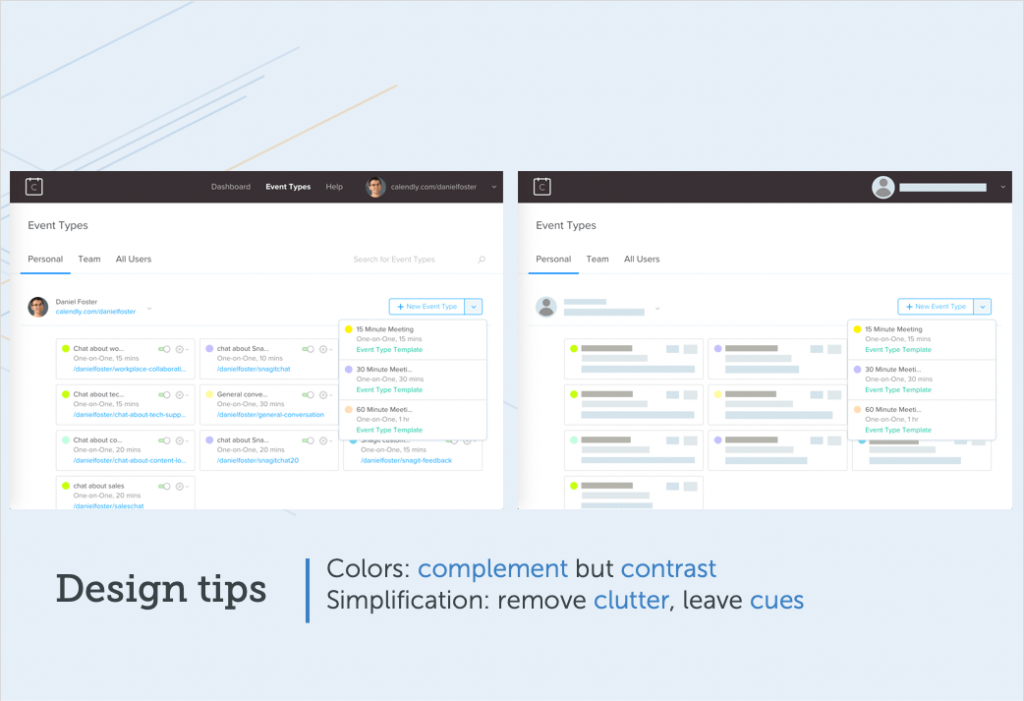
So, using those complementary colors, the colors that are kind of similar to whatever the original interface had, but then being strategic about things that aren’t important. Don’t need to see the foreground? Use less contrast.
Even maybe reduce the opacity and sort of make that text or make those elements kinda fade into the background. And then use contrast, higher contrast areas to either mark certain areas.
You can still put a square box or an arrow on something. Use your high contrast colors for that, but also any areas that you want to have more focus on and more attention on, use contrast deliberately there.
How much simplification should I use?
And then the second kind of high-level principle, how much simplification to do.
And we’ve seen in these examples that I’ve already showed, we’ve seen a whole range, but mainly I would say play around with it.
Don’t be afraid to simplify more than you think. So, if there are four lines of text in your interface you don’t have to put four boxes to represent those four lines. Maybe two is okay because that just helps just reduce the amount of visual clutter.
But at the same time what you wanna leave are certain anchor points.
So, branding is a great anchor point, like what’s your logo, maybe the top-level nav … in this example, I’ve got the top-level nav still visible as text.
And then, of course, your focal area, whatever it is that you want people to interact with and, and learn those steps, keep that, unsimplified, and, literal.
Two ways to create simplified graphics
There are two main ways that you can go about creating this SUI effect, or simplified graphics, and one is to, to take a very, manual approach and the other is an automated approach.
Let’s just talk briefly about each of those.
Manual
So, if you have a tool at your disposal like Gimp or maybe Illustrator, or something else, some folks do, and they know how to use those, what you’ll do is you’ll use like a rectangle tool, choose your colors, think about the palate of colors in advance, and then this animation just kind of shows how you would go about drawing out all those little rectangles.
And, you’re going to choose a different color for each kind of different focal area and top-level sort of hierarchy. Then you’re gonna have to line all those up.
So, it gets a little fiddly.
It can take some time. I would plan to spend some hours if you’re doing this manually because it’s going to take a little while.
Automatic
And then what we’ve done is we’ve actually built tools for this into Snagit 2019 because we believe that it’s such a valuable, useful kind of approach, so we’ve put some dedicated tools in.
The tool is called Simplify if you’re using Snagit 2019. You can use this functionality and try it out on your own.
And so basically you’re flipping a switch to turn on auto simplify.
We have algorithms that will read all of the different regions of your screenshot, find the objects in the text, and then cover everything over with the appropriate shapes.
And, of course, you can go in and manually, remove some of those in order to reveal some certain areas that you want to have unsimplified. And then you can also change the colors, like shift the palate a little bit, if the algorithm didn’t get it quite right or move some things around, so a lot of flexibility there that you can kind of tweak it and make it perfect for you.
How can I make a simplified animation?
And then I’m not going to go into full detail here either on how to do these animations, but I showed examples, and I don’t want just tease you.
How could you go about taking this simplified approach and put it in an animated context?
So, very high level, this is an example. And I’ll show you how you would make this example in a product like Camtasia or another video editor.
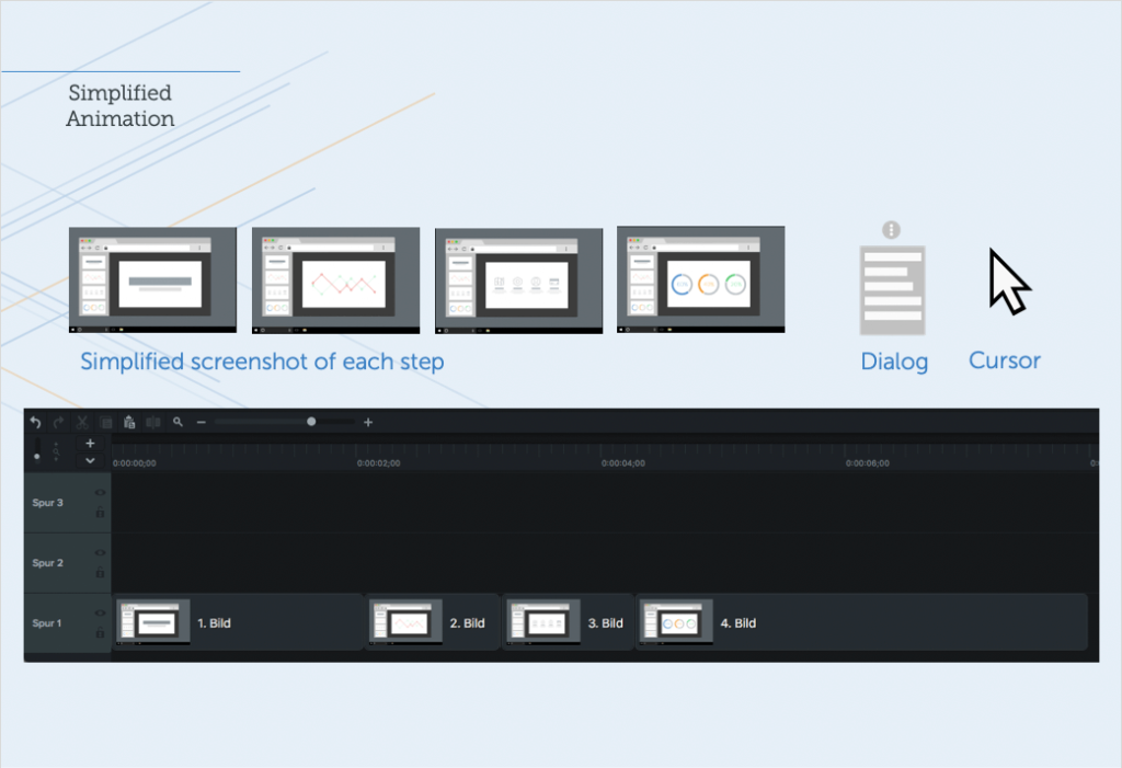
Let’s walk through this. So, first off, you start with each of the screens, right? So, you’re going to get a capture of each screen as a still image and you’re gonna simplify it.
Use Snagit, use Illustrator, whatever. And then once it’s simplified you’re going to then think about what’s like appearing on top.
So, in this case it’s a dialogue that appears on top. And then you have your mouse cursor that’s moving around. So, those are the elements that you’re going put into a multi-track editor.
Camtasia would be great for this. You could also use Premiere or whatever else you might have at your disposal as a multi-track editor.
So, you bring all those objects down. You start with the simplified, screenshots as the base layer. This is sort of what’s most distant from the viewer, right, it’s on the bottom of the video, so to speak.
And then you’ve put all those in and given them the right duration. Then you put your dialogue on top. So, this is where you’re going to want to have anything that appears like a menu item, or else that appears on top, you put that on one layer up.
And then on the top of cake here, you’re going have your cursor and the way you make it look like it’s moving around. You just add animation points.
So, in Camtasia you can do this and it’ll look something like what you see on your screen here with these animation points that are each put in. And basically it’s saying start here, end here, and at this point in time the cursor is one location, at that point in time it’s another location, animate it.
What we’ve done to really kind of pull this off as a simulation is to dip the mouse cursor and just make it a little bit smaller and then back to normal size each time there’s a click.
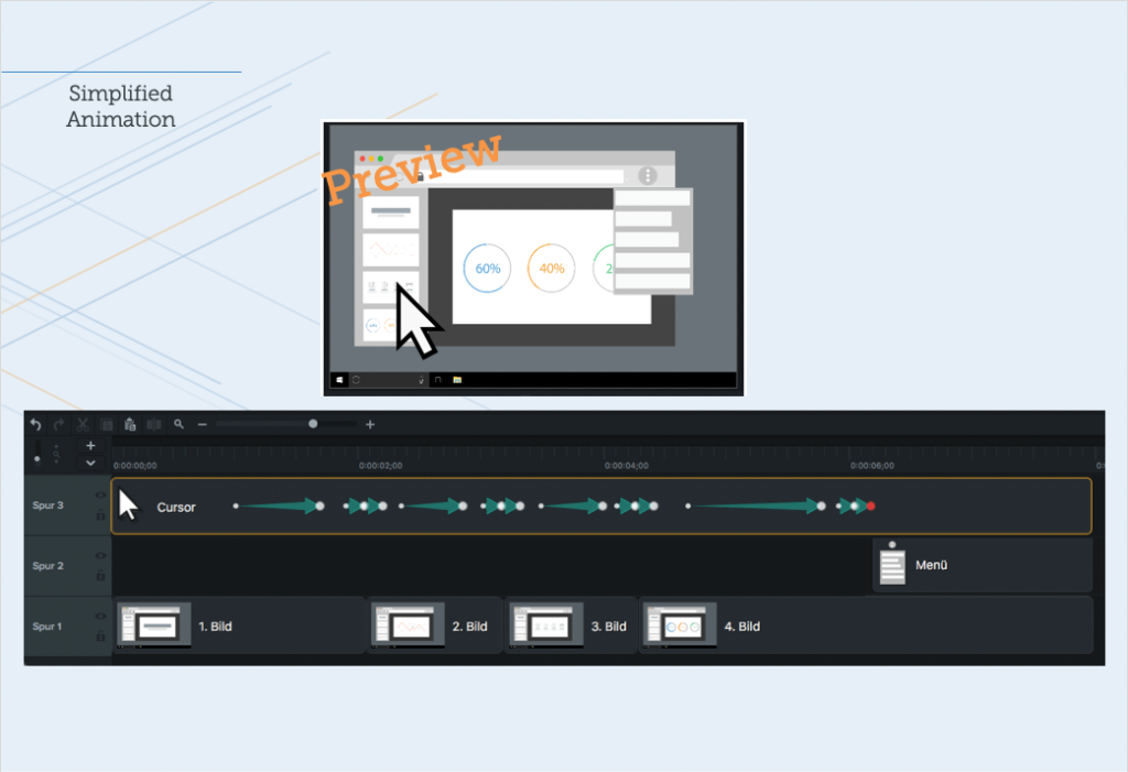
So, just to put it all together at the end here, you can see that the mouse is moving and each time it gets to a point where the screen changes the mouse dips a little bit, the dialogue comes on at the end, and this is kind of how all the parts come together.
It takes a little bit of planning to pull those assets together and then put them together in an editor, but this animation can be used and reused.
It’s very future proof, and it’s a great way to help people get an overview for a little process or a feature in your product.
Summary
So, let’s just recap the whole information here that we’ve talked about today.
Basically, we talked a lot about why visuals matter and that is because of preference. People really prefer to have visuals in their content. It actually helps them to learn and do more effectively.
And then to think about the economic outcomes of that and how that can help your customers or your colleagues.
And then finally, we also looked a creative approach. So, SUI is one approach to how you can actually bring down the cost and make more attainable this visual approach to content. It really helps with future-proofing your content, it helps with localization, and, it’s something that you probably want to experiment with and see where you could start introducing this in some of your content.
And if you want help and want some more thoughts on how to do this, reach out to us. We’d love to help walk you through it and connect you with a community of other people who are doing the same thing.
Record professional videos with Camtasia
Camtasia’s features make video recording and editing super easy
Download Free Trial
Share