


Making Your Content Accessible
Learn the basics of accessibility so you can make your images or videos easier to perceive by people with disabilities.
Learn the basics of accessibility so you can make your images or videos easier to perceive by people with disabilities.
There are around 1.3 billion people worldwide who experience a significant disability, which makes up about 16% of the world’s population (World Health Organization).
Keep in mind that there are many different types of disabilities, including visual, hearing, physical, and cognitive. Even two people who have the same type of disability can experience it very differently.

A person having a disability doesn’t prevent them from using technology, so it’s important to make sure that content and products are designed to be accessible to as many people as possible. This won’t only help people with disabilities—more accessible content can be helpful to anyone!
There are ways that you as a content creator can make your content more accessible. That’s what we’ll discuss in this tutorial.
Images are everywhere on the web. They can help visualize content and bring stories to life. If you are unable to see them however, or unable to see them clearly, it’s still important to understand what they show. Think of it like this: if images help tell a story, but you aren’t able to see them, then it’s like you’re missing a part of the story.
Adding alt text to images on web pages can help describe them, using words. Someone using a screen reader can listen to the description and understand the context just as someone else who can see the image clearly would.
Therefore, it’s not only important that you use alt text for your images, but that the alt text is easy to understand and provides a clear and detailed description.
Take this for example. What would you expect to see when you read “a picture of food and drink”? How close was your mental image to what’s shown here?

It’s true that the image shows food and drink, but there are some details you could add to make it clearer. Something like “a bag of french fries, a piece of cherry cake, and a glass of water side-by-side in a cartoonish icon style” could work better.
To make your alt text more effective, here are some tips:
See Also: What is Alternative Text? Image Alt Text with Examples
When two colors appear side-by-side, such as text on a background, it’s important that they have enough contrast to make them easy to read. Here is an example:
Can you read this?
This light green color on a white background makes the text pretty hard to read. Here it is again with a darker green:
Can you read this?
There are standards, such as the Web Content Accessibility Guidelines (WCAG), that tell us how much contrast is enough:
Figuring out the contrast ratio between two colors is quick and easy using online tools such as WebAIM’s Contrast Checker.
Another thing to keep in mind is that it’s best to avoid certain color combinations, such as red and green, since these can cause issues for people who are color blind.
Just like images, videos are a huge part of everyday life. Since they integrate both images and sound, it’s important to take a few extra steps to make sure someone who relies only or mostly on their hearing or their vision can still enjoy them.
Captions, or subtitles, are a familiar thing to many. Even if you don’t identify as having a disability, you’ve likely watched something with captions at some point in your life. For someone who is deaf or hard of hearing, captions allow them to read dialogue and action so they can understand what’s happening in a video.
To start out with, there are two different types of captions:
Think about which type of captions would work best for people who will be viewing your projects when deciding which one to use.
There are also ways to make sure that your captions aren’t just there, but they themselves are accessible. Here are some tips based on guidelines from the Americans with Disabilities Act (ADA) to help make your captions easy to read:
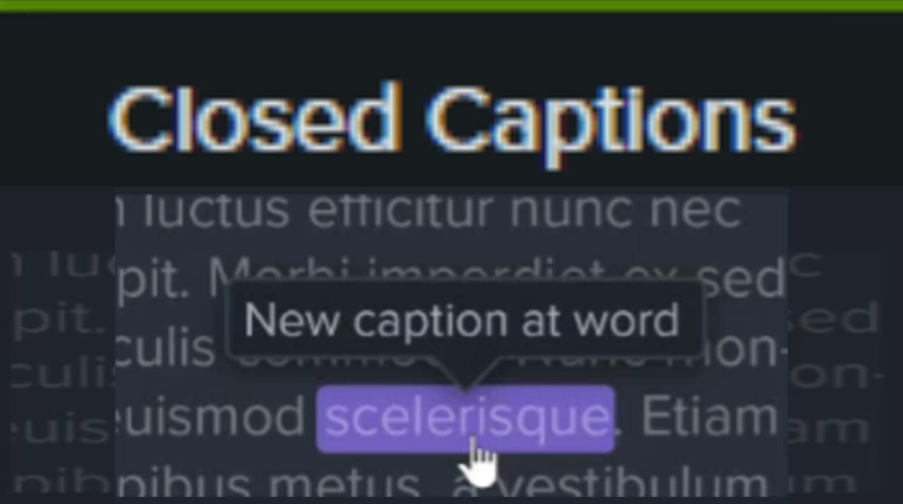
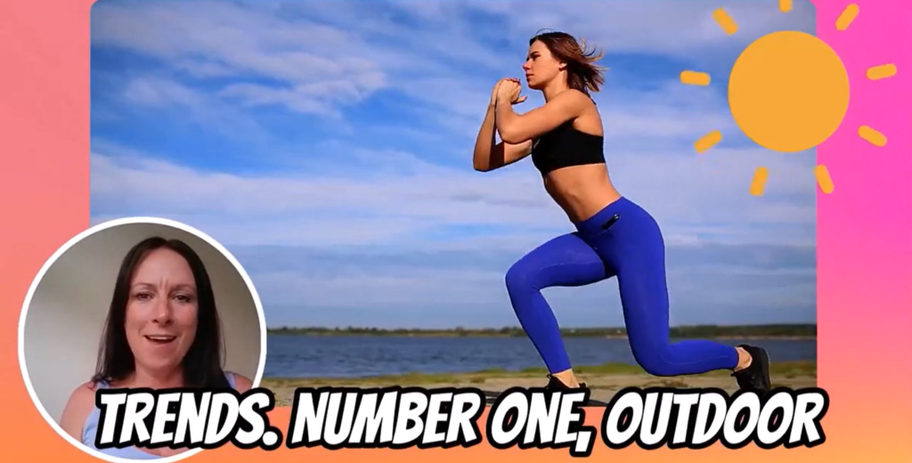
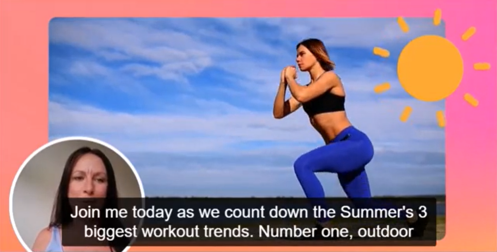
Here is an example of captions that follow these guidelines:
Camtasia has built-in checks that let you know if your captions break any of these guidelines before exporting your video. Pretty neat!
See Also: How to Add Captions to a Video
For people who are blind or visually impaired, sometimes just being able to hear dialogue in a video isn’t enough. For videos with lots of action, audio descriptions are voiceovers in between the primary dialogue that helps explain the action and provide context that otherwise could be missed. Here is a video that demonstrates audio descriptions and why they’re important:
See Also: Why You Need Audio Descriptions to Make Online Course Videos Accessible
Here are a few extra tips to make your videos more accessible: