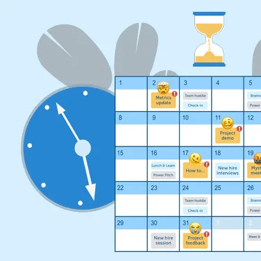


The best training manuals turn scattered knowledge into practical, searchable guidance. When instructions are visual, easy to follow, and clearly organized, teams stop repeating questions, and new hires get up to speed faster.
The difference between a manual that collects dust and one that’s a daily go-to comes down to design and accessibility. When done right, your training content cuts support requests, smooths out onboarding, and keeps processes consistent across your organization.
This guide covers the essential elements of effective training manuals, from identifying your scope to designing engaging content that employees and customers will reference again and again.
Why training manuals are so important
A training manual is a structured reference that explains how to complete tasks: step by step, with the right context and visuals. When built well, it has a few major impacts:
- Faster onboarding: New hires find answers without waiting for help.
- Standardized processes: Everyone follows the same steps, ensuring consistent quality.
- Lower costs: Fewer repeat questions and support requests free up time.
Visual manuals are especially effective, as they appeal to visual, auditory, and reading/writing learning styles. Videos and screenshots reduce ambiguity, let trainees go at their own pace, capture expert know-how, and make content feel more approachable, leading to better engagement and faster ramp-up.
Faster onboarding and reduced ramp-up time
When new team members have access to solid training materials, they become productive faster. Clear documentation removes the guesswork and takes the load off your experienced team.
Visual content makes a huge difference. Videos and annotated screenshots help new employees grasp complex processes more quickly than text alone, giving them the freedom to learn at their own speed.
Standardized processes across teams and locations
Training manuals help ensure tasks get done the same way, no matter who’s doing them or where they’re located. This consistency is critical for teams with multiple offices, remote workers, or frequent staff changes.
With shared documentation, quality stays steady, mistakes drop, and collaboration gets easier because everyone’s on the same page.
Lower operational costs and support burden
When people can solve common issues themselves, your support teams get fewer tickets and interruptions. Organizations also save on training costs when materials can be reused across multiple hiring cycles. Teams spend less time in meetings explaining procedures and more time on productive work when information is readily accessible.
Make great tutorial videos
Camtasia makes it ridiculously easy to make tutorial videos that keep your viewers engaged.
Free Download
When are training manuals necessary?
You likely need a manual when:
- Teams repeatedly answer the same questions
- Processes vary by person, shift, or location
- Onboarding process takes too long
- Compliance requires documented steps
- Critical know-how lives with a few experts
Key times to create one include HR ramp-ups, operations scaling, product or feature launches, formalizing workflows, major rollouts, and regulatory updates.
Key elements of successful training manuals
People turn to manuals when they can find what they need fast and follow it without friction. Here’s how to focus on audience, structure, language, and visuals that eliminate confusion.
Purpose and audience
Clarity of purpose should drive every decision you make when building a manual. Who are you creating it for? What do they need to do with it?
Define your primary users and assess their experience levels. New hires need more background and step-by-step direction. Seasoned employees may just want a fast reference.
Also consider when and where users will access the manual. If they’re at a desk, longer procedures and full-page screenshots work. For mobile, use concise content and touch-friendly navigation.
Clear structure and navigation
How your manual is organized affects how useful it is in the moment. Logical, intuitive structure reduces the time it takes to go from question to answer.
A helpful structure includes:
- Progressive complexity: Start with basic concepts before diving into advanced tasks.
- Consistent heading hierarchy: Stick to a clear format for sections and subsections.
- Detailed table of contents: Give users an overview and clickable navigation.
- Cross-references: Link related topics to reduce duplication and improve usability.
Consistent branding and language
Consistency builds trust and makes content easier to follow.
- Formatting: Use a consistent layout, fonts, and styles so users don’t have to relearn the format each time.
- Glossary: Define key terms in a central place to keep language clear and consistent across the manual.
- Branding: Align your tone, visuals, and structure with your broader brand to create a cohesive experience.
Visual aids and examples
Visuals remove guesswork and reinforce both comprehension and retention.
- Use Camtasia Snagit to capture annotated screenshots that highlight the exact UI element to click.
- Use Camtasia to record multi-step flows that are hard to explain in text. For dynamic procedures, short videos often speed up understanding.
Accessibility matters: Add captions and transcripts, and avoid calling dynamic captions “accessible” when they aren’t the same as closed captions. This Camtasia tutorial explains the difference well if you’d like to learn more.
Training manuals work best when they evolve over time. Feedback turns a good resource into a great one.
To gather feedback:
- Include simple feedback tools like rating options or comment boxes.
- Set regular review intervals (quarterly or yearly).
- Use analytics to track which sections get the most or least use.
- Interview users about how helpful and usable the manual is.
Go from screen recording to polished video
A screen recording is just the start. Camtasia’s editor helps you add the callouts, animations, and edits you need to create a truly professional video.
Free Download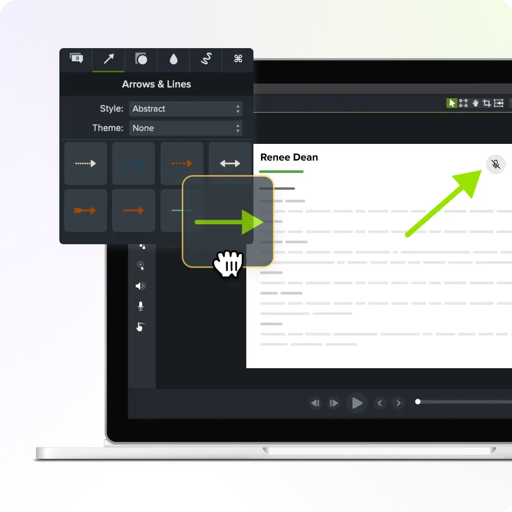
How to create a training manual people will actually use
Understanding what makes a good manual is only half the challenge. The following step-by-step guide provides a framework for writing employee training manuals that people want to use.
Step 1: Identify your training scope and goals
Your first and most important step is to define what the manual will cover. Scope creep is a common failure point. Trying to document every scenario leads to content overload.
Start by listing all potential topics, then narrow the focus by identifying which ones happen most often and have the biggest impact. Be specific about what’s in and out of scope, and define success upfront.
Ask yourself:
- Specific outcomes: What will users be able to do after using the manual?
- Measurable targets: How will you track whether the manual is successful?
- Realistic timelines: When will the manual be complete?
- Defined limitations: What topics fall outside the manual’s scope? When would a training video be more appropriate?
Step 2: Choose your format and tools
The right format supports user needs and aligns with how often content needs updating. It can also influence how often and how easily people use it.
| Format | Best Use Case | Pros | Cons |
| Stable procedures, offline needs | Printable, consistent layout | Harder to update; version control required | |
| Online wiki | Frequently updated content | Searchable, linkable, easy to cross-reference | Requires internet; governance needed |
| Video library | Multi-step, dynamic tasks | Fast to grasp; shows exact steps | Planning, captions, and updates take time |
| Interactive | Decision trees/branching | Self-paced; trackable | More technical requirements |
Also consider: Who’s responsible for maintaining it? How often will changes be needed? Stable content works for PDFs; fast-changing info doesn’t.
Step 3: Organize content into logical sections
Structure affects findability. Your organization method should reflect how users naturally think about their work.
Popular structures include:
- By job role or team
- By process or function
- By how often the task occurs
- By skill level or complexity
Before committing, test your approach with a few users to make sure it feels intuitive.
Step 4: Draft clear instructions and visuals
Use a consistent format for each task to make your content easier to follow.
- Begin with the outcome (“You’ll create X…”).
- List any prerequisites like access, files, or permissions.
- Present each step as a single, numbered action.
- Include the expected result so users know they’re on track.
- Wrap up with a short troubleshooting note for common errors.
Support the steps with visuals. Snagit works well for screenshots with callouts and cursor highlights. Camtasia is best for workflows that involve motion or precise timing.
Step 5: Gather feedback and refine
Testing with real users will reveal gaps you may have missed. It also shows how useful your manual really is.
- Start with a small test group (5–10 users is plenty).
- Watch how they use the manual while performing real tasks.
- Take notes on confusion points and where they get stuck.
- Revise based on what you observe and not just what they say.
This may take a few rounds, but it’s worth the time to build something that really works.
Step 6: Distribute and track usage
Even the best manual won’t get used if people can’t find it or don’t know it exists. Rollout and visibility are key.
Effective distribution includes:
- Clear announcements: Tell users where to find the training manuals.
- Multiple access points: Provide links in all relevant systems, like wikis and Slack.
- Manager training: Help leaders direct team members to resources; microlearning would work well here.
- Usage tracking: Monitor which sections are used the most and least often.
- Follow-up: Check in with users after the initial distribution and collect relevant feedback.
Design tips for an engaging training manual
Even excellent content can fail when the presentation makes information hard to process. Visual information often has higher retention rates than text-only content, making design choices key to your training manual’s effectiveness.
Here are a few design best practices for training manuals:
- Scannable layouts: Use headers, bullets, and short paragraphs.
- Visual breaks: Include images every few paragraphs.
- Highlight boxes: Call out critical information with distinct formatting.
- Progress indicators: Show users where they are in multi-step training processes.
Keep in mind that font consistency throughout your training documentation will reduce cognitive load as users become familiar with its formatting. Also, high contrast between text and background colors provides the clearest reading experience, regardless of medium.
How to keep your training manual updated
Outdated documentation causes confusion and erodes trust. If users spot something wrong, they may assume the rest is unreliable.
Stay current with:
- Monthly reviews: Check for recent process changes or software updates.
- Annual audits: Evaluate your manual’s overall structure and strategic alignment.
- Update triggers: Revise your manuals after major process changes or when you receive relevant user feedback.
- Version control: Add date stamps and clear version numbers consistently across all your manuals.
- Change notices: Communicate timely updates to all manual users.
Don’t forget to assign update ownership to specific team members and create a simple review schedule to track when sections were last checked.
Tips for empowering your teams with visual communication
Modern learners process visual information faster than text-heavy instructions, so multimedia content is essential. It makes content more engaging, easier to understand, and faster to apply.
Use visuals based on the training need:
- Annotated screenshots highlight specific buttons or interface elements.
- Process flowcharts show decision paths based on specific conditions.
- Short video tutorials demonstrate dynamic procedures with multiple steps.
- Infographics present quick-reference information in a scannable format.
Screen recording tools like Camtasia and Snagit make it easy to create professional-looking content without needing a video production team. They also integrate with many popular business platforms and export to multiple formats to meet your unique delivery and distribution needs.
Turn your knowledge into training manuals that work
If you’re wondering how to create effective manuals your teams will actually use, start with what’s already working. Document your top FAQs as short, visual tasks. Keep the format simple, the instructions direct, and the visuals clear.
Bit by bit, those entries will add up to a go-to resource for onboarding, daily work, and quality control — saving time and cutting confusion.
Ready to build visual manuals that scale with your team? See all of TechSmith’s products today to learn more about what you can do.
Build your next training video with Camtasia
Record your screen or camera. Then, use the video editor to add polish and clarity.
Learn More
FAQs
How long should a training manual be for different types of training?
A training manual should be as long as necessary to cover essential information but concise enough to maintain engagement — typically 20–50 pages for departmental manuals with modules that users can reference independently.
What software tools are most effective for creating professional training manuals?
Word processing software for text, screen capture tools for visual instructions, and video recording software for complex procedures work best. Many teams use integrated solutions like Snagit and Camtasia that combine these capabilities to streamline creation.
How can I increase employee engagement with training manuals?
Make manuals easily searchable, integrate them into daily workflows, and ensure managers reference them during training sessions. Successful adoption comes from making the manual the fastest way to find answers rather than just another document.
Share