

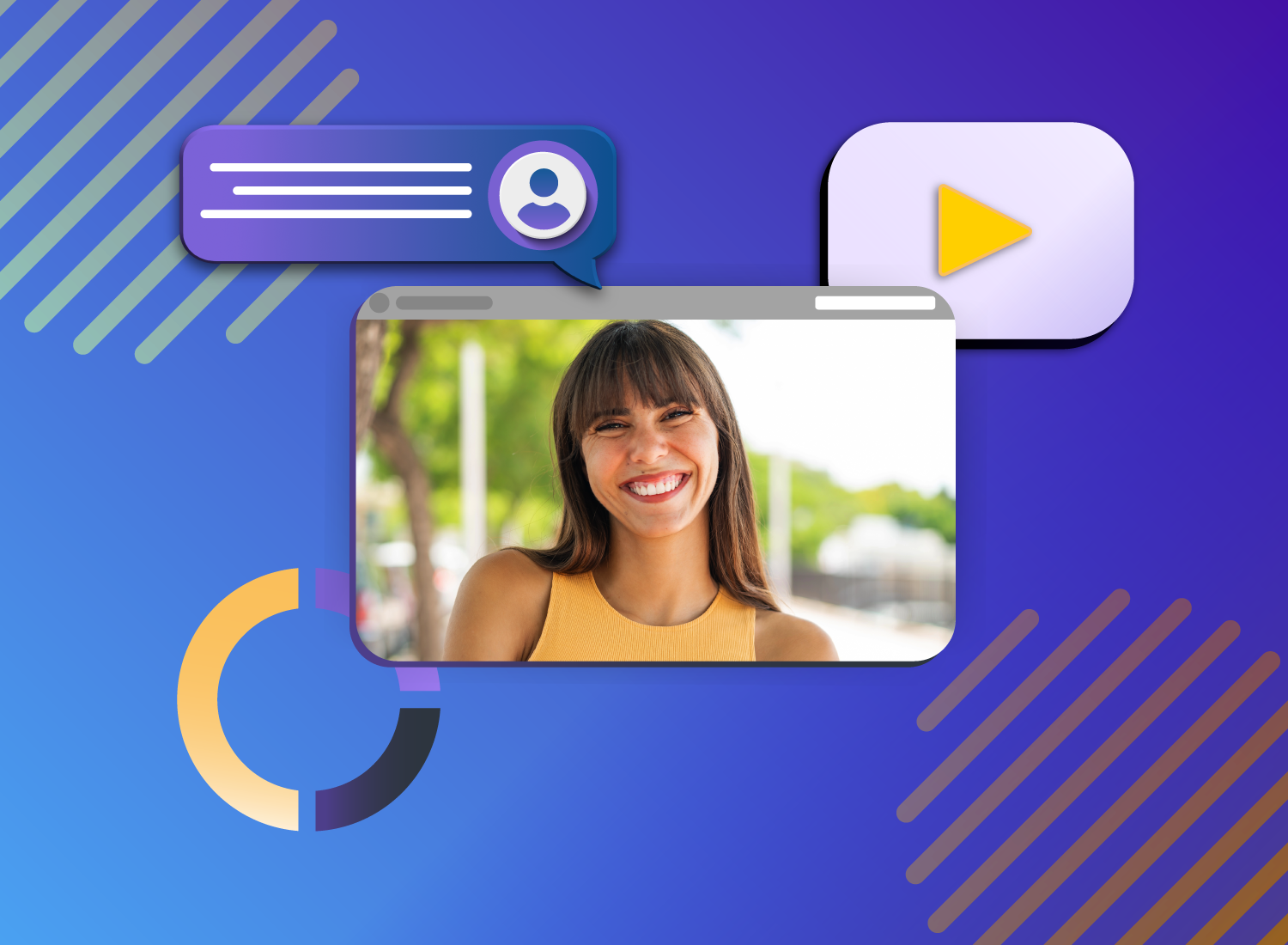
The modern workplace moves fast, and much of our work now happens on-screen. Teams need to absorb information quickly while collaborating remotely and asynchronously across roles, tools, and time zones. When business communications aren’t clear, they create friction: wasted time, missed details, and unnecessary back-and-forth.
Integrating visual aids, such as short videos, charts, or images, offers a simple way to address these challenges. They reduce cognitive load, make complex information easier to understand, and improve retention. Instead of asking people to read through long explanations, visuals show what matters and how things work.
Visual communication doesn’t require design expertise or new workflows. With a few simple formats and a more intentional approach, teams can communicate more clearly and move work forward with less friction.
Key takeaways
- Visual communication makes information easier to understand and remember. Images, videos, charts, and diagrams help people process complex ideas faster than text alone, which supports quicker learning and better decision-making.
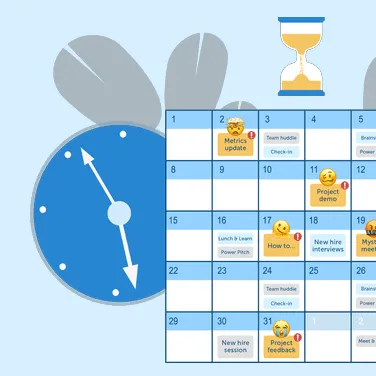
- Visuals reduce friction at work. Screenshots, screen recordings, and annotated images remove ambiguity, limit back-and-forth, and improve alignment across teams.
- You don’t need design expertise to communicate visually. Simple formats like screenshots and short videos are often enough to clarify a message and increase engagement.
- Intent matters more than polish. When you understand your audience, choose the right format, and apply a few basic design principles, your message becomes clearer and more effective.
What is visual communication?
Visual communication is the practice of using visual elements to convey a message, inspire change, or evoke emotion.
You’ll often hear related terms like communication design and graphic design in this context. While they overlap, they serve slightly different purposes. Communication design focuses on shaping a message so it educates, motivates, and engages the viewer. Graphic design applies design principles to make that message clear and eye-catching.
Many people already use visual communication in day-to-day work. If you rely on headers, bold text, images, or screenshots to clarify a point, you’re already thinking visually.
At its core, visual communication is about selecting the elements that create the most meaning for your target audience. These design elements often include text, icons, shapes, imagery, and data visualizations.
Common examples include:
- Charts and graphs to present quantitative data in a way that is easier to understand and remember
- Process illustrations that use shapes and connecting lines to show end-to-end workflows and highlight gaps or inefficiencies
- Symbols and icons, such as brand logos, that convey familiarity and meaning at a glance
- Storyboards that support visual storytelling and guide the audience through a narrative
- Color used intentionally to draw attention and signal importance
Common examples of visual communication
You don’t have to be a professional designer to communicate visually. Simple assets can capture attention and strengthen everyday communication. Screenshots, GIFs, screen recordings, charts, and videos are some of the most common formats used at work.
Screenshots
Screenshots are a fast, simple way to add clarity to a message, and they’re easy for anyone to create. A single image can illustrate a how-to tutorial, capture key comments from a social media thread, or support in-depth project feedback.
Because they’re quick to create and easy to share, screenshots are especially useful for clarifying questions, highlighting issues, or documenting changes without slowing down the workflow. In many situations, they act as the catch-all of visual communication.
Videos and screen recordings
Videos and screen recordings are especially effective for sharing instructional content and explaining complex processes. In fact, 83% of people prefer to learn instructional or informational content through video rather than text or audio alone. Video is particularly useful for step-by-step workflows, such as onboarding or training with multiple modules.
Screen recording tools make it easy to capture a process and refine it with simple edits. Visual communication becomes even more effective when you take an intentional, layered approach, with each element serving a clear purpose:
- Narration: explains the bigger picture and why the content matters
- Screen capture: shows what is actually happening
- Callouts: arrows, boxes, or labels that direct attention
- Emphasis: highlights, motion, zooms, or pans that surface the most important information and guide focus
This approach reduces cognitive load, helping viewers stay focused and retain information. By contrast, recording everything in one take can cause narration to run ahead of what’s on screen, or leave critical details unclear.
Short animations
GIFs may not be the first thing you associate with professional communication, but they can be effective when used intentionally. They help build rapport, add personality to shareouts, and bring a light touch to presentations.
Other short animations can be just as useful, especially when they focus on a single action. They can quickly demonstrate micro-interactions like mouse hovers, toggles, or post-click transitions, showing just enough “how-to” without requiring a full video. In many cases, a few seconds of motion can replace long text explanations in chat or documentation.
Charts and infographics
When sharing data or important milestones, charts, graphs, and infographics help convey information in a way that’s easier to understand. But context matters — using visuals works best when they’re paired with explanation, not dropped into a slide or report on their own.
Consider a team presentation focused on quarterly sales. A bar chart may show revenue by quarter, but it doesn’t explain what changed or why it’s important. Adding narrative helps your audience interpret the data and makes the presentation more meaningful and more likely to hold attention.
Infographics are especially useful for summarizing complex data sets with multiple variables or steps, giving viewers a clear, structured overview before you walk them through the details.
You can also bring charts and infographics to life with a screen recording using a tool like Camtasia. Pair static visuals with voice narration, or use simple animations to introduce data in sequence. Motion combined with explanation creates far more opportunity for engagement than a static slide.
If you’re not sure where to start, Snagit can help you turn simple screenshots into images, videos, and animated GIFs.
Looking for professional screen recording software?
From simple screen captures to polished video editing, TechSmith has everything you need to create professional-quality content.
Learn More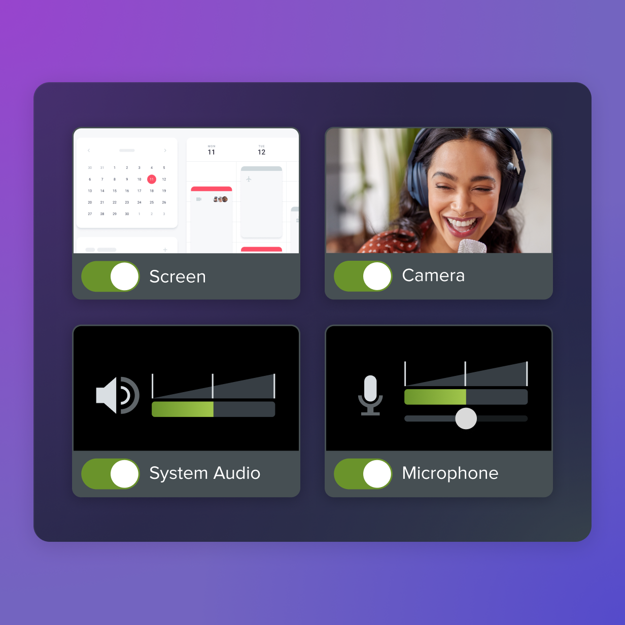
Why is visual communication important?
Visual communication matters at work because it helps people understand information faster, remember it more easily, and create shared understanding around key points.
Today’s teams are often cross-generational and cross-cultural, with different learning styles and backgrounds. Much of that collaboration also happens on-screen. In this environment, relying only on written communication increases the risk of misinterpretation, slower understanding, and missed details when messages are long or dense.
Incorporating visual elements can reduce friction and misunderstandings, creating stronger alignment across teams and with customers. Visuals also help clarify tone — something people often try to signal with emojis in text-based messages.
Using high-quality images and videos for internal communication reduces the time it takes to absorb information. Visuals strengthen memory associations and help people act on complex information with more confidence.
The impact isn’t just theoretical. TechSmith research shows that organizations can save up to $1,200 in productivity per employee per year by integrating visual content into everyday communication.
Go from screen recording to polished video
A screen recording is just the start. Camtasia’s editor helps you add the callouts, animations, and edits you need to create a truly professional video.
Free Download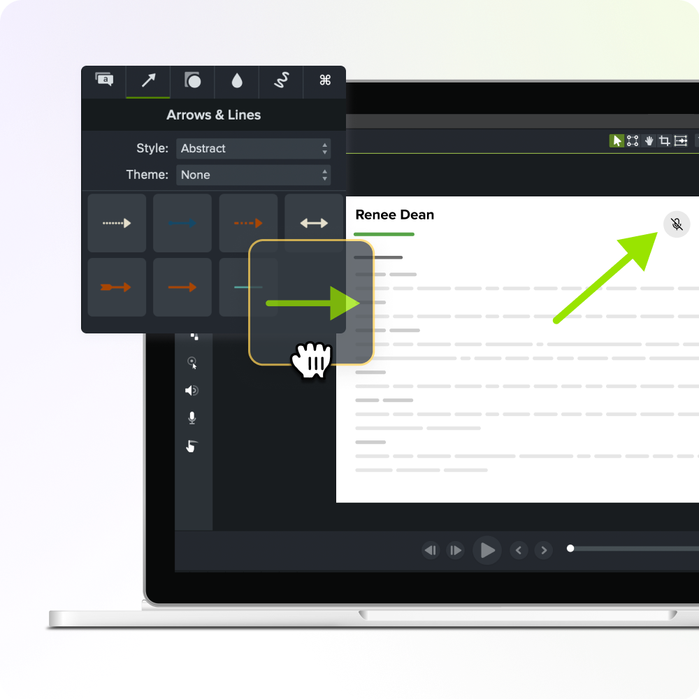
How to use visual communication in the workplace
Clear communication supports productive work in any environment. Many teams now collaborate through email, video conferencing, instant messaging, and file-sharing platforms. When you use visuals across these channels, communication becomes easier to understand and more consistent for team members, no matter where they work.
As a result, visual communication tools, like Snagit, are becoming essential for remote and hybrid teams. They make it easier to explain ideas clearly without adding complexity or slowing down collaboration. When teams don’t have access to these tools, productivity and engagement can suffer.
In fact, 98% of respondents who use video — a form of visual communication — say it improves the effectiveness of their message at work.
Here are seven practical ways to use visuals more effectively in everyday communication.
1. Onboard new employees
Onboarding is time-consuming for everyone. Managers need to schedule training, and new hires need to get up to speed quickly.
Narrated screencasts make it easier to deliver video training that shows how to use your organization’s standard programs. These videos can be reused to deliver the same core guidance, helping you keep video training consistent while reducing interruptions for your team. New hires can watch when it fits their schedule, which helps improve engagement from day one.
When something changes, you don’t need to re-record an entire video. You can simply swap in a new clip and update the relevant section, so your training stays current without extra work.
2. Capture inspiration
Good ideas rarely arrive on schedule. They often appear unexpectedly and can be lost just as quickly if you don’t capture them.
You can use Snagit to take screenshots of images you find online, which are automatically saved in your library. Over time, you build a collection of inspiration that you can organize with tags and turn into simple mood boards, so your ideas stay accessible long after the moment has passed.
The best snipping tool for Windows and Mac
Don’t let clumsy built-in tools hold you back. Take and edit screenshots with Snagit!
Get Snagit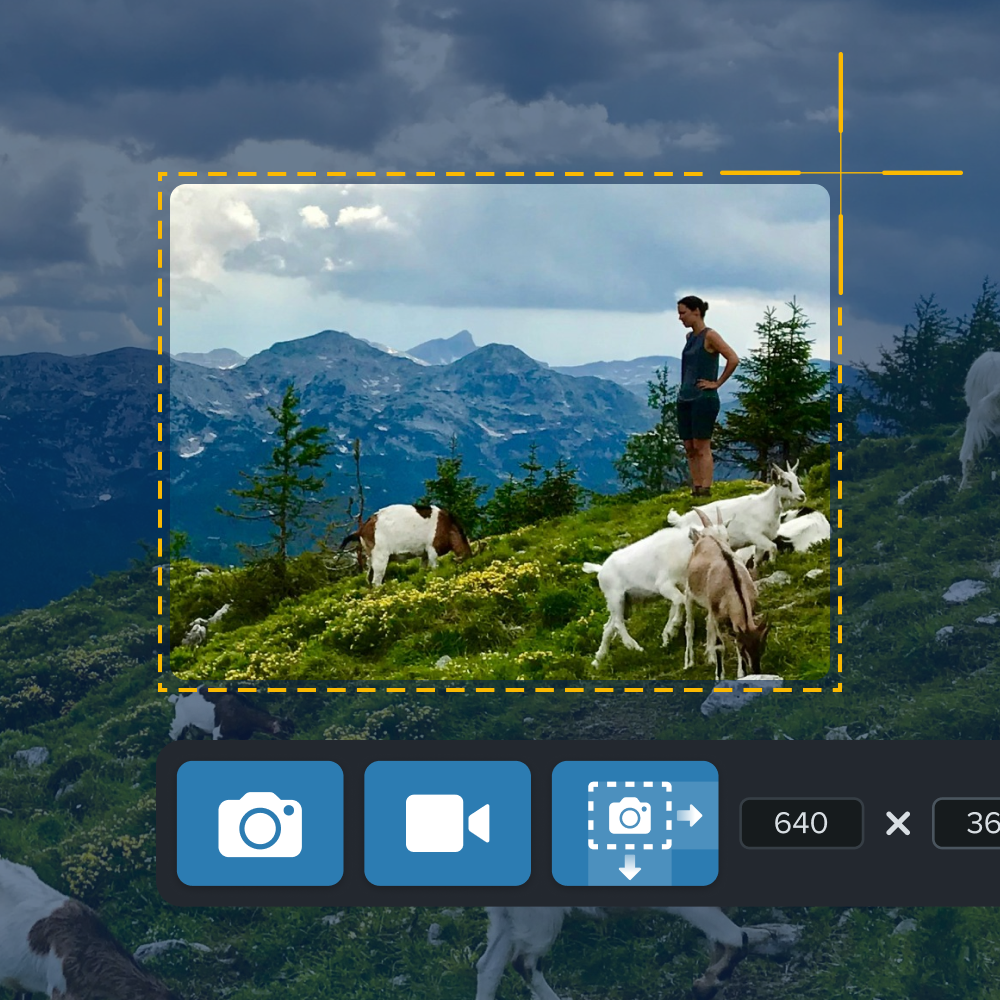
3. Skip writing pages of notes
Taking notes during a conversation can be distracting for everyone involved and often ineffective. Recording the discussion (with participants’ permission) helps you stay present while ensuring you don’t miss important details. Recordings are also easier to share and revisit than personal notes.
4. Give clear feedback
Giving and receiving feedback often means waiting for (or chasing) stakeholders, then trying to interpret long blocks of written comments. That process can lead to confusion, delays, and unnecessary revisions.
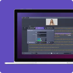
Using visuals, such as screen walkthroughs with voice narration and on-screen annotations, makes feedback clearer and more actionable. Instead of relying on paragraphs of text, you can pause, mark up the screen, and explain why something needs to change, not just what.
This approach reduces back-and-forth, minimizes interpretation errors, and helps everyone move forward faster.
5. Report progress
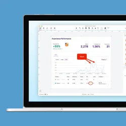
Line graphs and pie charts add clarity and improve engagement, but context is still essential.
One of the most effective visual communication strategies is to record a narrated walkthrough of graphs, dashboards, or slide presentations. This lets you explain what the data represents and use callouts or highlights to guide the key takeaways.
6. Write better emails
Email is a core tool for asynchronous communication, but it often relies too heavily on text. Adding screenshots can help make your message easier to scan and understand, while marked-up images help guide the audience to the most important points.
Let’s transform how you communicate today
You don’t need to master complex tools or become a designer to communicate visually. Visual communication works best when images, motion, and explanation support the same message. Start small — add a screenshot to a status update or record a short voiceover for a chart or slide. Changes like these make communication more efficient and easier to scale.
TechSmith gives you practical tools to do this every day. Tools like Camtasia and Snagit help you create business videos that capture, explain, and refine your message with visuals, so you can create clear, professional content without switching between tools or learning complex software. They fit naturally into how you already work, whether you’re training a team, sharing feedback, or presenting data.
Explore TechSmith’s products and start communicating more clearly today.
Crystal-clear screen recording
Why settle for blurry screen content? Camtasia Editor’s screen recorder captures everything at up to 4K!
Free Download
FAQs
What is visual communication?
Visual communication is the practice of using visual elements such as images, videos, charts, and diagrams to convey information or ideas. Its goal is to make messages clearer, more engaging, and easier to understand than text alone.
Why is visual communication important in the workplace?
Visual communication helps teams process information faster and reduces misunderstandings. In busy, distraction-heavy work environments, visuals make it more likely that messages are read, understood, and acted on.
What are examples of visual communication at work?
Common types of visual communication include screenshots with annotations, screen recordings, instructional videos, charts, graphs, GIFs, and slide presentations. These are often used for onboarding, feedback, reporting progress, and explaining processes.
How does visual communication improve learning and memory?
Visuals reinforce key ideas by pairing information with imagery, strengthening memory associations. People are more likely to remember what they see than what they read or hear, especially when the content is complex.
Do I need design skills to use visual communication effectively?
No. Many effective forms of visual communication are simple and practical, such as screenshots, short recordings, or basic charts. The focus should be on clarity and intent, not polished design.
Share