We get the question all the time: “What’s the ideal length for a video?”
It makes sense. Grabbing and keeping a viewer’s attention is challenging, and creators want to be sure they aren’t making videos that are too long (or short).
The thing is, there is no ideal length for all videos — no one video length to rule them all.
But, viewers definitely have a preference.
How long should instructional videos be?
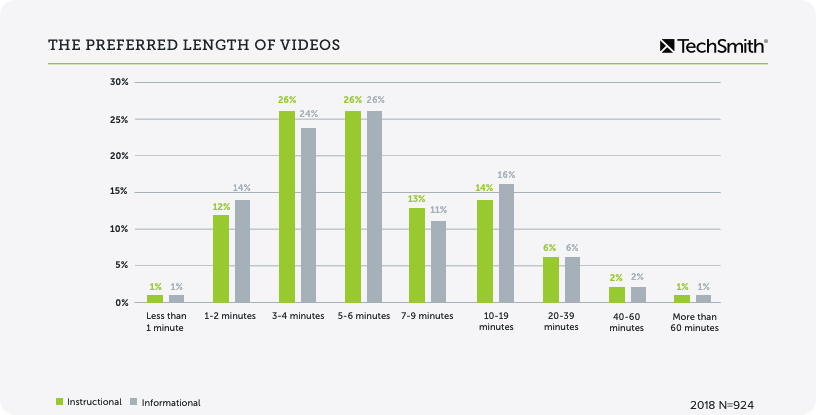
The majority of viewers want informational and instructional videos to be less than 20 minutes, with a preference toward the 3-6 minute ranges.
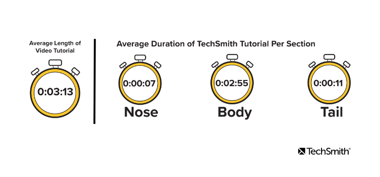
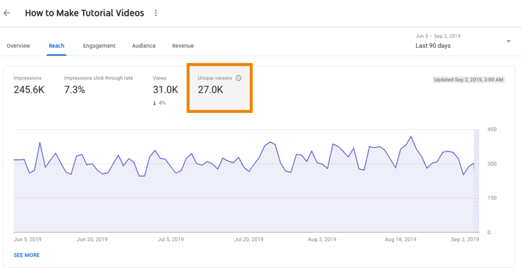
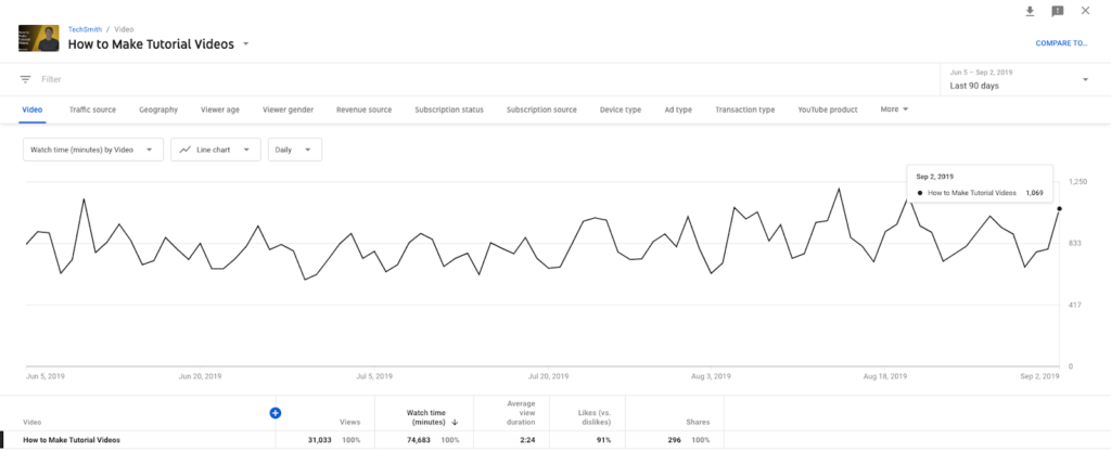
And when we analyzed over 50 of our tutorials to measure our videos’ engagement and found that the average length of our tutorials is 3:13.
Ultimately, the ideal length of a given video is determined by the content and the target audience. The optimal video length for a YouTube video is different than a Facebook video.
Every video has its own perfect length. Some times you need a long video. Other times you need a short video.
The key is finding the sweet spot.
But that doesn’t mean there aren’t ways to ensure each video you make is the right length.
New Research: Video Statistics, Habits, and Trends You Need To Know
Learn how to create instructional and informational videos that get watched.
The default answer you hear about video length is that shorter is always better. And, while that’s a good notion to keep in mind, it’s not quite gospel.
That’s not really surprising — and it’s in keeping with the notion that shorter is better.
But, that’s not the whole story. The next highest preferred length was for videos in the 10-19 minute range. This strongly suggests that people will watch longer videos if the content is what they’re looking for.
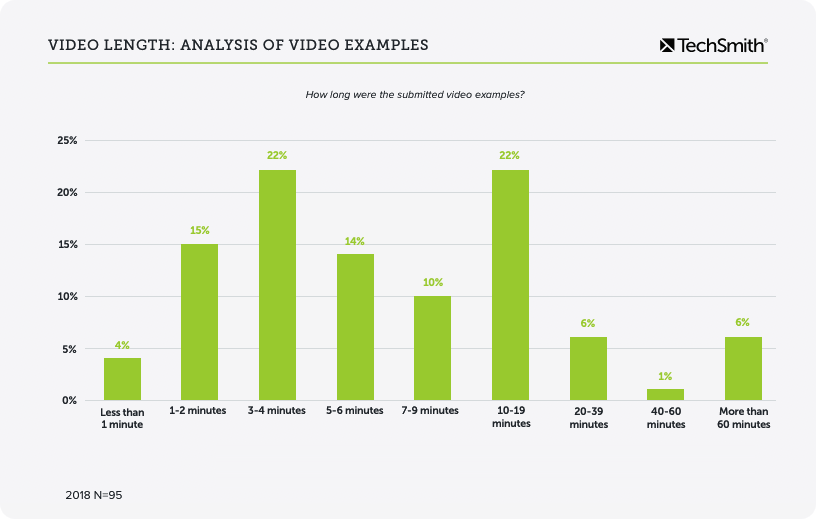
The research also analyzed nearly 100 videos that participants identified as examples of “great videos.” Of those, 22% were in that 10-19 minute range — the same percentage of those videos that were in the three to four minute range.
The verdict? People will watch longer videos, and they’ll even identify them as “great.”
So, if video length isn’t the best way to determine whether your video will be successful, what is?
Content is (still) king
As I noted in a recent post, coming at your video with a length in mind is, in many ways, putting the cart before the horse.
Think of it like cooking. The amount of time you need depends on what you’re making. You can’t make a homemade baked lasagna in 10 minutes and you don’t need three hours to make a box of macaroni and cheese.
The dish determines the length of time it takes to cook.
Similarly, your content should inform the length of your video.
Before creating any piece of content (not just video), ask yourself two questions:
1. What do my viewers need to know? 2. How can I best cover this topic in the most efficient and useful way?
Then, create a video that does that. That may seem simplistic, but using the tips and information highlighted in this post, you can turn those questions into a winning formula for determining the best length for your video.
When we ask about the perfect video length, what we’re really asking is, “How can I keep my viewers’ attention long enough to give them the information they need?”
We all know attention spans are shrinking, but that doesn’t mean it’s impossible to keep someone watching.
Turns out good content is still effective — we just have to provide it!
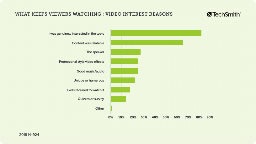
The number-one reason that people stop watching a video has nothing to do with the video length. In fact, 83% of the people we surveyed will continue to watch a video if they’re genuinely interested in the topic.
So the first step in keeping your audience engaged is to know what they’re looking for. You want to know these things:
Who is my audience?
What problem are they trying to solve?
What are their goals?
What will they need from me to accomplish those goals?
What is their skill level?
Then, figure out the goal for your video based on the answers to those questions. How can you address them in the most effective and efficient way?
When you know what your audience needs and how to address it, you can plan your video accordingly.
But be careful. If you’re anything like me, when you have something you’re excited about, you want to talk about it at length. To everyone.
It can be the same with your content. You’re excited to share your knowledge, so it’s natural to want to share ALL of it. But remember, you want to create a video that addresses a specific problem or topic. Make sure you create a video that does that and nothing more.
That doesn’t mean the other information isn’t important. It just means that you’ll want to share other information with other videos. No one ever said you had to make just one video. Make as many as you need to address as many topics, problems, pain points, etc. as necessary.
How to get their attention (and keep it)
So, now you know that video length isn’t the reason people stop watching videos. But, how do you keep them watching? Give them what they need and expect.
People stop watching a video because they didn’t get the information they expected. Whether your video is a minute long or 30 minutes, if your viewers don’t get what they came for, they will click away.
Be sure your video’s title accurately describes what your viewers will get when they watch. It’s tempting to use click-bait to get people to watch, but what good is that if they drift away after 30 seconds? And, once you’ve burned them, they’re much less likely to come back for more.
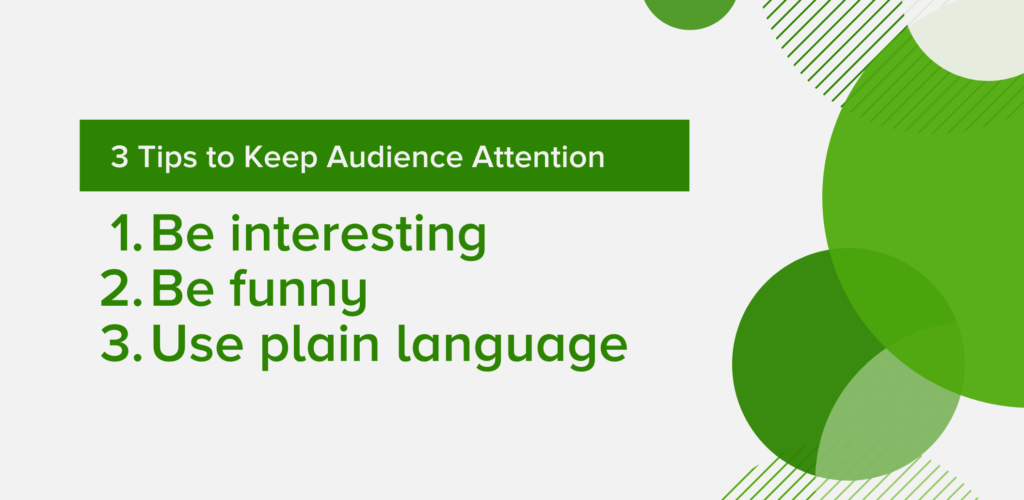
Additionally, here are a few things to keep in mind if you want to grab and keep your audience’s attention:
1. Be interesting
Use storytelling techniques and/or an engaging speaker/voiceover to help even dry topics seem less boring. You can also try adding some personality to your video by featuring a real person speaking.
Include practical, real-life examples your viewers can easily apply and be sure to make extensive use of good visuals like images and icons to illustrate your concepts.
2. Be funny
Who doesn’t like to laugh? Humor can be a great asset to keep viewers engaged and entertained. But, be careful of being silly or too off-the-wall, which can make your content seem less useful.
Also, be wary of humor for international audiences. What may be funny in one culture can be bland (at best) or offensive (at worst) in another.
3. Use plain language
Use familiar, everyday language in your script. One of the biggest mistakes we make when we’re trying to teach a new concept or show someone how to do something is use language terminology, or jargon that is unfamiliar to the audience.
Using big words and long, drawn-out sentences may seem scholarly, but it can come across as pompous, out of touch, and even just confusing.
Bonus tip: Video quality isn’t a game-changer!
One thing from our research that may surprise you about keeping and engaging viewers: Video quality was not a common reason for viewers to stop watching a video.
In fact, only about 5% of viewers listed poor video quality as the main reason they stopped watching a video.
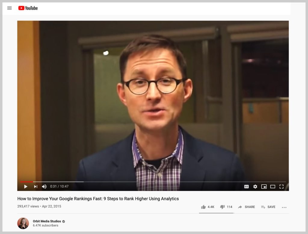
At five years old, the video still ranks well and has nearly 300,000 views!
Remember, good content trumps perfect production. You don’t have to be a video pro to make great videos.
There’s no such thing as the perfect video length
Video creators spend a lot of time wondering if their video is the right length.
While video length IS an important consideration for creating great instructional and informational videos, the real question to ask is, “How can I best cover this topic and drive value for my viewers?”
Then, plan your video to achieve that specific goal.
New Research: Video Statistics, Habits, and Trends You Need To Know
Learn how to create instructional and informational videos that get watched.
Ryan Knott is a Marketing Content Strategist at TechSmith, where he creates content about easy, effective, and efficient video creation, editing, and tips and tricks, as well as audio editing for creators of all kinds. He/him.
The following session was presented at Educause 2019 by Vince Kellen, Chief Information Officer (CIO), University of California San Diego; Orlando Leon, CIO, California State University, Fresno; Helen Norris, Vice President & CIO, Chapman University; and Phil Ventimiglia, Chief Innovation Officer, Georgia State University.
To serve a growing and diverse student population, Georgia State University takes on more than its share of digital innovations in higher education. For Phil Ventimiglia, Chief Innovation Officer, achieving greater efficiencies is a must to provide the best experience across campus.
“We have to leverage technology,” Phil said. “There just aren’t enough people and staff to provide students everything they need otherwise.”
Easily record your screen with Snagit!
Snagit is the ultimate tool for recording presentations, creating video tutorials, or sharing quick updates.
Now named one of the most innovative universities in the United States, it’s not surprising that many of Georgia State’s changes qualify as digital transformation (DX). Phil, however, knows no single term can convey the multi-faceted layers of work needed for lasting change.
“The term ‘digital transformation’ itself is meaningless other than for marketing an ongoing concept in a new package. Innovation is a continual process,” he said.
Chapman University Vice President and Chief Information Officer Helen Norris holds a similar view. Mostly, Helen wants to make sure the term goes beyond the current buzz to communicate the full magnitude of its impact, and prefers a more universal term.
“I would focus more on innovation than digital transformation,” she noted. “With digital transformation, it sounds that tech is leading. Instead, strategy should be leading. Specifically, it should be rooted in the strategic plan of the university.”
Protect new ideas, together
As the third-fastest-growing research university in the country, Phil sees everyone at Georgia State contribute to an innovative mindset.
“You can’t say that some people are innovators and some are not,” he explained. “Everyone in the organization has to be focused on innovation.”
To that end, Georgia State encourages all faculty and staff to work together on new ideas. “We have a DNA within our university to experiment, to try new things,” he said. This often includes working cross-departmentally on challenging projects. “We have to step out of our silos. We work very closely across all areas.”
The teamwork aspect is especially important. “Innovation cannot be owned by anyone,” Phil said. “In my experience when you try to have one person drive innovation, it’s like having someone run up against a brick wall. Collaboration is what is true, and what works.”
“Innovation is a tricky thing,” he confessed. “Not everyone likes to do innovation. Some like to do it, and they shouldn’t.”
Sometimes, the opposite is also true, he explained. “Some innovate, and don’t know they’re doing it.”
For example, although not their goal, faculty who launched a new Cloud Optimization Center found that the pilot inadvertently turned up some groundbreaking new information and processes.
To avoid human nature’s tendency toward status quo, new ideas often need extra support.
Presenting at Educause 2019, from left to right: Orlando Leon, Chief Information Officer (CIO), California State University, Fresno; Phil Ventimiglia, Chief Innovation Officer, Georgia State University; Vince Kellen, CIO, University of California San Diego; and Helen Norris, Vice President & CIO, Chapman University.
“Putting innovation on the agenda is important,” Vince emphasized. “Sometimes the best innovations need extreme defense and protection. Sometimes other parts of the organization will try to kill that innovation.”
Vince also noted that, if not supported from the top-down, sometimes change agents themselves fall into the target as well. For change to survive, it’s important to defend it while it’s young.
“The people doing the innovation need the protection,” he counseled. “We shield them from the instincts of the organization to either execute [innovation] too early, or kill it.”
Relationships as resources
In some ways, smaller universities have an advantage when it comes to transitions. Helen noted that smaller environments can be more agile.
”You don’t have the same amount of bureaucracy to get the same things accomplished,” she explained.
Part of this dexterity comes from more well-established human connections. “Because you’re smaller, you personally know half of the faculty,” Helen said. “You can leverage those relationships as you do innovative things and create change.”
There are disadvantages to being at a smaller organization, though. “You have a smaller staff,” Helen noted. “You just don’t have the resources to do some of the fun things. So you do partnerships with vendors and others in the community.”
Vince cautioned that larger institutions have a similar mixed-bag of pros and cons, when it comes to digital transformation.
“We have the illusion of more resources at a larger university,” he said. “But innovation is ‘garage band’ stuff.”
With more than $1.4 billion in research funding per year, there are a lot of other distractions, and it can be hard to grab faculty’s attention. You have to find points of collaboration and know your faculty to promote lasting changes. Ideally, it can translate to an opportunity for the faculty or staff, to make their experience better, or better for their students. “Having relationships with those faculty is key,” he said.
Orlando Leon, Chief Information Officer, California State University, Fresno, agrees, but emphasizes the importance of campus leadership willing to take some risk.
“Digital transformation needs to be top-down and bottom up,” Orlando urged. ”It’s got to start somewhere. You’ve got to be able to lead this level of change.”
Even amidst resistance, it’s important to rally support, even if it means starting small. “Partner with colleagues,” Orlando advised. “You don’t have to start with jumping over the moon.”
Complexities with change
A key up-front challenge is to not chase after all the new digital solutions available. Although tempting, it often results in using a shiny tool for the wrong thing.
“I think everyone gets enamored with the technology and fails to understand that the complexities are enormous, Vince explained. “All of ed tech is consistently underestimating the last 10 percent of support needed for digital transformation.”
For projects that do make the cut, having a solid IT team helps. Phil noted that Georgia State typically does 40-50 new integrations per year, and that their strong IT team allows them to quickly integrate new technologies.
Similarly, a strong IT team can keep everything else running smoothly at the same time new systems are being installed. “Core systems still need to work,” Orlando said. “I encourage our teams to do all our core functions well.”
IT’s meta challenge — rework its own foundation
Higher education must scale an undeniable tech ‘hump’ to truly be in a great place for the digital transformation of today. Vince noted that getting rid of mainframe systems can be a huge leap forward.
“The biggest digital transformation is within IT work itself,” he said. “That will be moving from a ‘homebrew’ software engineering environment to DevOps, namely we’ll be managing data and analytics and no longer doing software development.”
Cloud services allow better focus on other program goals as well. “Undergraduate growth is a priority,” Vince said. “There are interesting strategies we’re putting together online.”
Phil noted that Georgia State focuses on the student perspective, aiming to make the entire student journey easier. “We’re dedicated to making a place where students can succeed,” he said.
The human element of change
In all types of process transformations, face-time with faculty is a necessity.
“In spite of the fact that it’s digital, the human touch is really important,” Helen explained. “You need to work digital projects hand-in-hand with the faculty who will be impacted.”
Supporting already-busy faculty ensures they have the intellectual and emotional incentive to go through tough change in the first place.
Phil agreed, noting that with most innovative changes being done not by research faculty but full-time faculty, his goals include welcoming those efforts in a way that matters to instructors. He wants to ensure instructors have help to work through issues. “We want to give them more support. When there are stumbling blocks, they need the time to go work through that,” he said.“We need to make sure we’re not penalizing risk.”
The human aspect is critical. “How do we make sure we’re shining a spotlight and they’re getting credit for the great work they’re doing?,” Phil asked. “Ultimately, we want them to have rewards and to progress their career.”
Vince agreed that nurturing the motivation to change is a fundamental component to encourage faculty to adopt new ways of doing things.
“How do humans commandeer tech to serve their social biological instincts?,” he asked. “Because that’s really what’s going on here. To keep the humanistic element and work from there.”
Transforming students with new digital skills
Phil notes that successful digital transformation should foster the next level of digital literacy in students. Albeit openly amenable to try new digital tools, the challenge is to provide the best tools and activities for each degree program.
“How do we get students ready to compete in this 21st century economy?,” he asked.“As leaders in higher education we are in the fourth industrial revolution and it’s fundamentally changing higher ed. We’re already seeing these glacial shifts. How we deliver teaching and learning is changing.”
For example, after launching a digital literacy pilot in the honors college, Georgia State students completed a visualization project using Tableau/mapping software to help them better understand the significance of a historical event. The university is exploring digital literacy paths that include experiential learning, project-based learning, and real-world projects in partnership with organizations within Atlanta. Phil sees an obligation to help usher in this change.
“It’s a continual wheel of how we move the needle,” Phil said. “How can we continually up-level students’ skills so they’re not just competitive, but they’re ahead. As the tech leaders, it’s incumbent on us to be that thought leader and ask how we can serve those students better to be successful in this new world economy,’” he said.
In Fresno, students at California State University are working with a wellness bot, doing interdisciplinary learning, and teaming up with pre-K12 students to study blockchain. Particularly in their geographical area, familiarity with digital tools can potentially make a big difference to these students.
“These skills are great. Only 11 percent of jobs in the valley require a four-year degree,” Orlando explained. “Our students need to be ready to avoid being replaced by automation.”
Working on the administrative IT side of things, Orlando tries to make it easy for instructors to know about new tools and resources — and awareness is growing.
“We find that faculty didn’t know they had this support,” he said. “Our capability to change and do things is increasing.”.
Better data to improve outcomes
Already, digital transformation has put processes in place that collect strategic information and use it to the advantage of student outcomes. Phil commented that Georgia State has seen a significant increase in graduation rates.
Notably, his team used data to help figure out which class times are most needed, and then determined how to optimally distribute classes to best use the prime time.
“We keep looking at what is the next piece we can look at, to get that next half-percent of improvement,” he said.
Change happens slowly
Vince said that not all changes will happen quickly, and that’s okay. While some things have changed significantly, others — such as face-to-face meetings — remain the same.
“Compared to the combustion engine for farmers, which led to 1,000% increased productivity, the digital transformation in higher ed is much more nuanced,” he said. “There’s digital infusion, but a lot of modest steps forward.”
A step-approach to change is another good way to set expectations. “Think of the SAMR model,” said Orlando. “First you substitute digital for paper-based. Technology is there today, you just have to do it.”
Perhaps most importantly, for all digital transformations, ensure everyone understands the true role of technology is to use data and systems to amplify the best parts of higher education.
“I see this as similar to what’s happening in retail,” Phil said. “There was lots of hype that all brick and mortar will go away. Instead, we see companies like Amazon building a physical presence. Digital has increased the value of retail, so it’s extended the relationship with the consumer.”
The same is true in higher education, as it expands possibilities in teaching and expands the choices of students.
As far as how to be successful with digital transformation, it takes many people working together toward the bigger picture. “It’s not *one* thing you need to do for DX success,” Phil noted. “It’s hundreds of things.”
Easily record your screen with Snagit!
Snagit is the ultimate tool for recording presentations, creating video tutorials, or sharing quick updates.
But, what happens when there’s something in the screenshot you don’t want to share? Meet the blur screenshot tool.
Once you start using screenshots, they form a helpful routine that makes it easy to be clear and concise. As you use screenshots more and more, it’s important to have a set of tools that allow you to identify what is important in an image. You don’t need fancy image editing tools just to blur an image.
Additionally, you will run into times when there is content in a screenshot that you’d prefer not to share, but cannot be completely removed. When this happens, it shouldn’t stop you from using screen captures.
There are many ways to hide or de-emphasize content in a screenshot. My colleague, Dayna, has an excellent post detailing some great ways to do this. She suggests blurring out undesirable portions of images. Most high-quality screen capture software has a tool that lets you blur out part or all of an image.
Here are five ways TechSmith employees use blurring with their screenshots.
Get the best screenshot blur tool
Snagit is high-quality screen capture software that lets you blur your images. Try it today for free!
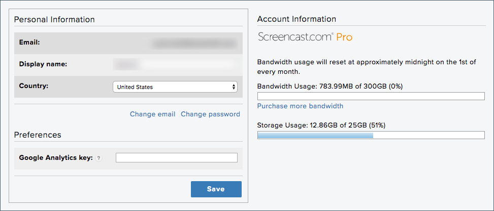
Our tech support team does awesome work every day, providing chat, email, and phone help to our users. This work requires them to take a lot of screenshots. Often, the screen grabs include email and other account information.
Our agents use Snagit’s blur tool to remove personal information, like their email address, from a screenshot.
In the screenshot above, one of our techs needed to show a user how to change an account setting on Screencast.com. He was able to blur out his email address and display name without the capture losing any of its context or meaning. Pretty sweet.
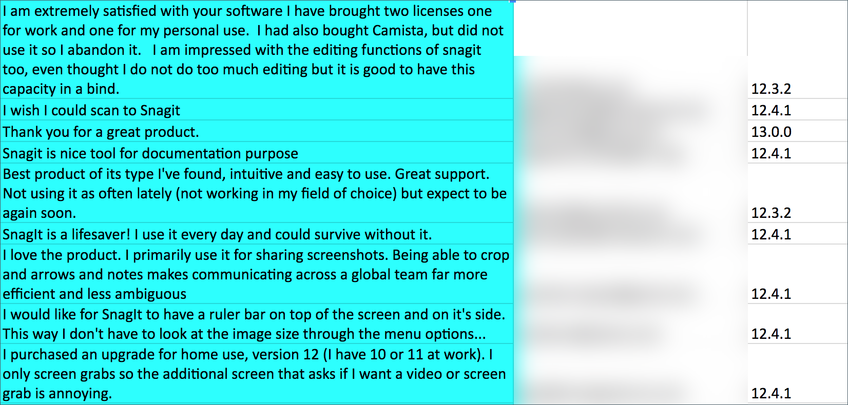
One of the most important parts of our software building process is listening to our users.
We run beta tests, communicate with user groups, conduct surveys, and maintain a feedback community, among many other input-gathering strategies. While planning new features, we make sure everyone working on our software has heard the voice of our users.
To do this, we create resources and share them throughout the team. The names or information of individual users, often collected in surveys, is not necessary to include. So, we usually blur it out.
The screenshot below is from a spreadsheet containing user feedback with the ‘email address’ column blurred out.
3. Remove unnecessary information
Sometimes the reason for blurring isn’t about hiding identifying or sensitive information.
Instead, there is irrelevant or unnecessary content that you want to de-emphasize. This is a tactic one of our trainers uses to direct the focus for example screenshots.
He grabs an image to include in a presentation and then blurs out the parts that could distract from the subject. In the screenshot below, he blurred text that was not pertinent to what he was explaining.
4. Use blur to highlight
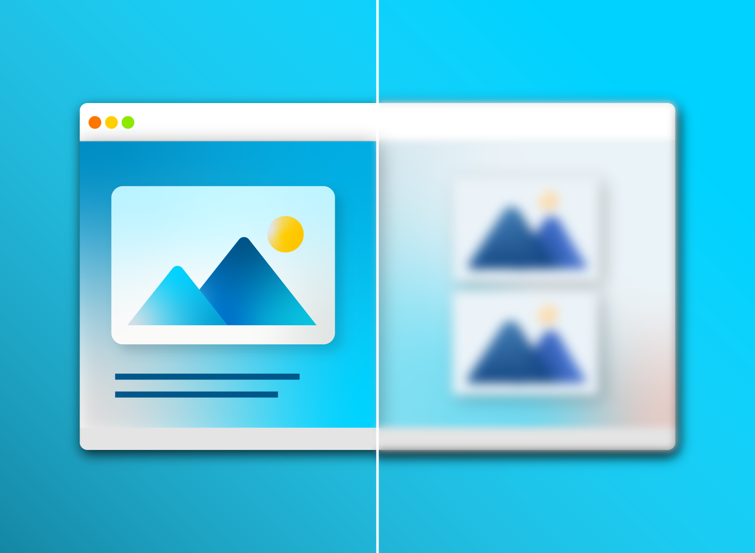
I’ve talked about how blur tools can hide information. But blurring also can be used to emphasize a particular part of a screenshot or video.
By blurring out the unimportant parts of any image, you can draw a viewer’s eye to a particular section of an image or video. This technique is useful when you still want to maintain context in your screenshot.
In this example, I’ve blurred the rest of the interface in order to draw attention to the menu in the upper left.
5. Progressive reveal
When explaining a complicated interface or diagram, some people like to use blur to do a progressive reveal of portions of an image. This is a great tactic in slide decks and presentations.
It also works well in step-by-step processes. By blurring parts of the image, you can be sure the people you’re presenting to know exactly what part of the interface or image you are talking about. Below is a GIF I created to show how a progressive reveal can be done with a screenshot.
There are tons more ways to use blur in images. Download Snagit to start capturing images and try out the blur tool for yourself!
Get the best screenshot blur tool
Snagit is high-quality screen capture software that lets you blur your images. Try it today for free!
Screenshots and images are like jet fuel for communication. They get your message across instantly without having to provide additional, written context.
This means that — as communicators — we can’t rely on text alone to help our users and customers understand how to use our products and services. Our help content needs to be, well, helpful.
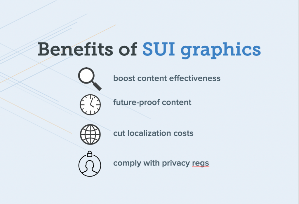
One of the best ways to provide top-notch, crystal clear help content is to use simplified graphics.
No time to read the whole guide?
Dont worry. Get a free PDF version so you can read it whenever you want.
Simplified graphics are transforming the way technical communicators, support teams, and other folks who support software and SAAS products create help content.
It’s a technique that grew organically from the need to illustrate products, features, and concepts in an attractive, easy-to-understand way.
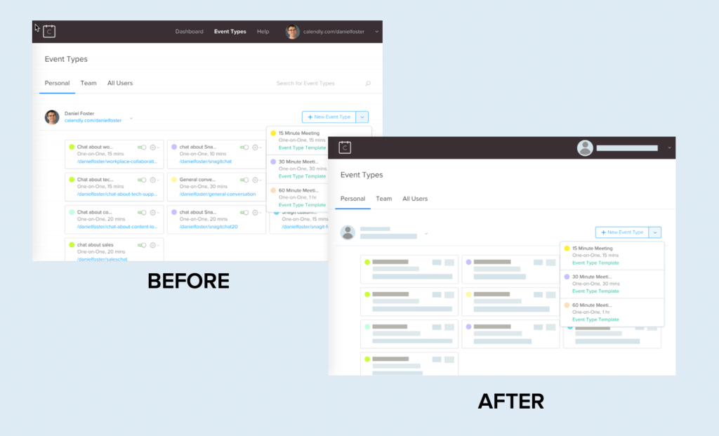
These graphics take a user interface (UI), webpage, or another form of screen content and remove unnecessary elements and details. This better directs users’ attention and allows them to focus only on the vital details.
Predictive eye-tracking experiments show that typical screenshots (which usually have far more elements and visual noise) can distract the user’s attention from the most important elements.
As this eye-tracking heatmap shows, the more elements of an image there are to look at and read, the more fragmented the user’s attention will be.
So, who can use simplified graphics?
Simplified graphics are useful across your company or business, but they’re particularly suited to departments and individuals that need to show users how to use a product, feature, or workflow:
But despite the dramatic benefits for both technical communicators and their audiences, many companies still aren’t using simplified graphics and images.
Why is this? Why aren’t all tech companies embracing the benefits of SUI graphics?
There are three common fears that cause people to avoid using this visual style. I’d like to dispel these fears, and then show you how to start making your own simplified graphics for your help content.
Here are three myths holding your help content back:
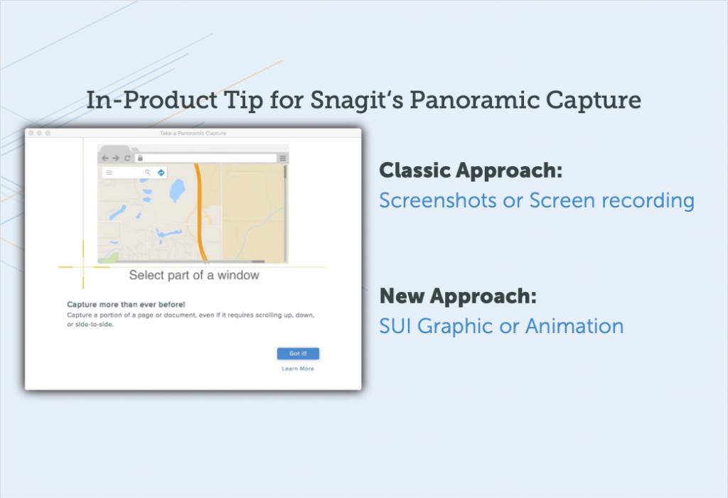
Myth 1: Simplified graphics will be additional work
It’s true that turning a screenshot into a simplified graphic is often — but not always — a manual process. But the small-time investment made to create SUI images normally leads to efficiencies down the road in the medium-to-longer term.
Here’s why:
1. Fewer updates
SUI graphics stay relevant longer. Unlike traditional images and screenshots, they rarely need to be replaced because of software updates.. When details are removed, it’s less likely any given change will leave an image out-of-date.
2. One image for all
If you need the same image in multiple languages, one simplified image could work in every location, greatly reducing the time and expense needed for localization.
3. Customer comprehension
In many situations, simplified graphics are more effective than traditional screenshots. Customers can grasp the concept and learn what you’re trying to show more quickly, as the graphics present the most relevant information without drowning it out with unnecessary visual noise.
This means happier customers and fewer calls for additional support.
What’s more, although creating a simplified image takes a bit more time than taking a screenshot, it takes much less time and effort than most people assume.
Myth 2: Simplified graphics are for designers
Because SUI graphics look so professional, many technical communicators believe they don’t have the skills to create them.
That’s just not true. In fact, they’re simple to create for anyone who knows the basics of image editing software — no pro design background or training in professional-level design tools necessary.
The Simplify feature in Snagit makes it easy to create a professional, attractive SUI graphics in a couple of minutes.
By reducing visual noise and complexity, users actually understand the most important information much faster.
Most folks who create technical or support content have some day-to-day experience with image editing tools and a general sense of what makes an effective, attractive image.
And, if they don’t, it’s a necessary skill to gain and develop.
“We’re in a bullet-point using, emoji sending, Instagram scrolling, ever-distracted society. We are an image society these days and people wanna see it quickly and they wanna move on.”
” – Kati Ryan
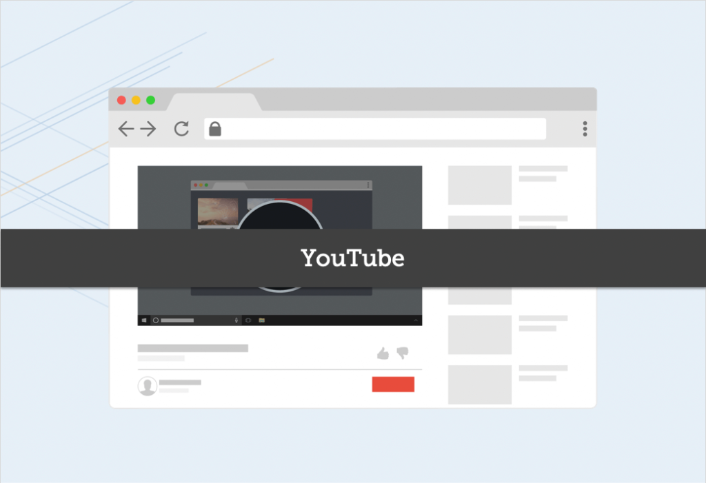
Myth 3: Users won’t recognize edited screenshots
As communicators, we need to convey information as clearly and simply as possible. So, it makes sense that technical communicators express some apprehension about using graphics that don’t exactly match the UI.
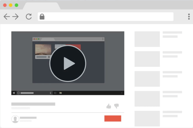
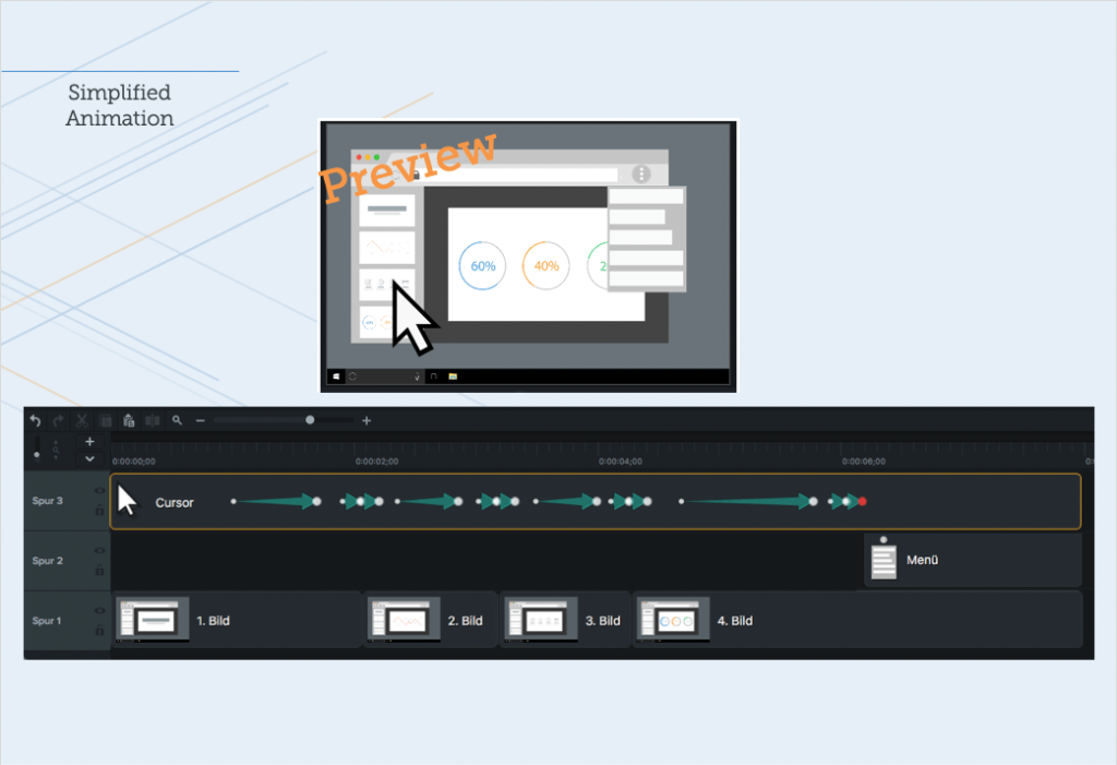
Fear not. Consider this example from YouTube:
It’s immediately clear that it is YouTube, and not another video player, even though there’s no text and everything is abstracted. The trick is to keep the layout similar to the original and to use the brand colors of the product you are trying to show.
The black, grey, and red are all distinct elements of YouTube branding.
Not only can users generally recognize the interface or website that a simplified graphic represents, but strong evidence suggests that by reducing visual noise and complexity, users actually understand the most important information much faster.
That’s great, but can I create my own simplified graphics?
Absolutely!
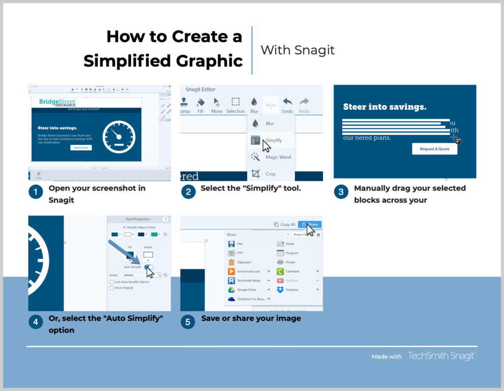
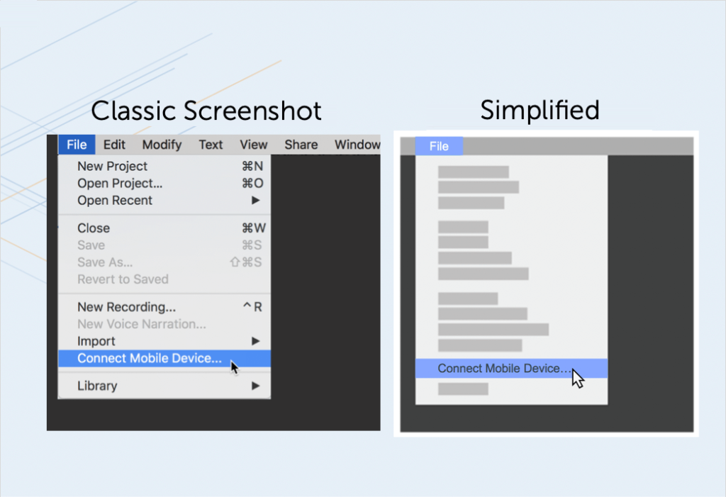
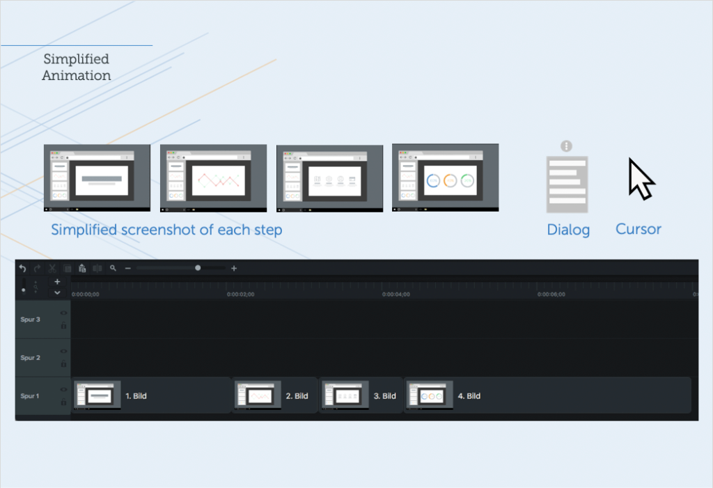
Step 1: Capture a screenshot
Using Snagit, capture a screenshot of the user interface you want to turn into a simplified graphic.
Step 2: Simplify the screenshot
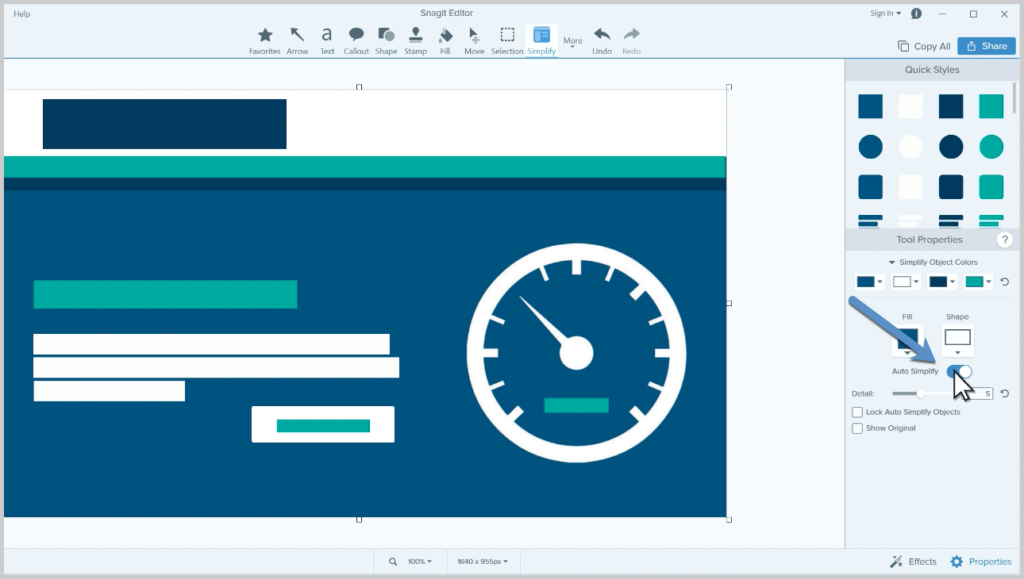
Choose Snagit’s Simplify tool, which lets you either manually or automatically simplify an image.
If you choose to manually simplify your image, use the graphic elements to hide unnecessary details and simplify elements in your screenshot.
The second option is to automate the process. Snagit’s Auto-Simplify feature recognizes shapes and text and then automatically covers them with elements themed to match the color palette of your image.
After applying the automatic process, use the options in the Tool Properties to adjust the level of detail as well as the object colors to fit your needs.
Step 3: Save or share
Once you have an image you like, you can save your file to the standard .jpg or .png, or another file type of your choice. An additional step I highly suggest is to save your image as a .snag file.
The .snag (.snagproj on Mac) file format allows you to reopen your image later and make adjustments.
If you want to learn more about creating simplified graphics in Snagit, we have a quick cheat sheet that will help you become a pro in no time.
Want to make a process graphic like this? You can do it right inside Snagit!
Key takeaways
If you think your standard screenshots are enough or your product is so intuitive that you don’t need to use simplified graphics, you need to rethink your strategy.
Here are a few key aspects to remember:
Making simplified graphics is a technique for technical communication that pays dividends in time savings and user satisfaction
Creating simplified graphics is not as difficult as most people think. A few simple-to-learn skills allow anyone to make attractive simplified screenshots
You can do it with Snagit and we have numerous resources to help!
In the end, you want to create the best help content possible.
Don’t sell yourself short by falling for these myths, and you’ll create a group of passionate fans rather than perplexed users.
Your video received a lot of likes and views, which is wonderful, but does that really measure its success? Did you retain viewers throughout the entire video or did they get bored and stop watching?
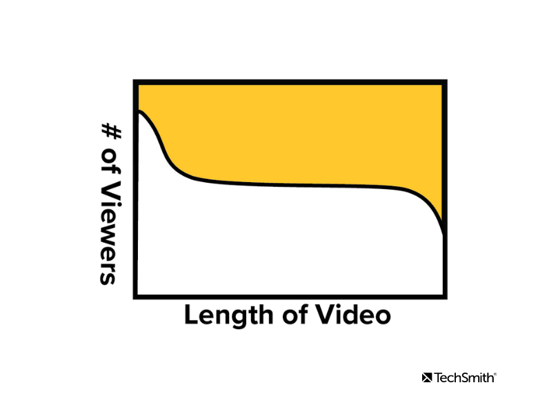
One of the best ways to quickly learn about how your viewers interact with your video is to measure video engagement with engagement graphs.
These graphs are popular within digital marketing, but they can also be key for anyone creating videos. You don’t need to have a video marketing strategy to wonder how your online videos are performing.
In the end, whether you’re creating video tutorials or video ads, you want to make sure your target audience is watching your video content.
Make professional-quality videos with Camtasia
Camtasia’s easy-to-use features make it easy to create your next video
Engagement graphs are available on most video hosting platforms including YouTube, Wistia, and Vimeo. They display the length of the video and the number or percentage of viewers that remain engaged at each point throughout the video.
These graphs are just one of many types of video metrics you can use to evaluate how well your videos are performing.
One thing to note is that different platforms refer to engagement graphs by different names. If you’re on YouTube, look for “Audience Retention.” Or if you’re using Wistia, simply look for “Engagement.”
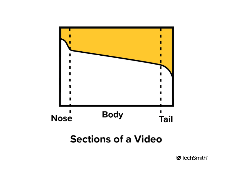
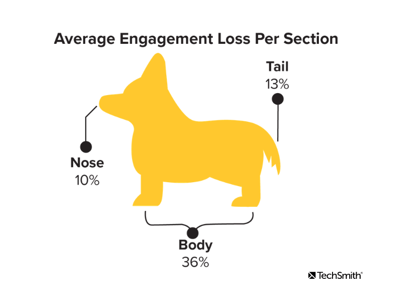
Anatomy of a Video
To get started, let’s dissect the anatomy of a video when it comes to analyzing engagement.
Videos consist of three primary sections
Nose
Body
Tail
Using percentages, Wistia defines the nose as the first 2%, the middle 96% as the body, and the last 2% of the video as the tail.
Nose
The nose is the beginning of the video. This is where the title and introduction occur. It is very common to see a quick drop within the first 3-5 seconds of a video.
This is due to several factors. The most common factor is that the video was not what the viewer was seeking and they stop watching shortly after the title screen appeared.
Body
The body is the main content of the video. It is the section just after the introduction and continues until the outro. Ideally the engagement graph would stay completely flat indicating that your video was so engaging that everyone had to watch until the very end.
While a completely flat line is ideal for the body, it is more common to see a slow, steady decline as viewers gradually drop-off throughout the video.
Tail
The tail of the video may include the outro and credits. It is very common to see a sharp drop in the engagement graph during the tail as viewers stop watching once they believe the video is ending.
Now that we’ve identified sections of the graph, let’s talk about what we can interpret about the success of our video from them.
What story is the graph telling us?
There are a few different trends to look for when you’re analyzing your engagement graphs. Here are some questions that we asked ourselves as we looked through our data.
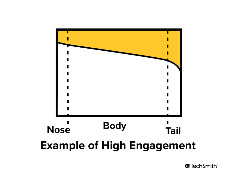
How do you know if your video has high engagement?
A video with high engagement will often look like the graph below. You will see a slight drop off in the first 3 to 5 seconds, followed by a steady horizontal line, then a steep drop off at the end.
This graph indicates that we lost a few viewers at the beginning, viewers were engaged during the body of the video, then realized it was ending and stopped watching towards the end. This is an ideal engagement graph.
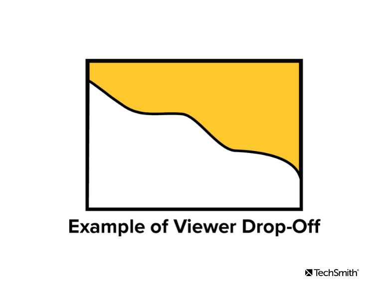
What does an unexpected drop-off look like?
The graph below tells the story of a video that is losing viewers at a particular point during the body. In this situation begin by reviewing the video and focus on the point in time when the drop off occurs.
The example below comes from a video that had an issue with the script. The script was worded in a way that made the viewer think the video was ending halfway through and they stopped watching.
Another example that could cause this is a call-to-action that takes the viewers away from your video. You may test whether the call-to-action fits better at a different point in the video to retain viewers.
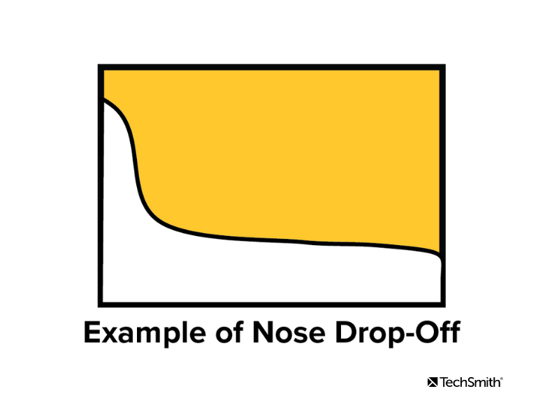
Why are people leaving quickly?
The graph below displays an example of what an engagement graph might look like for a video that loses viewer’s attention during the nose.
There is a sharp drop at the beginning of the video that continues into the body. This often indicates that the introduction went on too long before getting to the content the viewers were seeking to watch.
An example of this could be a tutorial on how to play a particular song on the guitar. The video begins with a long personal story and distractions before it reaches the musical instruction. Viewers decide to stop watching and select the next video in the search results.
Measuring Engagement
At TechSmith we recently analyzed 50 of our tutorial videos to see how they were performing.
Once we knew how to measure success by the shape of the engagement graph, we wanted to measure engagement by the numbers.
Before measuring anything it is always a good practice to identify what it is you are looking for. When evaluating our tutorials we were looking for answers to the following questions:
Which videos had a high and low performing nose?
Which videos had a high and low performing body?
Which videos had a high and low performing tail?
Is there a correlation between the length of the video and audience engagement?
Overall Engagement
Video hosting platforms offer an overall engagement or audience retention percentage. Wistia measures this by taking the total hours watched divided by the number of plays x the length of the video.
Think of it as an overall grade on engagement. When evaluating our 50 tutorials we had an average engagement rate of 70%. While this measurement is helpful to evaluate the success of a video, more can be learned by breaking it down into sections.
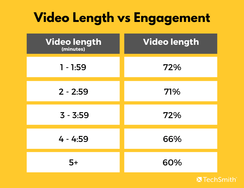
Does length of video effect average engagement?
We used the overall engagement percentage to measure whether there was a correlation between the length of a video and audience engagement.
Here were our findings:
As you can see above, engagement was fairly level between one and four minutes around 72%. But once we hit the four-minute mark we began to see a decrease.
Nose, Body, and Tail Performance
We found that the average nose ended around 7 seconds, the tail consisted of the last 11 seconds of the video, and the body was the time in between, which on average was around 2 minutes and 55 seconds in length.
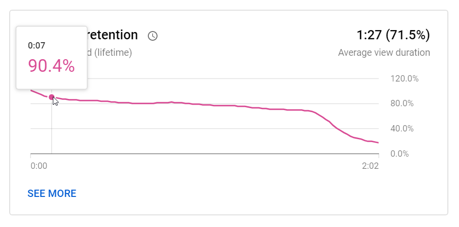
Using the engagement or audience retention graph, view the engagement percentage at the start (which is always 100% for the nose) and end of each section.
In the example below the engagement percentage was 90% at 7 seconds into the video. In this case, we lost 10% of viewers during the nose of the video.
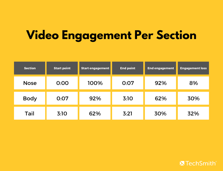
Engagement per section results
Below is an example of the results after evaluating a tutorial video. The last column indicates how each section performed. Since we are looking at engagement loss, the lower the percentage the better that section performed.
Using Data to Improve Your Video
Once you have collected the data it is helpful to establish an average for each section of the video. This can be used to identify which videos are performing above and below average.
Here were the averages that we established after reviewing 50 TechSmith tutorials:
Looking at the table in the previous section we can see that our video succeeded during the nose and body.
The engagement loss for the nose was 8%, which is below the average loss of 10%. The loss during the body was 30%, which is below our average of 36%. However, we need to work on improving engagement during the tail which had a 32% engagement loss while our average loss for the tail is 13%.
This is helpful to identify trends and you may decide to make changes to improve your video.
Here are a few suggestions based on our experience:
Re-edit the video
Create a new intro or outro
Change the placement of your call-to-action
Get to the main objective sooner
Update the script
Cut out a portion of the video that may not be essential
After you’ve made the changes, revisit the engagement analytics to see how effective the changes were.
At TechSmith, we have also used A/B testing to see which video was most effective and engaging.
Engagement graphs are a powerful tool to help improve your video. Now you have the tools to see how successful your videos truly are and how to keep your viewers wanting more.
TechSmith Instructional Designer. Content Creator. Paddleboarder. Ukulele Player. Mom of two great kids. Lover of all things beach, camping, Great Lakes. Favorite Places to Be: Floating on the lake or driving in the Jeep with the wind blowing through my hair and good music playing. Life Motto: "Enjoy the Ride"
But recording your screen in real-time as you walk through a process, including navigating your screen, highlighting areas you want people to notice AND narrating — ALL AT THE SAME TIME — can be really intimidating.
https://gph.is/2Su6MxL
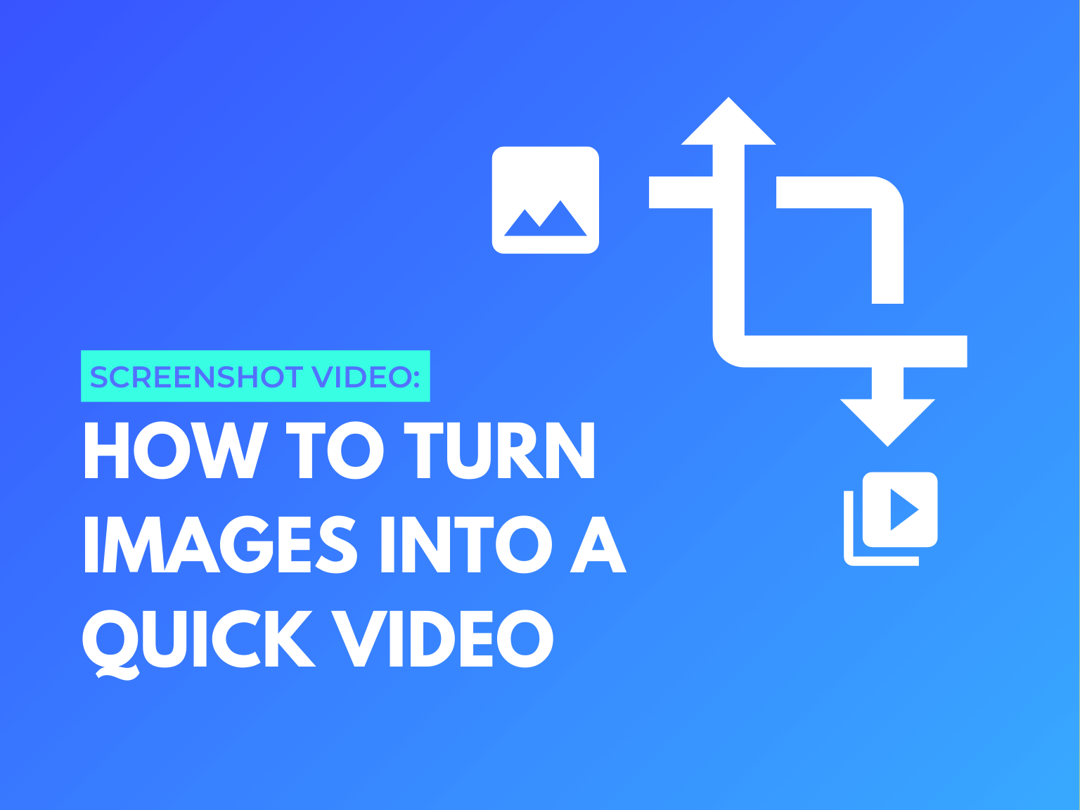
That’s why I’m really excited about Snagit’s new ability to create a video from a series of screenshots!
Don’t get me wrong, there are still a lot of great reasons to do traditional screen recordings, but if you want something a little more polished AND that takes some of the pressure off of making it perfect, then Snagit’s new ability to create video from images can be a lifesaver.
Until recently, if you wanted to do a screencast showing someone how to complete a series of steps or provide a tutorial via screen recording video, you had to pretty much do it on the fly. That meant making sure you were ready to record each step, emphasize the areas of the screen you wanted to emphasize, and narrate it all at the same time.
And, if you get it wrong, at best, you have to do some editing to correct the mistake. At worst, you have to start the whole thing again.
But, now Snagit allows you to take a series of screenshots and use those to create your video. So, now you can make sure you have exactly the image you want to share before you go through the process of recording your video.
Then, as you record your video with your screenshots, you can easily add arrows, text, and other annotations. You can even add a webcam video to add some personality.
But what does that look like?
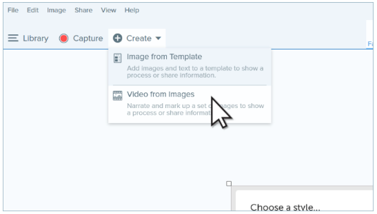
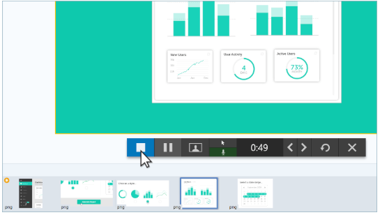
How to create video from screenshots
Just like creating an image from a template, creating video from images is super-simple. And — quite frankly — some of it looks like magic!
First, grab all of the screenshots you need to show the steps or process you want your viewers to learn.
Then, from the Snagit editor, click the Create button and choose Video from Image. (Alternately, you can select the images from your recent captures tray, right-click, and then choose Create Video From Images.)
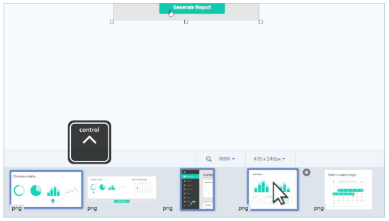
If you didn’t pre-select your images, select the images in the recent captures tray that you want to use in your video.
Then, in the recording toolbar, you can choose from a number of settings. If you’re going to narrate your video, you want to be sure to enable recording of microphone audio. You can choose to turn your webcam on, as well.
You can also choose whether or not to show your cursor as you record. For some videos, seeing the cursor may help illustrate what you’re trying to show. However, if you choose to hide the cursor, any text or annotations you add as you record will appear as if by magic, which is really cool. (See the video below for that that looks like!)
When you have all your settings done, click Record.
Next, go ahead and start your tutorial. As you narrate, use Snagit’s annotation and text tools to draw attention to the important elements from your images.
When you’re done with one image, use the arrow keys in the recording toolbar to advance to the next image. If you need to go back to a previous image, you can do that, too.
If you need to take a break, you can pause your recording and then resume it when you’re ready. When you’re all done, click Stop.
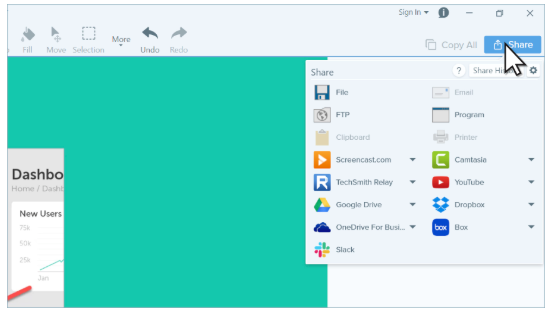
Finally, use Snagit’s editor to trim out any unnecessary parts and you’re ready to share your video with the world.
Snagit offers a number of sharing options. You can save it as an .MP4 file on your local drive or share it to a variety of popular destinations such as Screencast, YouTube, Google Drive, Dropbox, and Slack.
If you want to see how it all looks together, check out this video.
Snagit makes it easy
One of the scariest things about making videos is the worry that you’ll mess it up or that it won’t look good enough. But, when you start with screenshots and use Snagit’s Create Video from Images feature, you don’t have to worry about doing everything at once.
It’s just one more way Snagit makes it easy to create quick and easy how-to videos that help you teach, train, and explain, without having to be a video pro.
Ryan Knott is a Marketing Content Strategist at TechSmith, where he creates content about easy, effective, and efficient video creation, editing, and tips and tricks, as well as audio editing for creators of all kinds. He/him.
Yep, workplace technology is great. But, for those who have to create support content or train others on how to use workplace technology, it can be a double-edged sword.
Technology has done so much to simplify the workplace, it’s almost unimaginable to think of working without it.
As workplace technology advances, though, it can seem like it changes so fast that we’re constantly learning a new system or teaching someone else how to use it.
How do you keep up?
https://youtu.be/FNmOTbh0G_o
You have better things to do than worry about designing your content
For many people, one of the hardest parts of updating user documentation and other help materials is that the design work can seem really daunting. Especially if your content includes great visuals (which, of course, it should).
In the past, keeping content up-to-date took a great deal of time. And, if you wanted it to look good, you either had to be a graphic designer or wait for your design department to design it for you.
Luckily, there’s a better way.
The easy way to create how-to content!
Download a free trial of Snagit to quickly and easily create how-to content.
Snagit now has professionally-designed templates that make creating great-looking how-to and tutorial content really easy. Now you can take your screenshots and add them to the templates with just a few clicks.
Templates in Snagit take the guesswork out of designing your document. All you have to do is grab some screenshots, make whatever markups or annotations you need to, and then add them to the template.
So, whether you’re creating new content or updating documents you’ve already created, it’s fast and easy.
You don’t have to be a designer to create professionally-designed content
Confession: Though I know how to use software like Photoshop, InDesign, Illustrator, and other design programs, I would never in a million years call myself a graphic designer.
I simply don’t have the skills or education. There have definitely been times where I was trying to create educational or tutorial content where I knew I wanted something more polished, but didn’t know how to do it. It’s frustrating. And, I know the content I created could have been so much better.
But now, by creating my how-to content in Snagit, I don’t have to be a designer. Snagit’s new templates were created by a graphic design professional, with design best-practices in mind — so I don’t have to worry because I know they’ll look good.
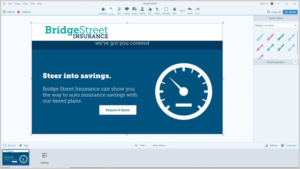
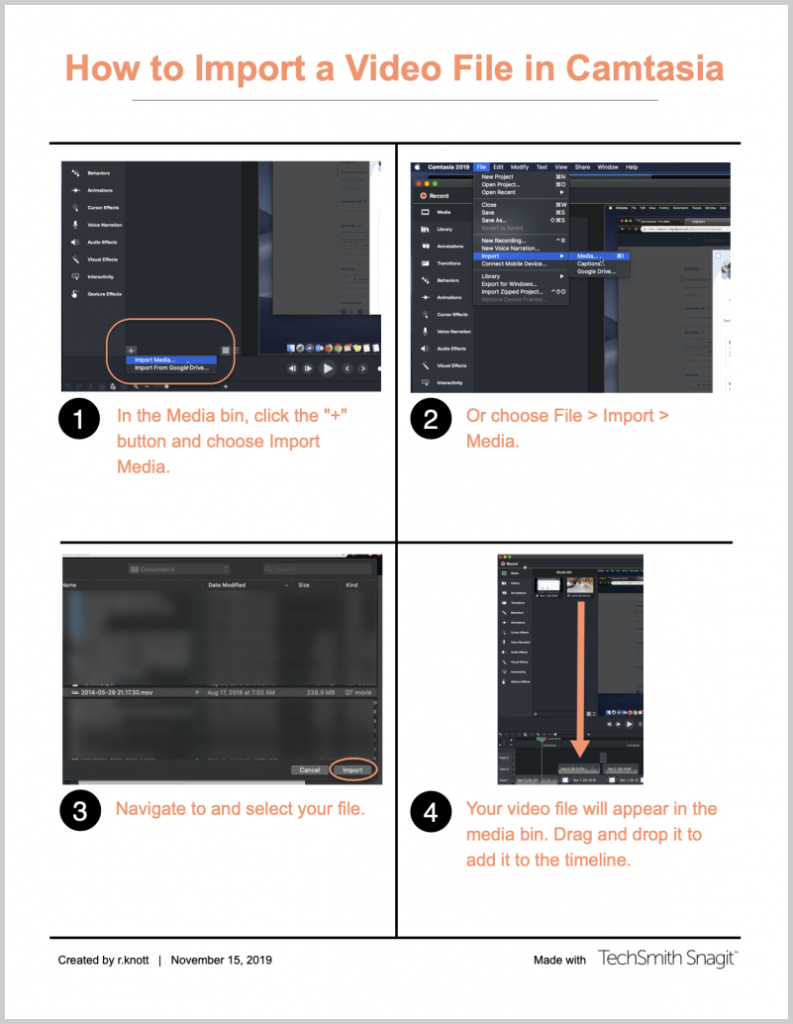
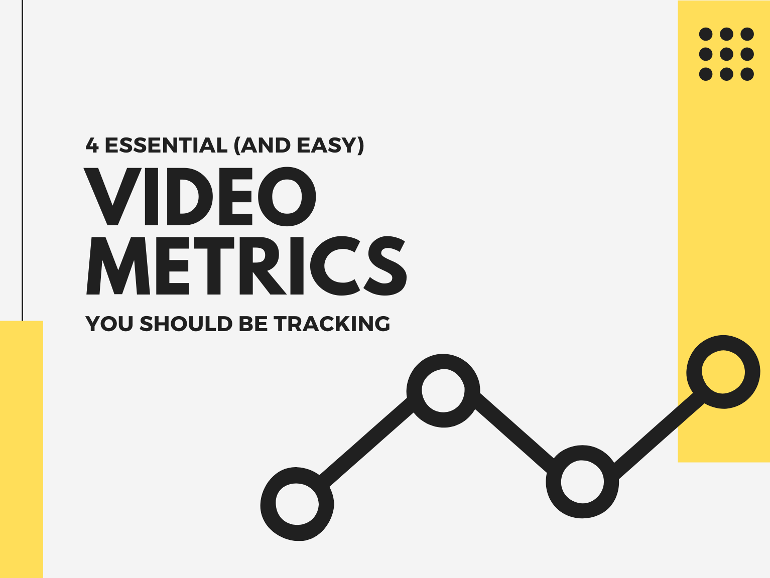
Now I can create something that looks like this:
in almost no time.
And, I was able to do the whole thing in Snagit! No need to export or move images to another program or application.
Professional-looking content in just a few clicks
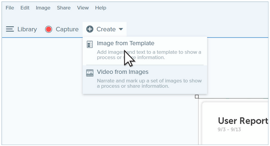
This is seriously super-easy. When you know the process you want to show, open Snagit and grab the screenshots you need. Next, make any necessary annotations to provide more clarity and direction.
Then, click Create and chose Image in Template.
(Alternatively, once you’ve captured and edited your screenshots, you can select them from the tray, right-click and choose Combine in Template.)
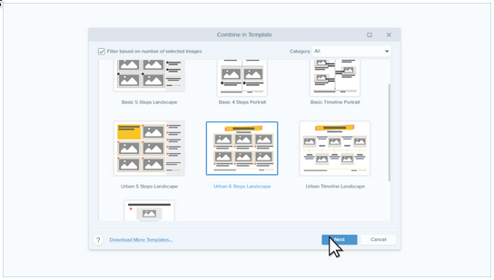
Next, you can select your template. Snagit comes with a number of free templates, but a bunch more are available with TechSmith Assets for Snagit along with a whole lot of other graphics resources, such as icons, stock photos, and more.
https://techsmith-13.wistia.com/medias/ol59o7cyna
Once you’ve selected a template, click Next. If you haven’t already selected your images, you can drag them from the Recent images tray and drop them in the designated spaces. You also can give your document a title and add a caption to your screenshots. Then, make sure they’re in the right order and click Combine.
Snagit automatically generates your nifty new how-to guide.
You can now continue to edit your document by resizing screenshots to ensure you’re emphasizing the right parts of the images, drag and drop them to reorder as necessary, or replace images with new ones.
https://techsmith-13.wistia.com/medias/z5297px1ti
You can also edit the captions and title, change fonts and colors, and a lot more.
When you’re done, you can save it as a local file or share it with the world.
If you want to see the whole process all the way through, here’s a great tutorial video on how to do it.
https://techsmith-13.wistia.com/medias/dgtc4x9qqj
Keeping up with the ever-quickening pace of technology changes can be challenging. But it’s helpful to know you don’t have to be a professional designer to create professional-looking documentation and how-to materials. Give Snagit a try and see for yourself!
The easy way to create how-to content!
Download a free trial of Snagit to quickly and easily create how-to content.
Ryan Knott is a Marketing Content Strategist at TechSmith, where he creates content about easy, effective, and efficient video creation, editing, and tips and tricks, as well as audio editing for creators of all kinds. He/him.
One of the challenges with any training program or other basic instruction is to make sure it achieves what it was designed for. Measurement is critical if you want to know how your video is performing.
You don’t want to spend time to create something only to share your video on social media or internally and find out that nobody clicked play and the view count was low.
Important metrics like play rate, conversion rate, number of viewers, and bounce rate have been part of video marketing for a long time.
But in this quick guide, we will focus on some of the measurements you’ll want to for instructional video content. Not all video players and hosts offer the same metrics, although many of them have similar ones or may call them different names.
Below we list a few common ones, and explain what you can understand about your videos by looking at them.
What video metrics should you pay attention to in your video strategy?
1. Plays and views
One of the most straightforward metrics to track with video is the number of times a video has been played. The play number may not be helpful as a standalone metric but can provide some key insights.
First, the number of Plays tells you if your video is getting watched. If not, you’ll want to ask some questions as to why. Is there a technical reason that people aren’t watching, such as the video not working in the browser? Or maybe your audience isn’t finding the video in search? Or is there some other problem that is breaking the link or prohibiting the playback?
Beyond seeing the number of Plays hopefully growing, what else should you look for? Are you expecting to hit a certain threshold but not seeing enough Plays? (e.g., 30 people were registered to go through the course, but the video Play number is only seven.) On the other hand, are you seeing a higher number of views than anticipated? It could mean people are watching multiple times, or the video is drawing in unanticipated viewers.
It’s hard to dig into specifics with video Plays. There are other data points that we’ll look at that can paint a better picture of what is happening. However, remember it’s the easiest of the data to get and does provide some information worth knowing.
2. Unique plays
Another data point that most services provide is the Unique Plays of a video. First, a definition. A Play counts every time the video play button is pushed, including Plays by the same person. Unique Plays filters out repeat video playbacks by the same person. Meaning, if I play a video twice, the Play amount is two, and the Unique Play amount is one. You should know, a viewer who watches the video once from their laptop and once from their phone may count as two Unique Plays, depending on your video host’s capability to determine if a viewer is the same. You should check with your video host’s documentation to better understand what’s counted as a Unique Play.
Knowing if your audience is watching a video multiple times can lead you to questions and insights into the effectiveness of your video.
If viewers are watching your video more than once, you’ll want to figure out:
Is it because the video’s interesting, enjoyable, and/or useful?
Was there confusion that required multiple viewings?
Is the video being used as a job aid or reference guide?
To answer these questions, you may need to look at other metrics and data, or you may need to go ask your audience. Finding out the answers to these questions is well worth your time, because it will help you better position your video going forward.
If someone is confused, it might mean the video isn’t effective, or the audience isn’t prepared for the presented information. Or, if the video is being used as a job aid and referred back to often, is video the best way to provide the information?
Unique Plays may not help you completely understand the impact your video is having. It can, however, help give you context about your viewers’ behaviors and lead to other interesting and important questions.
3. Watch time
Another common statistic most video hosts provide is the video Watch Time. The Watch Time is a cumulative amount of how much your video has been seen by your audience.
For instance, if ten viewers each watch one minute of a video, the watch time would be ten minutes. If one viewer watches ten minutes, the watch time would still be ten minutes.
However, If one viewer of the ten only watches 30 seconds, the watch time would be nine minutes and 30 seconds.
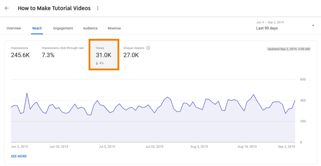
This graph shows the daily watch time by video within your selected date range.
From this, you can see if the viewers are watching a majority of your video. When you use Watch Time with other stats, like Plays, you can start to paint a picture of what your viewers are doing when watching your videos. You also may see if viewers from specific traffic locations (i.e., social media, website, advertisements, etc…) garner more attention and longer Watch Times.
If one particular audience demographic is watching more than others, you could make some decisions on future content. You can adjust your video to accommodate those not watching or lean in and support those who are watching by creating more content similar to what’s already being viewed.
Make sure that as you look at metrics like Watch Time you consider them within the context of all of the other metrics available. Using all available data will help you make better decisions about what viewers are doing and if any changes are needed to ensure that viewers get what they need from your videos.
4. Audience retention and engagement
One stat that is extremely useful is Audience Retention or Audience Engagement. Audience Retention is often depicted as a line graph that goes up as more people are watching that part of the video, and less as fewer people watch the video.
So if multiple people watch or rewatch the first 10 seconds of the video, the line will trend upward or be high-up on the graph. As fewer people watch, the line will drop. The Retention graphic can trend up mid-video if multiple viewers rewatch a section of the video.
This graph shows audience retention as a percentage as your video goes on.
There are a couple of insights you can gain from the Audience Retention graph. One is a quick comparison of how many people started watching versus how many viewers were still watching at the end of the video.
Another takeaway is to see if retention spiked or went up at any place within the video. You’ll also want to look for changes that cause viewership to drop.
In both cases, maybe something funny happened that caused people to watch that part multiple times? Or perhaps something visually interesting caught their attention?
On the other hand, that part of the video could have moved too quickly or was confusing, causing viewers to watch it again to understand the information. Look for anything that might cause a change, and ask, “What happens at this point that would cause viewers to decide to take this action?”
The Retention Graph won’t tell you why viewers behaved the way they did; it can only tell you what they did.
It will be up to you to interpret the data and determine why it happened. This may take some investigation. Watch the video to see if you notice anything to cause the behavior. You may need to survey or talk with your audience. Or you might want to take your best guess and determine if you need to make a change to the video to better help your viewers.
Measuring video metrics is always super important when releasing a video or training program. It allows you to have valuable information about its performance and helps with making future content.
Ready to start creating your own videos and training programs?
Camtasia lets you record your screen, edit your video, and export into a beautiful video!
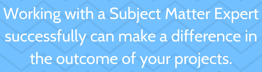
It’s a classic conundrum: You need great video or tutorial content, but you’re not an expert in the field. On the other hand, your subject matter experts aren’t exactly expert video creators and you need something that looks professional.
So, who should make the video?
Great companies play to their employees’ strengths and that holds true for content creation, as well. So just like the adage says, teamwork makes the dream work.
Being a content creator means having to know a little about a lot of things. Most of us have to be able to write, do some basic graphic design or image editing, video work, and more. That’s on top of often having to know a little something about whatever it is you’re creating content for.
But great tutorial and training videos need more than a passing knowledge.
That’s where your subject matter expert (SME) comes in.
In a perfect world, all interactions with your SME would be seamless, flawless, and smooth, but that’s not always the case.
This guide provides some helpful tips on getting the most out of your interactions and relationships with your various SMEs, as well as some common pitfalls to avoid.
What is a subject matter expert and why are they important?
Chances are, if you’re creating content of any kind, you’ve had to work with a subject matter expert at one point or another — you just may not have realized it at the time!
Your SME is exactly what it sounds like — the person who is an expert in your content topic. It can be someone on your team, another colleague from somewhere outside your department, or even someone outside your company entirely.
When it comes to creating training or tutorial content, your SME can make all the difference. Imagine creating a video on how to work within a software program when you only know a few of the features. Sure, you could highlight some good information, but your video wouldn’t be complete. That’s not good content.
Your SME fills in your knowledge gaps and ensures that everything you show and share is accurate and complete. They can provide valuable context and technical knowledge that make your videos more beneficial to your viewers.
Think of them as your own private knowledge bank.
That said, not everyone thinks like a content creator. So, while SMEs might have all the knowledge needed to create great content, they’re not necessarily the appropriate choice for actually creating the content.
But how do you create a good working relationship with an SME to ensure that the content you create together will be the best it can be?
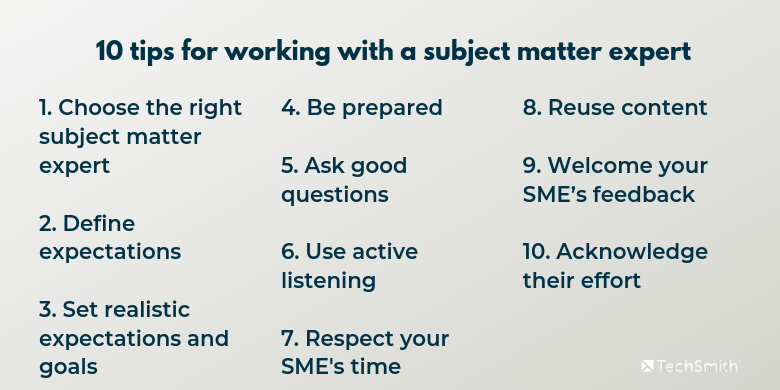
10 Tips for working with an SME
As stated above, in a perfect world, every interaction with an SME would go without a hitch. But, for a wide variety of reasons, sometimes that’s not the case. But, there are a few sure-fire ways to ensure that the vast majority of your time working with an SME is productive and efficient.
1. Choose the right subject matter expert
This may seem like a no-brainer, but it can be a little trickier than you might think. For example, when a project is just getting under way, your project manager or other team member may have a suggestion for who you should work with. But that may not always be the best person for the job.
To ensure you enlist the help from the right SME and avoid wasting your and their time, make sure you understand the parameters of the project before you get started.
For example, for a software training video, it may make sense to grab one of the developers to help you get the knowledge you need. But, it may also be beneficial to work with their project manager instead. While a developer might have the technical knowledge of how the product works, a project or product marketing manager might better understand the “why” behind the features.
Other times, you may need to enlist the help of multiple SMEs. Maybe one SME can give you the best technical look, but you also need the full story for other reasons. In that case, having two more may be they key to success.
On occasion, you may not have a choice. You may be assigned to work with someone or a particular person may be the only SME in your organization or available to you at the time. In that case, you may have to make do.
2. Define Expectations
Anytime two or more people work together, its best that everyone has a clear and shared understanding of their role and how it relates to yours, as well as the full parameters of the project and what will be expected from each person. Make sure your SME knows the exact process for completing the project.
Be clear at the outset what you need from your SME, including such things as time commitment, the type of knowledge you need help with, project timeframe, and due dates, etc.
Knowing these things up front can go a long way in reducing confusion and/or frustration throughout the process.
Oh, and it’s always best to have these things documented, so that whenever there’s a question or conflict, you can go back to the document for clarification.
3. Set realistic expectations and goals
Want to ensure a project is doomed right from the start? Then by all means, set a whole bunch of unrealistic expectations and goals.
Oh, what’s that? You want your project to succeed? Then be realistic.
This will vary project to project, but keep in mind that your SME has a job and likely can’t be available to you at a moment’s notice. Make sure you build in time for meetings, content reviews, feedback sessions, and more to ensure that you’re not scrambling to find time to get it done.
Speaking of which, don’t forget to set a realistic timeline for completing the project. Make sure your subject matter expert knows how much of their time will be required and when they can expect that time requirement to be over.
4. Be prepared
While you may not be the expert, there are a number of ways you can help things along with some basic preparation. If you’re working with an SME from inside your company, chances are you have at least some basic familiarity with the topic at hand. But even then, make sure you’re not coming into the relationship without the proper context. If you don’t know anything about the topic, do some research ahead of any meetings or interviews.
At the very least, you should:
Know key terms around the topic
Have an understanding of and be able to explain the project topic and goals
Know why the audience needs to know about the topic
Have a few questions ready to jumpstart the conversation
When reporters interview people for the articles they write, they do a good amount of research on the person and/or the interview topic long before the interview happens. Do your best to come prepared and your subject matter expert will appreciate you even more.
5. Ask good questions
As mentioned above, it’s important to have questions ready to ask to keep the conversation moving. But, make sure those questions really get at the heart of what you need to know.
But did you know there are different kinds of questions you can ask? Here are a few examples.
Closed questions
Closed-ended questions typically require just a single word or short phrase to answer (often just yes or no) and are valuable for confirming facts, opening a conversation, and helping you maintain control of the conversation.
Some examples:
Do we want to highlight this feature?
Are we meeting today or tomorrow?
Did you have a chance to look at the draft?
Open questions
Open-ended questions typically garner much longer responses and are perfect for getting more details and inviting a dialogue.
Some examples:
What can you tell me about this feature?
What would happen if …?
Why should our customers know about this?
What would be the best use case for this?
How is this different from previous versions?
Can you explain in detail how someone would use this?
This means giving your subject matter expert your undivided attention. Don’t scan the room or check your phone for messages. Don’t check and answer emails. Let your SME know that you value their time and their knowledge.
Here are a few tips to practice active listening:
Face the speaker and maintain eye contact
Be present and pay attention
Keep an open mind
Listen to the words and try to picture what the SME is telling you
Don’t interrupt. Wait for natural pauses to ask clarifying questions
Ask questions only to ensure understanding
Finally, once your SME is done explaining, it’s a good practice to offer a summarizing statement to help them and you ensure you truly understand what they just explained. That way, any misconceptions or misunderstandings can be dealt with right away.
You can also ask if your SME would allow you to record the meeting. That allows you to go back and re-hear anything you need to for clarification purposes.
7. Respect your SME’s time
This is another one that may seem like a no-brainer, but keep in mind that your SME has another job besides helping your with your video project. Make sure that you maximize your time and theirs by being prepared and by ensuring that each meeting is absolutely necessary. Be on time to your meetings and end them at the appointed time.
8. Reuse content
Does your subject matter expert regularly speak or write about the topic you’re creating content about? Don’t reinvent the wheel! If your SME has content that’s already been created around your topic, that may be the perfect way to get started on your video. Even if it doesn’t work out perfectly, you’ll have a great place to start and can gain some valuable information before heading into the question and answer sessions.
A word of caution though: Don’t get trapped into a certain way of thinking about your subject just because content has been created from one perspective. A good content creator understands that new perspectives can help people understand new concepts or reinforce understanding. Don’t be afraid to take what’s been done and turn it on its ear if necessary!
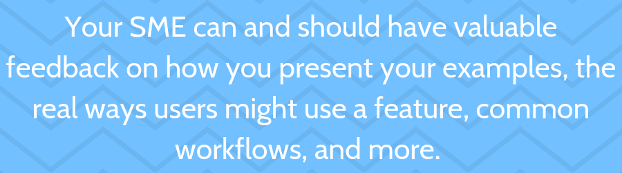
9. Welcome your SME’s feedback
One of the most common mistakes content creators make when enlisting the help of an SME is not enlisting their feedback as the project moves on. Your SME is more than just an encyclopedia of knowledge about the subject. Your SME can and should have valuable feedback on how you present your examples, the real ways users might use a feature, common workflows, and more. As you create your scripts, storyboards, and video content, make sure your SME has a chance to review and offer help that might end up saving you tons of time down the road.
10. Acknowledge their effort
It feels great to create a good piece of content and be recognized for your achievement. Getting kudos from your boss or hearing a customer or coworker tell you the video really helped them can make your day.
The same goes for your SME!
Make sure they understand how much you appreciate their help and, when the kudos come to you for the video you created, make sure you tell your boss, colleagues, and coworkers how invaluable your SME’s help was. At the very least, make sure their boss knows that they did a great job.
Common pitfalls and how to avoid them
Sometimes, all the planning, preparing, goal-setting, and listening in the world isn’t enough to get things going in the right direction. But, that doesn’t mean your video project is doomed! Here are a few common issues that can arise when working with SMEs and how you might avoid them.
Your SME is a “talker”
The best SMEs are great communicators. They understand what you need and have relevant answers to your questions. They can elaborate and give pertinent details, and make good, succinct points that are easy to follow.
On the other hand, there are the “talkers.” We all know someone like this. They have a LOT to say, and not all of it (or even much of it) is relevant to the topic or task at hand. They go off on tangents and forget what they were originally trying to say, or seemingly have no regard for their time or yours. It’s not ill-intended! They’re probably even a great person. But they’re definitely not helping you finish your video
Your best defense against a talker is to come prepared with a list of very specific questions. Remember the closed-ended questions we highlighted earlier? They can be a great way to keep someone focused and you in control of the conversation.
Another way to keep someone on topic is to submit questions to them before a meeting and have them respond via email or on a collaborative document. That way you ensure you get your most relevant questions answered up front. Then, any face-to-face meetings can be more follow-up and clarification oriented.
Your SME is not a talker
On the other hand, some SMEs have all kinds of knowledge, but seem loathe to actually share it with anyone.
There may be a variety of reasons for this. Some people are just more introverted than others and may not feel comfortable speaking with someone they’re not super-familiar with. Other people are — let’s face it — just plain old anti-social.
Whatever the reason, getting information from someone like this doesn’t have to be like pulling teeth.
Thinking about journalists again, most good reporters know that getting more information from someone who seems unwilling to cooperate can be as simple as staying silent. Even non-talkers get more uncomfortable the longer an awkward silence goes on. At some point, they may get so uncomfortable that they just start talking to fill the silence. Then you can use your questions to get at the real knowledge.
Also, like with the talkers, you might have more luck by sending a list of questions and asking for answers before any face-to-face meetings. Even bullet points would help. Make sure your questions are pointed and get to the heart of what you need to know to make sure they can answer them without too much effort.
As a last resort, if your SME just isn’t giving you the information you need, work with your boss or another colleague to identify someone else in your organization who might be a better fit. Keep this in mind the next time you have need of an SME so that you don’t have the same problem again.
Too much knowledge is too much
Sometimes a SME has so much expertise it can be hard to find the most relevant information for the task at hand. They have so much to share that it can strain the scope of your current video and threatens to balloon the viewing time beyond what’s reasonable.
In cases like this, setting goals and expectations and having a shared understanding of the project scope at the outset helps keep things focused and on target.
Make sure your SME understands the purpose of this particular piece of video content and why it’s important. Be upfront with what you need and why you need it. An outline of your video can be helpful in maintaining focus, as well.
On the other hand, don’t be afraid to listen to your SME when they have a valid reason for providing more information than was requested. Maybe your original video scope won’t accurately or completely answer the problem at hand. Perhaps there is different or additional content that will make more sense to present.
Listen to their perspective and be prepared to change if there’s good reason to. Keep in mind that changing project scope may need permission from a supervisor or the person who requested the project.
Your SME wants to take a stab at the content
While this is more common with written content, for video creators, there will be times when your SME just wants to take the reins and create some of the content themselves. While they likely won’t want to actually make your video, they may want to write the script, work on the storyboard, or take over on another aspect of the pre-video planning.
Handle this on a case-by-case basis. If you have a good working relationship with your SME and you’re confident in their content abilities, this can actually work out well. As the SMEs, they can go a long way in creating — at the very least — a good place to start.
On the other hand, if you’re new to working with this SME, or you’re not confident that this kind of “help” will actually be helpful, it’s better to push back. There are a number of ways to do that without hurting feelings.
For example, thank them for the suggestion, but let them know that you’re relishing the opportunity to really learn from them, so it will be more helpful for you to get the information and boil it down to the most salient points.
Or, remind them of the expectations and roles you set at the beginning of the project.
Finally, you can compromise and ask them to put together an outline to help shape the content.
No matter what, make sure they understand you appreciate all their effort and you’re happy to be working with them.
Put it all together
Working with SMEs can mean the difference between a good video and a great one. Pulling together the most relevant and accurate information ensures that your viewers get exactly what they need. Whether you work with one SME or several, follow the tips in this guide to ensure your working relationships and projects are the absolute best they can be.
10 quick tips for great SME content
Simply the language: Your SME probably knows all kinds of technical terms, acronyms, and jargon that — unless they’re experts themselves — may be unfamiliar to your users or customers. Be sure to create your content to a level makes it easier to understand.
Start from the beginning: Remember, before someone starts using that nifty new software feature, they have to log in. Did you include all of the steps, even if they seem obvious to you or your SME?
Don’t be afraid to ask for help: Clarify what you don’t understand!
Take it slow: While you don’t want to waste your SME’s time, be sure to take the time you need to truly understand what you have to explain in your video to avoid unnecessary follow-ups.
Explore the “what-ifs”: What happens if the customer clicks this button? What would happen if this system failed? What would a customer do if this happened?
Explore the “whys”: Why does this happen? Why would a customer need to do this? Why is this a best practice?
Ask follow-up questions: Why is that? Can you tell me more about how this happens?
Ask the SME if they have anything to add: You never know what insights they may provide!
Let them give you their background story: While it may not be pertinent to the discussion at hand, it helps build rapport by showing you care about more than just what they can give you. And, you never know, you may end up learning something more useful than you thought!
Come prepared, but don’t be afraid to deviate from your plan: Create a list of questions you need to be answered, but follow relevant answers down paths you may not have foreseen. You can gain valuable insights both for you and — ultimately — your video viewers.
Looking for more information on what it takes to create great videos? TechSmith Academy is a free resource for helping you take your videos to the next level.
Ryan Knott is a Marketing Content Strategist at TechSmith, where he creates content about easy, effective, and efficient video creation, editing, and tips and tricks, as well as audio editing for creators of all kinds. He/him.
Tutorial videos are a powerful way to provide support for your coworkers or customers. They’re highly adaptable to your needs and offer a ton of benefits compared to text-based tutorials and help content.
In 2011, Carl Knerr was the Services Director at Avaya when he and his team found themselves asking, “Wouldn’t Avaya employees and customers benefit from the company’s own Khan Academy?” Making a library of tutorials may seem daunting, but using these five steps, they were able to create nearly a thousand YouTube videos.
https://youtu.be/qy7lqLWF9hE
After 20 months, Knerr and his team published nearly 1,000 videos on YouTube which were watched more than 350,000 times. Customers, employees, and partners from 196 distinct geographies watched more than 1,200 hours of Avaya Mentor videos per month.
In this guide, we’ll take a look at the five steps to create a tutorial video and learn the wisdom Avaya gained through the process.
Ready to get started?
Record professional videos with Camtasia
Camtasia’s features make video recording and editing super easy
Creating an impactful tutorial video starts with a well-thought-out plan. Identify your audience and what they need to know. What are the key takeaways you want your audience to have? Where will they be watching your video?
Things to consider while planning:
Your objectives for tutorial content
The needs and interests of your audience
The amount of time and resources you can dedicate
This is also a good time to think about the scope of your video series. Will you need 10 videos or a thousand?
You’ll also want to think about what type of videos you’ll need. Software videos will likely need screen recording aspects, for example, which will influence what kind of video editing software you choose.
Plus, by deciding the exact type of videos you want to make early on, it’s easy to create simple templates which help you and your team collaborate more effectively.
Step two: gather your tools
The quality of your tutorial video heavily depends on the tools you use. You’ll need some kind of video editing software and recording tools. Camtasia was a great option for Avaya as the team needed a solution that could both record their screen content and offer robust video editing.
With Camtasia, they could add their video and audio directly to the templates, and easily highlight or zoom to certain parts of the screen. The team also purchased high-quality microphones.
Avaya used Camtasia and Blue Yeti microphones to create their Youtube training videos.
Select the right software ー this can vary depending on your project.
Gather your recording equipment ー which may include cameras, screen recording software, microphones, or anything else you might need.
Knerr felt it was important to maintain a common look and feel to the videos, so the team built a template for Camtasia with legal and branding-approved intros and outros. They even built in other aspects like transitions and video length, making editing a breeze later on.
Step three: select relevant topics and bring your video to life
The topics you choose should cater to the needs of your audience. Check with your technical support or customer care teams. What questions do customers frequently ask? What common issues or complaints do they have that you can address with a tutorial video?
The best time to conduct keyword research (especially if you’re posting on a platform like YouTube) is right after you identify core needs of your audience. Consider alternative terms and wordings for your title, description, and video tags. Search for what currently exists! Using relevant keywords make it easier for people to find your video later on.
Also begin to consider things like the emotional state of your audience. Are they frustrated by an issue or excited to learn about a new feature? The more relevant your content is, the more engaged your audience will be.
Scripting your video
Once you’ve decided on some relevant topics, you’ll need a script for your video. Again, this can vary based on the video you’re creating. Sometimes, a few bullet points will work. But if you’re wondering how to write a script for your videos, we’ve got you covered!
Audiate can also generate and record a script for you. Simply add the main points you want to cover and select options related to style and tone and click “generate script.” Make edits as desired, then click “record script”
Accessibility is also important. Since you already have a transcript, adding captions to your video is as easy as uploading the script to YouTube along with your video. Or if you want to add captions to your video directly, Camtasia + Audiate makes it easy to add captions to your videos. Captions will make your content more accessible, and they are additionally used by video sites like YouTube for content-indexing to improve search results.
Recording and reviewing your tutorial
Screen recording and adding footage to the template is simple in Camtasia, which made it easy for Knerr’s team to create a large number of videos. Even better, the videos all had a consistent style and theme without much editing. The review e
The main issue he encountered with the videos was background noise. Today, Camtasia has an audio effect called Remove Noise which would have been super useful back then! Simply drag the remove noise effect from the audio effects tab to your audio track.
Once the video has been recorded and reviewed, you just need to write some of the surrounding content:
Write a clear video title: Your title should clearly state the problem that your video is solving, how it is presented, and the product it applies to.
Create a detailed description: Craft a description that carefully outlines the content and key learning points of your video. The first paragraph of your description should contain relevant keywords.
Tag your video: Pick your target keyword as a tag, and then choose other tags related to your primary keyword.
Add captions: Captions will make your content accessible to anyone with hearing impairments. Also, captions are used by video sites like YouTube for content-indexing to improve search results.
Including relevant keywords in your titles, tags, and descriptions are important for creating findable content. Once you’ve created these items, it’s time to start sharing!
Step four: share with your customers
Once your video is polished and ready, it’s time to share it with the world. YouTube is a fantastic platform for reaching a wide audience, but there are many others.
Choosing the right platform: While YouTube is a popular choice, also consider other platforms where your audience is active. This could be a learning management system (LMS) if you’re creating content for higher education, or a cloud-based platform like Screencast for easy sharing with specific people.
SEO Optimization: Use relevant keywords in your video title and description to make them easily discoverable.
You want to really think about where people are viewing your content. Depending on your audience it could be helpful to embed the videos on your website, share them through social media, or include them in your email newsletters.
Step five: interpret results
After your videos are live, keep an eye on how they’re performing. It can be helpful to track views, but some platforms like YouTube even allow you to view watch time and engagement for your video! Watch time is super helpful because it can tell you if a certain moment in the video is causing people to leave.
If you identify one of these areas in your tutorial videos, go back to the template and make some changes for your next video. The goal is constant improvement here, not perfection!
The way you handle feedback is invaluable for understanding what content works for your audience and how you can improve your future videos.
How Avaya used this process to create nearly 1000 training videos for YouTube
Since many different people would be helping make these tutorial videos, Knerr felt it was important to maintain a common look and feel. The team built a template for Camtasia with legal and branding-approved intros and outros. The team also built other aspects into their template, like transitions and video length.
To reduce the number of errors made by video authors, Knerr frequently shared a list of common problems he encountered during a review. While the review process was a bit grading, viewers noticed and complemented Knerr’s team on the quality of their videos.
“I felt it important to delay the initial announcement until we had the first 100 videos published. I was concerned if someone came to the site and only saw 5 videos, they might never return.”
– Carl Knerr
But delaying the announcement was just the beginning. Once the team reached 100 videos, Knerr had the President of Services announce the program internally, followed by similar announcements in external communications to Avaya partners and customers. To reinforce this in a more detailed way, Knerr wrote a blog post for the Avaya corporate site and created a Twitter account for Avaya Mentor, allowing people to receive tweets when new videos are uploaded.
Want to make instructional videos for YouTube?
If you’re interested in learning more about creating your own videos for YouTube, we have two helpful guides that will walk you through the entire process.
Ryan Knott is a Marketing Content Strategist at TechSmith, where he creates content about easy, effective, and efficient video creation, editing, and tips and tricks, as well as audio editing for creators of all kinds. He/him.
It can be tempting to just skip the screenshots and avoid making videos when it comes to user documents and other content.
But when you create visual content, you make content that matters.
In this video, Daniel Foster shares how easy it can be to add visuals to your documentation or training content, even if you don’t think you have the skills or time.
Video transcription
Hi. I’m Daniel Foster. I work at TechSmith, and I want to share today with you some ideas, that I’ve been sharing, with a lot of groups around the country and even internationally.
First off, who is TechSmith? So, we’re the makers of Snagit and Camtasia. And these are tools for creating images, GIFs, and videos.
And if you’re in Technical Communication as a field you’re probably already familiar with these products.
Content Wrangler, which does a, a benchmarking survey every couple of years, recently, showed that Snagit’s number one and Camtasia’s number eight among all the software tools that Technical Communicators have in their toolbox.
And, one of the things I get to do, as a Strategy Lead, is to help set the direction for Snagit. And so to do that I’m walking to a lot of practitioners, a lot of folks that are actually in the trenches making content. And one of the themes that I hear a lot is that even though the tools and, the ability to make visuals has gotten more and more accessible to more people, they still struggle on their teams with this tension between text-only content or visuals.
And so it ends up sometimes looking like this wall of text. And why is that? Well, that’s because there’s a perception that it’s much easier to just create, and localize, and update, and maintain text-only documents.
And I want to say to you today don’t settle. We don’t have to settle for that because I think there’s a way out of this tension and that’s I want to talk about today. So, really there are two main takeaways, that I want to leave you with after we walk through this content.
And the first is that visuals do matter, and I’m gonna share some original research that we did that helps establish that fact.
And, second, I want to give you some ideas and inspiration for how you can get creative to, to escape this tension between, “Yeah, I wanna have visuals in my content, but it’s expensive and difficult to do. Is there a solution?” And I want to talk about one potential solution and kind of a creative approach that we’re seeing out there that Technical Communicators are adopting.
Record professional videos with Camtasia
Camtasia’s features make video recording and editing super easy
So, first off, you know, this is totally a fair question to ask, is do visuals even matter? Does it matter if my content is just text or if it contains these visual elements?
Well, we felt like there wasn’t really a great answer out there. There wasn’t a lot of good research on this that felt credible. And so what we did is we hired an independent firm to tackle this in a research project so that we could answer that question.
And, we really gave them the reins of objectivity. We just said, “Hey, you know, we’re going pay for this, we have some input about how it’s structured, but really the outcomes are up to you. You know, we’re not going dictate what you find.”
And so we took a risk that the results could be different than what they were. But let me talk about what the project was and a little bit about the three big findings.
So, before I get to the findings though, I’ll just give you a quick outline of the methodology.
So, we kind of had three stages to the, to the research. One was about preference, what did people prefer. So, opinion poll, a pretty broad opinion poll that was global in scope.
And the next stage was actually going into a lab and, and an observation experiment, having people perform different tasks, and then seeing their time on task and how efficient and effective they were.
And then the third was some economic modeling to see what would that look like, in terms of economic indicators and significance.
So, with the first section what we really found is that people do have a marked preference for visuals in their communication and in the technical things that they use to learn new technologies or new processes at work. But most workplaces actually fail at delivering this.
A lot of the content is just sort of a wall of text. And, so, particularly among Millennials this was a very marked preference that folks really preferred to have images, videos, even animated GIFs in their content rather than text only.
And Millennials are, you know, a growing percentage of your coworkers, your colleagues, and your customers, which is really important.
So, they’re not just a small group at this stage anymore. Millennials are really the dominant group in the workforce and becoming more so.
And so let me think about, why this preference matters. Oh, and actually this, this slide shows that preference actually extends beyond Millennials.
So, there it is in the broader workplace population as well, people have a marked preference for video and, and images.
But why does this matter?
Well, to your customers, if you think about it, your audience or your customer has choices. And so they can Google and find other content that’s not your content to answer their questions. And if what comes up in those Google results is videos from some third-party or just somebody who thinks they know your product, maybe it’s quality, maybe it’s accurate, maybe it’s not.
So you kind of lose control and you’re not really in that conversation at that point.
Also, there’s a perception issue, right?
So, if people have a marked preference for visual content and they’re not finding that content from your brand it kind of reflects poorly on your brand, right? Your brand ends up looking a little bit stale or obsolete and unengaging in ways that you don’t want to have that reflection or shade on your brand.
Do visuals actually help people perform tasks better?
So, the second main finding from our research was, that, that visuals actually help people perform tasks better. And so, we did an observational study and so we had people perform various technical tasks. We’ll link to the full study, so you can kind of dig in and see all the research yourself.
But, what we found is that there was an important, significant, increase in the ability to complete these tasks when people, had visuals in their content. So, about 7% was kinda the lift there. And, people also felt like they could remember the task’s, instructions better if they had more visual, content to them.
So, after they walk away that means that they’re not having to ask again or search again or, contact your support center again to remember how to do this.
Retention is important.
And, finally, task completion. Just being able to literally, complete the task accurately. There was a good lift that we found there, too.
So, just to recap, it’s important to include visuals for these two reasons that we’ve talked about:
One, preference
And, two, execution of tasks.
People are actually more effective at, at technical tasks when they have some visual support in there.
Can using visuals gain productivity?
And then, third, we kind of wanted to do an economic modeling exercise. So, the third part of the research was actually taking some of these productivity outcomes and saying, “What happens if you model those out economically using things like GDP and productivity numbers?”
So, what would that mean to companies, in terms of gained productivity? When we looked at the numbers you say, okay, well people pick up maybe six minutes a day if they have visuals in their content and they’re able to execute their tasks more efficiently.
And then you multiply that out to a week, it’s about 33 minutes per week, or over the course of a full year, it’s something like 25 hours.
All of that just to say that these kinds of things do matter. Right? They matter to your business and they matter to your customers and how effective they can do the kind of jobs that they’re trying to do.
And this was a great summary quote from the actual researcher who did this project for us, and really it’s pointing out that this is not going away.
This is a trend. There’s going be more expectation by people and more demand for visual content because all the rest of the information and content that they’re consuming elsewhere is visual. So, that’s just the way things are going. And it’s not likely to reverse.
How to hack your technical communication with visuals
So, all that to say visuals matter, right? And we’ve talked about that from a preference, from an actual, task efficiency standpoint, and then from the economic factors.
But in reality, a lot of us have a lot of challenges as Technical Communicators.
And these are things like how do I update my visuals in my content every time my UI changes? So, for many people, the product or service that they work on might ship updates frequently, you know, a few times a year, maybe even a few times a week. So, that can create a lot of, challenge with churn.
Maybe you localize your content into multiple languages and that can be a challenge when you think about the visual component. Maybe you have to support many different versions or platforms. And so that puts stress on content teams.
Maybe your UI of your product is just, it feels clunky, not modern. It’s just not beautiful and it comes across as kind of an eye chart when you put it in your documentation.
And then there are these niche problems that we’ll hear about like, “I have a cloud product I support and unfortunately I can’t easily get at a dummy instance with dummy data that’s already populated to make it look real, to make it look like it’s the real live instance.”
So, as Technical Communicators you may encounter some of these problems and, one of the things that I love doing is, is looking across different domains and different, disciplines and saying, “How are other people solving these problems?”
A few years ago I started seeing a lot of content that looks kind of like this, so it’s basically wireframe-looking-content and usually, it came from marketers. And, it would be sort of a suggestion or an abstracted version of a screenshot that would be in some of this marketing material.
So, it started to make me think about why are they doing this? What’s the benefit of that? Besides being eye-catching, is there some other benefit there?
And then you started to see this kind of content, this simplified graphic, also works its way into things like in-product onboarding, the little animations or the static images that show up in a product that is explaining some of the functionality or the how-to or in What’s New content, or in, release notes.
Then we’d see it work its way into documentation. So, this example is from Google, and you can see here that they have the exact same images in their English, French, and Japanese articles.
And, of course, they support like 20 other languages, so it’s in those as well. So, it’s kind of like what’s going on here? Why are folks doing this and what is this trend? We cast about for what, an established name would be for this, because it’s easier to talk about something if, you know, if it has a name and, there wasn’t really an established name. So, we coined the term, simplified user interface or SUI for short. It’s also really fun to say SUI.
But it’s really this idea that you’ve abstracted out any irrelevant or distracting details from an image and what you’ve left is the key, important pieces.
And so this is what that can look like, here’s a quick before and after. So, what you see on the left is just a screenshot of a service that I use called Calendly. It’s really great for scheduling customer calls. But anyway, the interface, you can see that a typical screenshot you’d have all the detail.
And then on the other side what you see is this SUI-fied or, or simplified treatment where you’ve really abstracted out a lot of that detail. And, and you might think, “Well, can people actually recognize what the product or interface is?” It turns out you can.
So, if you look at this one it’s pretty obvious what this is when you, when you stop and think about it a second.
This is Finder or Explorer, on Mac and Windows.
And, here’s another example, which is YouTube, right?
You can kinda look at it and see right away like, “Oh yeah, that’s YouTube”, even though there’s no text and everything is very abstracted.
And one more example, this is one we spend a lot of our time in day-to-day and, of course, it’s Outlook.
Right?
So, you kind of can get the sense from the layout and from the basic colors of what, what that original interface was.
Can simplified graphics work in technical communication?
So, great, that’s good, but then as a Technical Communicator you’re probably asking yourself, “Okay, but I still need people to follow steps. Like, the point of the graphics is not just to look pretty, but it’s to show you where in the interface to click. So, where is the value for a Technical Communicator?”
So, let’s take another example.
This one is a very just typical menu, and what you’ll see here is that when you step back and really look at it with fresh eyes there’s a bunch of stuff in here that’s not important for showing the two steps, which is ‘click file, click connect mobile device.’
That’s really the point of this graphic and yet there’s a ton of extraneous information.
So let’s abstract that out and you can see how much easier it is to really just follow along and say, “Oh, file, connect mobile device. That’s the two main things I need to know. Got it right there. Very visual. Very front and center.”
Of course, you’re going to want to pair that with some text.
And the text on the side is gonna say, you know, “Here are the steps”, and a little bit of context, but when you pair those together, this simplified graphic and that text, it’s a very powerful way to convey the information.
So, what we just saw is that this simplified graphic approach actually helps focus the viewer’s attention on what’s most important, which boosts your content effectiveness, but it has some nice side benefits for technical teams as well.
Future-proof your content
So, one is that it’s gonna help future-proof your content. Right? So, every time your interface changes, small changes to the interface, incremental things that happen on an ongoing basis, you don’t have to go back and revise all of your screenshots again. Because a lot of that detail has been abstracted out. So, there’s a big cost savings there.
Scale localization
Localization, if you localize, you may be able to get away with having a little bit of English. I’ve been seeing this, more and more brands they do this, there’s some English in their screenshots in their localized content because they’ve abstracted out a lot of the text and what’s left is just the key elements.
And you know your audience. If your audience is okay with that, that can be a great way to save some dollars on localizing your images.
Hide personally identifiable information of customers
And then, we kind of hinted at this, if you are in a regulated industry or dealing with, PII, personally identifiable information of customers, it’s a great way to sort of hide that and make sure that your screenshot doesn’t look sort of hacked up. You know? It’s not like black boxes or blur that looks so mysterious, but it looks good and it can save you from getting customer information out there in the wild when you shouldn’t.
How are top brands using simplified graphics?
So, let me just run through a couple of quick examples. These are some different, brands that you recognize or maybe you don’t recognize, but, brands you probably recognize and how they’re using this technique in some of their own content.
So, this one is from, Microsoft.
They recently launched this whole set of great tips for Microsoft Edge browser. And what you notice is that the animation on the top is completely simplified.
There’s no text in it at all. And all the text is editable text that’s around it, so it’s much easier to localize that, but the animation itself has no text, so that it doesn’t have to be localized.
Now, they went all in. It might not work for you. You could even look at this and say maybe they went a little too far, that it’s a little hard to follow, but you can see the savings right away and not having to localize those for every language.
And this example is from Google.
They recently, put a lot of content out around the G Suite, Google Suite, and if you look at particularly in the Getting Started series, getting started with Slides, getting started with Drive, you’ll find that there are these really nice simplified graphics that show up in amongst the content.
Dropbox, this example is a Spanish web page, but it’s on the English site as well, and I expect it’s on every language.
These little animations that just show you an overview of a concept, right? And it’s all simplified. Again, they can use that one graphic or animation across all of their content and languages.
Procore, this is a group that some of their folks are in our, SUI community. We have a Slack community, with people that are trying to implement this approach to graphics. And, one of their members, one of their team members shared this example from their own documentation.
And you can just see it’s, you know, it’s text and then you have this, graphic that everything, has simplified down and it looks really nice.
Another one from Blackbaud, also a member of our, SUI community in, in Slack, and this is just getting at this challenge of a blank slate.
When you come into their product it would be all blank, so how do we get people going and get them kind of over the learning curve.
So, they created these little animations, again, using this simplified approach.
Our own content, so as TechSmith, we, we do this as well.
So, we have Snagit on Windows and on Mac platforms. So, with being multi-platform, of course, those menus aren’t always gonna be identical.
And so what you see here is how the menus, look different on, on Windows and Mac, and that’s okay, but in your documentation you just want to show one representation of that and not have to worry about the differences and also, not have to update those menu items every time those two menus might change, items or wording or, or items come in and out of those menus.
So, again, future-proofing and helping with, supporting multiple platforms.
We’ll take a quick look at this one. This is actually in the Camtasia product.
So, when someone opens Camtasia for the first time, again, instead of an empty state we actually have a project on the timeline that, that kind of walks them through a high-level overview of the interface and some of the key functionality.
So, I’ll let this play, and it does have some audio, and notice how much we’ve abstracted here.
“Right now, you’re in the Camtasia Editor. The editor is made up of the timeline, where you can arrange and edit your clips, the canvas, which is your video preview, and the tools panel where your media’s stored, along with shapes, animations, effects, and more. At the top of the tools panel, there’s a button to launch the Camtasia recorder, a tool that captures all of the action on your computer screen.”
So, you know, we just have a voice that’s kind of narrating through and saying, “Here’s what you’re seeing.” And, again, it’s really abstract. It’s very high level to say, “Here are the parts of the application and here’s like one key workflow to get started with, recording.
And I want to point out in that workflow, and you’ll see it visually, illustrated here, is we’ve really been aggressive with how much, detail we’ve pulled out of the interface for this video. And we’re just showing you the real key details, where is that record button and where is the start recording button.
And a lot of the other stuff we’ve done the favor to the user of removing that for the moment so that we can focus their attention on what’s most important.
Can I make simplified graphics?
All right, so you might be thinking, “Cool, how do I actually do this?”
I’m not going go into right now all the detail on how to do this. We have some great tutorial content on our site, and show you how to create these graphics, but let me just start by giving you a few kinds of high-level guidelines or design principles.
What colors should I use in my graphics?
So, the first one here, and I’ll use this example again, is thinking about color. So, color is really important to this simplified graphic or SUI approach because color is what helps people see that it is, indeed, the same interface that they’re used to.
So, using those complementary colors, the colors that are kind of similar to whatever the original interface had, but then being strategic about things that aren’t important. Don’t need to see the foreground? Use less contrast.
Even maybe reduce the opacity and sort of make that text or make those elements kinda fade into the background. And then use contrast, higher contrast areas to either mark certain areas.
You can still put a square box or an arrow on something. Use your high contrast colors for that, but also any areas that you want to have more focus on and more attention on, use contrast deliberately there.
How much simplification should I use?
And then the second kind of high-level principle, how much simplification to do.
And we’ve seen in these examples that I’ve already showed, we’ve seen a whole range, but mainly I would say play around with it.
Don’t be afraid to simplify more than you think. So, if there are four lines of text in your interface you don’t have to put four boxes to represent those four lines. Maybe two is okay because that just helps just reduce the amount of visual clutter.
But at the same time what you wanna leave are certain anchor points.
So, branding is a great anchor point, like what’s your logo, maybe the top-level nav … in this example, I’ve got the top-level nav still visible as text.
And then, of course, your focal area, whatever it is that you want people to interact with and, and learn those steps, keep that, unsimplified, and, literal.
Two ways to create simplified graphics
There are two main ways that you can go about creating this SUI effect, or simplified graphics, and one is to, to take a very, manual approach and the other is an automated approach.
Let’s just talk briefly about each of those.
Manual
So, if you have a tool at your disposal like Gimp or maybe Illustrator, or something else, some folks do, and they know how to use those, what you’ll do is you’ll use like a rectangle tool, choose your colors, think about the palate of colors in advance, and then this animation just kind of shows how you would go about drawing out all those little rectangles.
And, you’re going to choose a different color for each kind of different focal area and top-level sort of hierarchy. Then you’re gonna have to line all those up.
So, it gets a little fiddly.
It can take some time. I would plan to spend some hours if you’re doing this manually because it’s going to take a little while.
Automatic
And then what we’ve done is we’ve actually built tools for this into Snagit 2019 because we believe that it’s such a valuable, useful kind of approach, so we’ve put some dedicated tools in.
The tool is called Simplify if you’re using Snagit 2019. You can use this functionality and try it out on your own.
And so basically you’re flipping a switch to turn on auto simplify.
We have algorithms that will read all of the different regions of your screenshot, find the objects in the text, and then cover everything over with the appropriate shapes.
And, of course, you can go in and manually, remove some of those in order to reveal some certain areas that you want to have unsimplified. And then you can also change the colors, like shift the palate a little bit, if the algorithm didn’t get it quite right or move some things around, so a lot of flexibility there that you can kind of tweak it and make it perfect for you.
How can I make a simplified animation?
And then I’m not going to go into full detail here either on how to do these animations, but I showed examples, and I don’t want just tease you.
How could you go about taking this simplified approach and put it in an animated context?
So, very high level, this is an example. And I’ll show you how you would make this example in a product like Camtasia or another video editor.
Let’s walk through this. So, first off, you start with each of the screens, right? So, you’re going to get a capture of each screen as a still image and you’re gonna simplify it.
Use Snagit, use Illustrator, whatever. And then once it’s simplified you’re going to then think about what’s like appearing on top.
So, in this case it’s a dialogue that appears on top. And then you have your mouse cursor that’s moving around. So, those are the elements that you’re going put into a multi-track editor.
Camtasia would be great for this. You could also use Premiere or whatever else you might have at your disposal as a multi-track editor.
So, you bring all those objects down. You start with the simplified, screenshots as the base layer. This is sort of what’s most distant from the viewer, right, it’s on the bottom of the video, so to speak.
And then you’ve put all those in and given them the right duration. Then you put your dialogue on top. So, this is where you’re going to want to have anything that appears like a menu item, or else that appears on top, you put that on one layer up.
And then on the top of cake here, you’re going have your cursor and the way you make it look like it’s moving around. You just add animation points.
So, in Camtasia you can do this and it’ll look something like what you see on your screen here with these animation points that are each put in. And basically it’s saying start here, end here, and at this point in time the cursor is one location, at that point in time it’s another location, animate it.
What we’ve done to really kind of pull this off as a simulation is to dip the mouse cursor and just make it a little bit smaller and then back to normal size each time there’s a click.
So, just to put it all together at the end here, you can see that the mouse is moving and each time it gets to a point where the screen changes the mouse dips a little bit, the dialogue comes on at the end, and this is kind of how all the parts come together.
It takes a little bit of planning to pull those assets together and then put them together in an editor, but this animation can be used and reused.
It’s very future proof, and it’s a great way to help people get an overview for a little process or a feature in your product.
Summary
So, let’s just recap the whole information here that we’ve talked about today.
Basically, we talked a lot about why visuals matter and that is because of preference. People really prefer to have visuals in their content. It actually helps them to learn and do more effectively.
And then to think about the economic outcomes of that and how that can help your customers or your colleagues.
And then finally, we also looked a creative approach. So, SUI is one approach to how you can actually bring down the cost and make more attainable this visual approach to content. It really helps with future-proofing your content, it helps with localization, and, it’s something that you probably want to experiment with and see where you could start introducing this in some of your content.
And if you want help and want some more thoughts on how to do this, reach out to us. We’d love to help walk you through it and connect you with a community of other people who are doing the same thing.
Record professional videos with Camtasia
Camtasia’s features make video recording and editing super easy
DFCU Financial employees needed to capture their screens as part of a company-wide push for process documentation.
Employees found free operating system tools cumbersome and lacking required features, so DFCU Financial purchased TechSmith Snagit.
Snagit now helps employees process information faster and with a professional polish that meets the high-quality expectations maintained by DFCU Financial.
Giving employees the right tools for the job
DFCU Financial employees needed to capture their screens as part of a company-wide push for process documentation. However, they found that free system tools hindered productivity and turned to TechSmith for help.
DFCU Financial upgrades to Snagit after free tools become a hindrance to business
Founded in 1950, DFCU Financial began with a group of Ford engineering employees.
Today, DFCU Financial is the largest credit union in Michigan and one of the best managed financial institutions across the United States.
With 24 branches across Michigan, teams at DFCU Financial needed a way to establish and standardize procedures across departments and branches. So, they began to document procedures with Snagit.
The Problem
As with any financial institution, efficiency and user documentation are essential. So, when DFCU Financial decided to overhaul their documentation processes to better accommodate their growing departments, they naturally turned to screen capturing software.
“Part of our IT strategy is to first try to use the tools included in our operating system,” said Vanessa Dinn, IT project manager at DFCU Financial. “When we upgraded to a newer version of Windows, we started using the screen capture tool built into our operating system, which allowed us to capture a screen. But that was basically all it did.”
“We tried annotating screen captures with the free operating system tool,” said Vanessa. “But the results always looked choppy and unprofessional. We needed a tool that was quick but provided a clean look.”
While Vanessa was struggling to create high-quality images for the DFCU Financial IT knowledgebase, tellers at branches across the state were also struggling with the limitations of the built-in tools.
At the end of the day, tellers are required to capture closing totals and record any discrepancies. Their core banking system did not offer an easy way to do so. Using the built-in tools took multiple steps and made the process much more complicated than it needed to be.
After assessing the limitations of the screen capture tools on hand, Vanessa set out to find a tool that would meet the needs of employees across the company without breaking the bank.
The Solution
In her search, Vanessa came across Snagit by TechSmith. With Snagit, she was able to quickly capture, annotate and share her screen with a clean, professional look.
“Features like the all-in-one capture, the blur tool, and the Snagit library make it much faster and easier for us to share information around the company,” said Vanessa. “I use Snagit on a daily basis. It’s like a bookmark for my work.”
For tellers, Snagit makes capturing end-of-day totals from their workstations far more simple. All tellers have to do is capture the screen with Snagit and print.
“With the free tool, we had to save the image to the desktop and print it with the Windows Image Viewer, which added a number of unnecessary steps,” said Vanessa.
Other departments also struggled with emailing screen captures. With Snagit, all they have to do is capture the screen and paste the information directly into an email for documentation purposes—without having to worry about attachments.
According to Vanessa, “Snagit sits right within the company’s Lotus Notes client environment, so when we include images in our email, it goes directly within the email.”
Use screenshots and videos across your entire team, department, or company. Learn More
The Results
Vanessa is now able to create clear, concise manuals for the company’s IT knowledge base. Rather than drawing annotations by hand, Vanessa is able to use the Snagit editor to quickly modify any screen capture while maintaining the professional look she expects her work to have.
With Snagit, the documentation process for tellers is much more streamlined and stress-free. The simplified process has also decreased the number of helpdesk support calls from tellers.
DFCU Financial has ranked in the top 10 financial services organizations for financial performance among peer credit unions across the nation for more than 10 consecutive years. They continue to push for documentation across the organization to maintain their excellent standings. Beyond Vanessa’s department, employees in accounting, finance, marketing and more are also capturing their knowledge to share with others.
“In addition to everyday processes, we also have to document processes to answer the tough questions,” said Vanessa. “How do we document the knowledge of our most experienced staff if they retire? What do we do if there’s a disaster? Snagit allows us to document answers to those questions.”
DFCU Financial is now able to document processes and knowledge in a clean, easy and professional way. With the help of Snagit, Vanessa and her colleagues are able to document and maintain the excellence for which DFCU Financial is known.
If you’re tired of the limitations of free screen capture tools, we’d love for you to give Snagit a try. It’s free for 30 days.
In June 2019, Mary Meeker released her annual report on internet trends. This year’s report included substantial discussion on the sharp rise in the use of visuals and images in online content.
Meeker’s report stated the number of internet users to be 3.8 billion, which is more than half of the world’s population.
That is a lot of internet usage — and those users seem to be creating and sharing more images and video than ever before.
This isn’t surprising! Recent research by TechSmith showed that video and visual content is more engaging and helps people retain information faster and better. In fact, businesses can see HUGE increases in productivity just by adding more visual and video content to their workplace communications.
So we asked TechSmith’s Vice President of Product Strategy Tony Dunckel, General Manager of Camtasia Troy Stein, Snagit Strategy Lead Daniel Foster, and Camtasia Technical Product Manager Brooks Andrus for their thoughts on why people are sharing more images and video, and what this means for businesses.
Here’s what they had to say:
The below is a transcript of the interviews:
Why do you think people are sharing more images and video?
“Why are images and video increasing in importance? I think this has been a natural progression. The human brain has a vast visual GPU that processes signals like crazy, and so we are naturally drawn to it.” – Camtasia Technical Product Manager Brooks Andrus
“Images are just becoming saturated in all our media we consume and that people create. The way to produce images has become much cheaper and easier and more accessible, where as a few years ago it was sort of something that the few would engage in. Now its really become mainstream.” – Snagit Strategy Lead Daniel Foster
“We are visual learners, so those types of iconic ways of communicating gives us a level of depth and richness that words alone just simply can’t express.” – Vice President of Product Strategy Tony Dunckel
“The fact that in 2019, people are using more images and videos when they communicate — its a natural evolution and it’s going to continue. There’s going to be fewer words and more images in the future because images are concise, tight and vibrant, and they accelerate the transfer of knowledge.” – General Manager of Camtasia Troy Stein
2019 Internet Trends Report- slide 72
Meeker’s report shows more images being shared on social media. How are these trends carrying over to business?
Andrus:People are going to be drawn to visual imagery. If you can give people a quick hook into your content, there is a greater chance they’re going to sink deeper in and go for the details.
Foster: One of the really interesting trends that happened over the past few years is we’ve gone from just take a raw picture, send it to you and that sort of does the communication … to adding layers. So first it was filters and things like that on Instagram.
Then you saw the rise of stories and a number of platforms have really picked that up as a mode of communication. So what I’ve seen is that people doing that in their private and personal lives, they start to want to bring those habits to work too and be able to communicate that way in quick, visual, concise little packages back and forth with their coworkers, their colleagues, and even their customers.
What can businesses learn from people about using visual content?
Andrus:Perfect is the enemy of good. So consumers are unafraid, they are authentic, they care about the speed of communication, and that’s what businesses can start really pushing toward.
Foster:Putting too much effort into making it perfect is not really what’s needed these days. So I think that’s something businesses can take to heart- is if you’re getting hung up on having to pay for and hire a huge group and make some giant investment for visuals, maybe rethink that. Maybe bring that down to a level where anyone in the office can engage in that.
Stein:Now people are just putting content out there and you get a million views on it because it has great content, it’s fast, and it’s timely as opposed to super polished.
Will the use of visuals online continue to grow?
Dunckel: It would be very hard to imagine- especially with the groundswell of use that’s been happening- our double-digit rise that we’re seeing both in images and videos being created- only lend a hand to saying that it’s here to stay. It’s a new way of communicating- the question now will be how does it expand and how does it grow in use across all different mediums in a corporate enterprise.
Stein:Image and video use is going to accelerate because it’s going to get even easier. The tools that are out there that allow me to communicate visually- be it images and video- those are getting faster, more potent, and richer. So people are going to be using them more and more.
2019 Internet Trends report- Slide 87
What makes a visual work or not?
Dunckel:At the end of the day when we look at the success of using images and videos, it’s about comprehension and knowledge transfer. Whatever helps complete that the best, works.
Andrus:Most of the time, getting closer in on the content, zooming in, not being afraid to focus the eyes, making sure there is a visual point of interest, is really important.
Foster:Adding those text labels or other visual elements to really point things out in an image can help it communicate a lot more quickly and clearly.
Dunckel:Whether you blur out the background, or you draw a circle around an area of interest, or you simply talk to it and squiggle your mouse- it’s all about knowledge transfer.
How can businesses begin using more visual content?
Andrus:If you’re a corporation and you’re trying to understand how you can start using video and images in your workflows, don’t be afraid to try. Walk right in.
Stein:Don’t overthink it. What you really want to do is solve a problem. If the problem is that you’re writing a bunch of documentation that no one is reading, make a video! You’ll see the same thing that some of our customers have found: people watch a lot more than they read. Then you can also use your resources more effectively.
Dunckel:When you’re trying to convey complex information, being able to see what someone is talking about is the same as walking over and tapping someone on the shoulder and saying ‘can you show me?’
There are so many ways that we are communicating now at work. Whether being via email, instant message, Slack, Flowdock, and all of those real-time interaction platforms. So images make it all that much richer when doing that versus just text-based situations.
End of interviews
How much could you gain from using visuals in the workplace?
TechSmith believes that using visuals such as screenshots, screencasts and videos save time and money. But we wanted proof.
So we hired some expert researchers to find out for us.
By adding more visuals to workplace communications, companies could gain $167 billion in productivity globally each year.
Each employee could gain 6 minutes and 43 seconds per 8 hour workday.
That adds up to big impacts on a company’s bottom line.
To learn more about our research into the Value of Visuals, download our report.
Sold on the idea of using visuals and want to get started?
Download a free trial of Snagit, our easy to use screen capture & screen recording tool and start communicating visually today.
Ryan Knott is a Marketing Content Strategist at TechSmith, where he creates content about easy, effective, and efficient video creation, editing, and tips and tricks, as well as audio editing for creators of all kinds. He/him.
Not only does the ADA Section 504-refresh highlight the need for audio descriptions in higher education videos, but it’s also an accessibility best practice that has the potential to benefit all students.
Learn the different types of audio descriptions, how they work, and how to create them so your institution stays compliant.
Are audio descriptions like captions?
Sort of. Here’s the difference: captions use text to describe what’s being heard on-screen. Audio descriptions (AD) talk through what’s being seen. Put another way, captions help people who are hard of hearing, while audio descriptions help people who have difficulty seeing.
Audio descriptions are also sometimes called ‘video descriptions’ or ‘descriptive narration tracks.’ They all refer to the same thing – an option that gives you all the information from a video without ever opening your eyes.
You’ve probably watched movies that have embedded audio descriptions, even though you didn’t use them yourself (or even know they were there!). Ever see the AD symbol on a DVD? That means the movie has an audio description track that can be turned on as needed. Many movie theaters offer audio description support, too.
An example – what they sound like Although visuals are a core strength of video’s ability to convey information, it can be difficult for people with sight loss to understand what’s going on based on standard audio alone. Audio descriptions bridge the gap by narrating what occurs on screen so everyone can understand the meaning.
Here’s an example that demonstrates how audio descriptions can describe important on-screen action that makes the video easier to understand for sight-challenged viewers.
In higher education, audio descriptions are important and providing them is legally required. This is good news because it makes crucial on-screen visuals in online and blended courses available to every student.
They can help other students, too. Some people learn better with both audio and visual inputs or are primarily auditory learners. Non-native speakers may like hearing audio descriptions to better understand the language. Students on the autism spectrum can benefit from hearing social/facial cues read aloud.
Some students turn on audio descriptions simply because they prefer to hear the video lesson. Whether they’re jogging, reviewing a video lesson at night with headphones while their roommate sleeps, or watching videos on a jostling bus, there are many reasons why having the option to treat the lecture like a podcast makes sense.
How to add audio descriptions
There are two main ways to add audio descriptions:
Embedded voice descriptions – In this method, audio descriptions are their own separate digital “track,” behind the scenes. They can be turned on as needed. This is the most advanced and versatile method because all students have the same version of the video, and only listen to audio descriptions if they need them.
The best of today’s accessible video platforms now offer features that make it easy to add audio description tracks to videos. In TechSmith Knowmia, formerly TechSmith Relay, you simply log in, go to your video, click on the ‘Accessibility’ tab, and then ‘Manage Audio Description.’
Then, upload your audio description track, which can be an Mp3 or M4A file type. Once your video has an audio description track, students can easily turn it on by clicking the AD Track button on the video player.
Separate video – Usually only used when embedded tracks are not available, this involves creating a duplicate video with audio descriptions permanently part of the audio, or “burned in.” There’s no option to turn on or off the audio description narration with this method. While this is great for students who always use the narration, having two copies of every video can be confusing and double bandwidth and storage costs.
Create audio descriptions yourself, or outsource
The easiest way to create audio descriptions is to outsource it to a company who does this as a service. Many of the same vendors who create captions can also create audio descriptions and usually charge about $15-$30 per minute.
Another option is to create audio descriptions in-house. It’s more affordable, and you retain complete control of the wording and phrasing.
Before you begin, learn from those who have done this before and can share best practices. There are a number of preferred ways to explain what’s happening on-screen. It’s helpful and will save you time when you understand common practices. One great resource is the Described and Captioned Media Program (DCMP), which has a handy description key and other resources with tips and techniques that will make your audio descriptions easier to create and understand.
When you record your audio descriptions, keep in mind that they don’t need to synch perfectly with the visuals. As long as they are approximately nearby the on-screen action, they will be effective.
Another tip is to time your narration so that it doesn’t interfere with on-screen dialogue or other audio in the original video. Record audio descriptions in the empty spaces in between the existing audio. You don’t need to verbally explain every single thing that happens on the screen, as long as you describe the gist of what’s happening.
Alternatives to audio descriptions
An annotated transcript is an alternative to audio descriptions. Instead of narrating what’s happening visually, you write it out and provide it separate from the video.
For example, if a complicated chart is shown in a health sciences video, an annotated transcript would include an extra section that describes what the chart looks like, in detail.
Create automatic transcripts with Audiate
Audiate automatically transcribes your audio into text.
One benefit of this method is that deaf and blind students can use assistive devices to ‘read’ these transcripts, whereas audio descriptions are only helpful to those who can hear. Extended transcripts may also help other types of students who want to review material through written words, or struggle to process visual information for other reasons. Cons include extra time creating the transcript and maintaining another resource.
A final alternative to audio descriptions is simply to verbally describe all visuals within your original video. This takes the concept of providing an AD track and makes it part of the video itself. This method works particularly well for educational videos and demonstrations where descriptions of on-screen action are a natural addition.
For example, if you’re making a video lesson with a chart, verbally explain the main points. If you’re hand-writing a calculus proof, talk through it as you go. Demonstrating a chemistry experiment? Describe what you’re doing along the way, so students have the audio and visuals.
There’s a lot to understand about audio descriptions. This topic will continue to grow as more video platforms offer this functionality, and more colleges and universities begin including audio descriptions alongside video captions as standard accessibility accommodations.
I’m going to make a bold statement: You — yes YOU — can start using video to increase conversion rates right now.
Video is all the rage. It seems that just about every content marketing guru, ninja, expert, or wizard has declared that if you’re not using video in your marketing, you’re not engaging your customers. To be clear, I agree. But beyond engagement, video can actually increase conversion rates by helping customers better understand your products and services, and building trust at important stages throughout the funnel.
But what types of videos should you create? What types of videos work best at which stages of the marketing funnel? Throughout this post I’ll share some examples of how TechSmith has successfully used videos in several ways to increase conversion rates.
Record professional videos with Camtasia
Camtasia’s features make video recording and editing super easy
For this discussion, I’ll reference “the funnel” quite a few times. Just so we’re clear, at TechSmith, we use Eugene Schwartz’s five levels of awareness. These are:
Unaware: The customer is not even aware they have a problem.
Problem aware: The customer is aware of the problem, but doesn’t know how to fix it.
Solution aware: The customer understands there is a solution, but doesn’t know how to do it.
Product aware: The customer knows the product or products available to solve the problem, but hasn’t yet chosen one.
Most aware: The customer has purchased the product.
Each stage of the funnel requires a different type of communication or marketing content. In other words, you don’t want to target a customer with content about a solution before they become fully aware of the problem. Instead, meet them with content that is relevant to their point in the funnel.
The attention problem
Fact: We are inundated with information. While the internet has brought with it benefits that seemed unimaginable just a few decades ago, it also brought a serious case of information overload.
In the workplace alone, it can feel overwhelming. Each day 128.8 billion business emails are sent. A recent study estimates that we spend one-third of our time at work just reading emails.
And in our personal lives it gets even worse with the 24-hour news cycle, social media, smart phones, infotainment systems in cars … well, you get the picture.
All that adds up to a major challenge for marketers: A constant battle for consumers’ attention.
Why Video?
A lot of people will tell you that video is the future.
I disagree.
Video is right now.
More people than ever have access to broadband internet connections and they are watching videos at an astounding rate. On YouTube alone, people watch a billion hours of video every day. That’s the equivalent of more than 114,000 years of video EVERY SINGLE DAY.
And with 5G wireless connections about to stomp the gas pedal on streaming and data transfer speeds video will become even more important.
But it’s not just about what people are doing, it’s about what they react to best. And if we’re talking about grabbing and keeping attention, video is the best way to do it.
Need more convincing? Here are seven statistics to help you see the light:
So how can YOU use video to improve your conversion rates?
1. Digital Ads
If you’re in marketing, you likely already do some digital advertising. It’s a great way to present targeted messaging across several phases of the funnel.
Want to let someone know there’s a better way to do something? Give the unaware customers a look at a problem they didn’t even know they had.
Want to remind someone who’s already been looking at solutions to a problem? Target them with an ad highlighting features that set your product apart!
But, what if there was a way to make digital ads even more effective?
Video to the rescue!
According to Facebook, ads with video have an average click-through rate (CTR) of 1.84%, the highest CTR of all digital ad formats. They also tend to grab attention more effectively than static images. When you consider that mobile customers spend an average of just 1.7 seconds with a piece of content, grabbing and keeping their attention becomes downright essential.
In this video, we highlight a key feature of Camtasia, reminding those who are already aware of Camtasia that device frames offer a great way to showcase their software or app.
2. Recorded webinars and demos
According to insidesales.com, 73% of marketing and sales leaders say webinars are one of the best ways to generate quality leads. Why?
They’re highly engaging. According to GoToWebinar, the average time an attendee spends viewing a webinar attendee is 61 minutes. If we’re all constantly competing for attention, then having a customer’s attention for over an hour is absolute gold.
Webinars work across the entire customer journey. From discussion panels to product demos, webinars are a dynamic and effective way to engage your customers.
Webinars generate high-quality leads. They come with a ton of information about your prospects. Information that you can use to identify who is ready to buy or who may need some more help to get to the point of purchase. With each webinar registrant, you can collect lead and engagement data your sales team can use to initiate personalized outreach.
If you choose to conduct a webinar, make sure to record it. Then you can offer it as gated content and collect leads, or even make a YouTube video out of it. This extends the life of the content and gives customers who were unable to attend a chance to come back and learn more about you and your products.
3. Landing pages
Landing pages are typically best for those in the product aware phase of the funnel, but can also be used for things like webinar sign-ups, ebook or white paper downloads and more.
We did a really cool test of using video on a landing page highlighting Snagit’s features and came up with some pretty amazing results.
The image above is our original landing page. It was static, listing each feature with a graphic representation. The landing page performed well, but we were curious about what would happen if we added video.
This video shows the landing page with video added. The video highlights the Favorites feature, which allows customers to add tools they use frequently to the Favorites palette.
Overall, the variant with video saw a 12% increase in conversions and an 8% increase in revenue.
People like to see a product in action, and adding video allows you to show them in the best, most engaging way!
4. Product pages
Much like landing pages, your website’s product pages offer a great opportunity to showcase your product’s best features. But with video, you can show even more!
After our success with adding video to landing pages, we wanted to see if we could duplicate that success with our product pages.
Our original Snagit product page included a static image with a “Buy Now” call to action. We did an A-B test with that original banner image vs. a page with an animated gif.
And yes, an animated gif does count as a video. While there’s no sound, an animated gif incorporates motion, highlights key features, and shows off your user interface in an engaging way.
Once again, we were pleased with the results. The product page with the animated gif outperformed the static image page by a large margin. We saw a 6% increase in conversion, a 12% increase in revenue, and a 5% increase in free trial downloads!
5. Post-purchase onboarding
Once a customer has purchased, you obviously want to keep them coming back. This is the time when you can help customers feel more connected to your brand. Once again, video can be an essential part of nurturing that relationship by onboarding them in an efficient and delightful way.
We use short tutorial videos to help our customers understand the ins and outs of Camtasia. We cover key features to help customers work through making their first videos one topic at a time. This lets them master key features without having to watch a super-long video that tries to cover everything.
While we knew our tutorial videos were successful, we wondered if we could create a better way to deliver them. So we ran a layout test of our Camtasia trial email series, which helps onboard new trial users to the product. The series links to tutorial videos and other resources on our website.
Content in the control and test layouts was the same, but the test version put imagery at the top in a prominent position. It was usually a video thumbnail with a play button linking to the online tutorial video.
At the same time, we also ran a subject line test, so the results were affected by that, as well.
Overall, the test version had a 13% higher number of transactions per opened email, even though it had a 13% lower click-to-open rate (influenced by the by the subject line test). This indicates that those who took action and clicked through in the test emails were more likely to complete a purchase.
BONUS: Customer testimonials
Customer testimonials offer another great way to engage customers with video. They showcase a real customer to whom they can relate, present a specific problem that your product can solve better than anyone else, back up promises with evidence, and demonstrate key benefits in action.
This is a quick customer testimonial we did with Integrity Data, one of our Camtasia customers. It’s short and to-the-point, highlighting quickly how they use Camtasia to provide more value to their customers.
Try it for yourself!
Now that I’ve shared a few ways you can use video to increase conversions, it’s your turn! While some types of videos may require a more professional touch, there are a number of ways you can start creating videos right now. Even a quick interview with one of your customers on your smartphone or a screen recording of your software product in action can help move the needle toward a purchase.
Record professional videos with Camtasia
Camtasia’s features make video recording and editing super easy
Ryan Knott is a Marketing Content Strategist at TechSmith, where he creates content about easy, effective, and efficient video creation, editing, and tips and tricks, as well as audio editing for creators of all kinds. He/him.